15 Orange Living Room Wall Ideas That Are Bold and Warm
Burnt orange and its sophisticated variants energize living room spaces with bold, layered warmth and trend-forward appeal. Strategic accent walls, dynamic colour blocking, and pairings with navy, teal, or rich earth tones transform these interiors into visually compelling retreats. The interplay of vibrant oranges with crisp whites or creamy neutrals amplifies modernity, while highlighting architectural features introduces inviting depth. Explore the nuances of contrast, layering, and natural textures to craft a truly distinctive, statement-making ambiance in your home.
Key Takeaways
- Layer various shades of burnt orange, such as Brick Red and Copper Blush, to create depth, warmth, and designer-inspired dimension on living room walls.
- Pair bold orange walls with contrasting teal or navy accents for dynamic visual interest and a modern, balanced look.
- Use burnt orange feature walls to highlight architectural elements or create spatial zones with color blocking in open-plan living rooms.
- Soften orange walls by combining them with natural wood textures, earthy neutrals, or warm browns for a cozy, inviting atmosphere.
- Amplify orange’s vibrancy by incorporating crisp white or cream accents, enhancing both warmth and visual freshness in the living room.
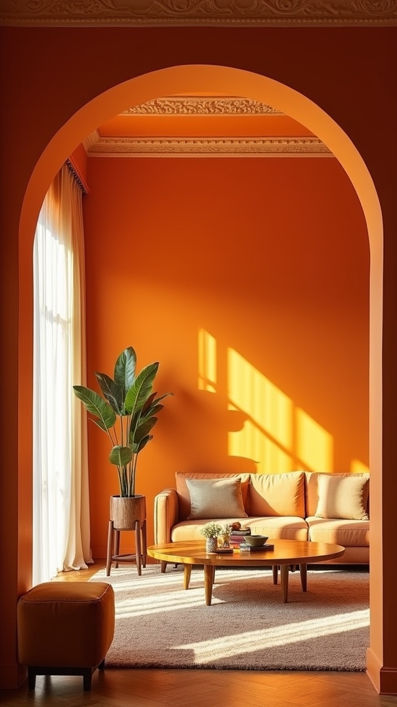
Choosing the Perfect Shade of Orange

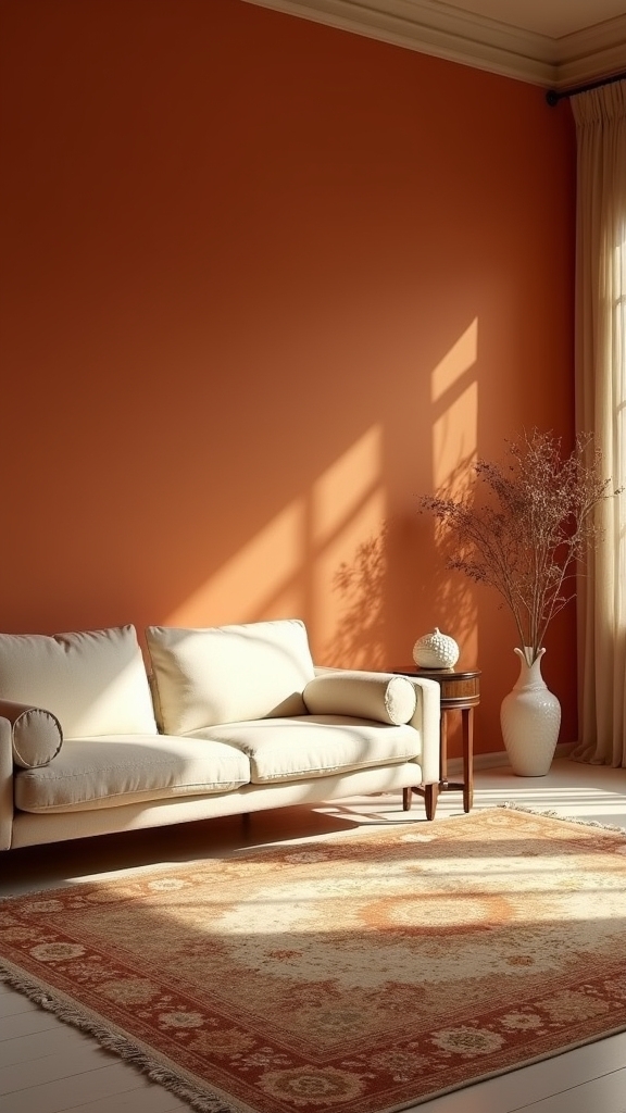
When curating an orange palette for the living room, discerning homeowners and designers weigh the nuanced impact of each shade. Selecting from vibrant orange shades such as Earths Core introduces a dynamic, energetic atmosphere, ideal for an accent wall that anchors the space with visual importance. In contrast, muted options like Copper Blush deliver understated warmth, supporting a tranquil yet contemporary ambiance. Deep reddish oranges—think Brick Red—imbue the room with richness and sophistication, aligning with current trends for cozy, inviting interiors. Expertly chosen orange shades can transform mood, from invigorating to serene, by varying tone and intensity. Pairing these hues with complementary colors, such as teal or navy blue, enhances the palette, ensuring the accent wall remains both bold and harmoniously integrated within the space. Incorporating natural materials and houseplants can further enhance the warmth and character of these orange hues, making the living room feel more cohesive and inviting.
Layering Burnt Orange for Depth
Contemporary interiors increasingly favor the strategic layering of burnt orange tones—such as Brick Red and Copper Blush—to achieve a nuanced interplay of color and depth.
Mixing Multiple Orange Shades
By thoughtfully layering multiple shades of burnt orange—ranging from the vibrant intensity of Earths Core to the subdued elegance of Copper Blush—a living room achieves remarkable depth and dimension.
Expertly curated orange hues, such as deep Brick Red paired with lighter burnt orange, establish a dynamic visual gradient that energizes while maintaining warmth.
Employing a spectrum of orange as an accent colour, whether through feature walls or select furnishings, enables spatial zoning and subtle visual movement—an on-trend technique in open-plan concepts.
This multidimensional palette encourages interplay between saturated and muted tones, amplifying both vibrancy and coziness.
Multiple orange shades, tactically placed, avoid monotony and introduce a sophisticated, designer-inspired approach to colour layering, delivering a living room that is both bold and inviting.
Balancing With Complementary Colors
How does one achieve depth without overwhelming a space dominated by burnt orange? The answer lies in strategic layering and the intelligent use of complementary colors.
Layering multiple shades—from Brick Red’s deep undertones to Copper Blush’s subtle warmth—creates a nuanced foundation. The introduction of complementary colors such as teal, navy blue, and warm neutrals is essential for balance and visual dynamism.
- Feature Wall: Employ a saturated burnt orange like Toasted Clay for a feature wall, paired with lighter hues above to establish a gradient effect.
- Color Accents: Integrate teal or navy blue through textiles or décor, amplifying the vibrancy of the burnt orange while preventing visual monotony.
- Material Contrast: Utilize crisp white trims, natural woods, or metal accents to frame and enhance the layered palette, establishing modern warmth.
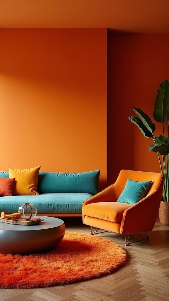
Orange and Teal Contrast Walls

Orange and teal contrast walls exemplify contemporary design by skillfully balancing the warmth of burnt orange with the invigorating coolness of teal.
A feature wall in a saturated orange, offset by a teal accent, establishes an immediate focal point and amplifies spatial depth.
This high-impact palette not only energizes the living room but also aligns with current trends favoring bold, dynamic color interplay.
Balancing Warmth and Cool
Dynamic contrast defines the interplay between burnt orange and teal in contemporary living rooms, setting the stage for a visually compelling environment.
This sophisticated pairing leverages orange accents against the invigorating presence of teal to create a balanced spectrum of warm and cool tones. The result is a space that radiates both energy and comfort, aligning with current interior design trends favoring bold, yet harmonious palettes.
For ideal effect:
- Feature Walls: Utilize a burnt orange hue like Toasted Clay for a dominant wall, balanced by a secondary teal accent wall.
- Architectural Detailing: Employ crisp white ceilings and trim to delineate and brighten, allowing colors to visually “pop.”
- Styling Elements: Integrate furnishings or accessories echoing these tones, reinforcing the room’s dynamic yet cohesive atmosphere.
Focal Points With Color
A singularly bold approach to living room design, the use of contrast walls in burnt orange and teal establishes an immediate focal point that anchors the entire space.
A feature wall in a rich shade such as Toasted Clay functions as an orange accent, drawing the eye and enhancing architectural elements like wooden beams or mantelpieces. Complementary to this, a smaller accent wall in Teal Lux injects depth and a contemporary edge, balancing the warmth of orange with cool sophistication.
The interplay between these hues creates a vibrant yet harmonious environment, especially when paired with crisp white ceilings and trims to prevent visual overload.
This color strategy is on-trend for contemporary interiors, appealing to those seeking a dynamic, playful, yet refined living room focal point.
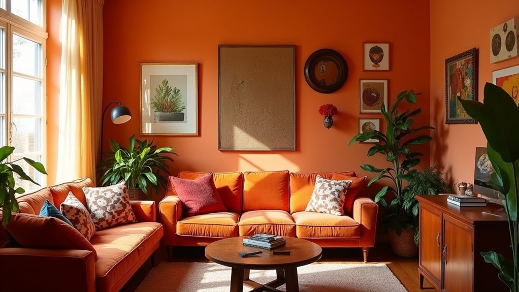
Highlighting Architectural Features With Orange
When seeking to accentuate architectural features within a living room, incorporating burnt orange as a feature wall or strategically placed accent can instantly direct the eye to key elements such as exposed beams, fireplaces, or recessed alcoves.
This orange accent approach not only highlights architectural features but also creates dimensional depth and visual warmth. Employing pale neutrals like Timeless as a background amplifies the vibrancy of burnt orange, ensuring these design highlights remain at the forefront.
Burnt orange accents bring out architectural details while adding visual warmth and depth, especially when paired with pale neutral backgrounds like Timeless.
For enhanced effect, consider the following expert strategies:
- Feature Walls: Apply a rich shade like Toasted Clay to a single wall to energize and focus the space.
- Complementary Hues: Use warm tones such as Frosted Papaya alongside rustic wood for a cohesive, inviting ambiance.
- Nook Highlighting: Paint alcoves or recessed areas in burnt orange to generate visual intrigue and spatial continuity.
Colour Blocking With Orange Accents
Employing colour blocking with orange accents introduces a sophisticated interplay of tone and space, utilizing adjacent shades—such as the earthy Copper Blush paired with lighter hues—to delineate zones and infuse open-plan living rooms with purposeful energy. This technique leverages the strategic placement of muted orange on feature walls, establishing focal points without overwhelming the palette. By integrating neutral furniture and natural wood elements, the boldness of orange accents is tempered, ensuring a balanced visual experience. Metallic finishes, particularly copper or gold, further enhance the scheme, adding a refined luminescence that harmonizes with vibrant hues. Thoughtful distribution of orange blocks not only guides the eye but also creates compelling spatial narratives, resonating with contemporary design sensibilities and offering a dynamic, curated environment for modern living. Incorporating decorative pillows with varied textures such as linen and velvet, can further enhance the visual interest and warmth of the space, blending seamlessly with the orange accents.
Pairing Orange With Earthy Tones
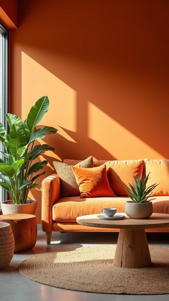
Pairing burnt orange with an array of earthy neutrals such as taupe, terracotta, and warm browns enhances visual warmth while anchoring the color palette in natural sophistication.
These grounded hues facilitate a seamless shift between bold orange walls and organic wooden furnishings, balancing vibrancy with tactile comfort.
Current design trends highlight this layered approach for its ability to create inviting, on-trend living spaces with enduring appeal.
Enhancing Warmth With Neutrals
A carefully curated blend of burnt orange walls with earthy neutrals—such as warm browns, creams, and taupe—anchors the living room in contemporary comfort while delivering a visually balanced palette.
Earthy tones provide a neutral backdrop that tempers the vibrancy of orange, ensuring a space that feels both bold and grounded. This aesthetic approach not only highlights the warm undertones of orange but also infuses the space with a tranquil, inviting atmosphere.
To enhance the sophistication and depth of the room:
- Layer tonal variations: Combine multiple shades of orange with muted neutrals like beige and taupe for visual interest.
- Integrate natural textures: Add tactile richness through linen, wool, or woven accessories.
- Curate accent pieces: Select décor in complementary earthy hues to reinforce the cohesive palette.
Balancing Orange and Wood
Rich, burnt orange walls juxtaposed with the organic texture of natural wood introduce a sophisticated interplay of warmth and earthy elegance to contemporary living rooms.
This expertly balanced combination allows the vibrancy of each orange shade to be grounded by the subtle grain and depth of materials such as walnut or oak. Warm wood finishes temper the intensity of orange, ensuring a welcoming rather than overpowering aesthetic.
Designers leverage reclaimed wood coffee tables or wooden accent pieces to accentuate the tactile quality of the space, enhancing visual depth and rustic appeal. Earthy tones like brown and tan further complement the palette, resulting in an inviting, harmonious environment.
This trend emphasizes natural materials, seamlessly blending color and texture for a modern yet timeless living room composition.
Creating a Cozy Retreat With Rust Orange
Few colors rival rust orange in its ability to cultivate a warm, enveloping ambiance ideal for cozy living room retreats. Rust orange, with its earthy undertones, instantly transforms ordinary spaces into intimate sanctuaries. This hue thrives when integrated with natural materials—think exposed wood beams or brushed metal fixtures—for an enhanced rustic charm. Wooden furniture serves as the cornerstone of rustic living room design, adding warmth and complementing the earthy tones of rust orange. To expertly achieve a cozy retreat, interior specialists highlight the following strategies:
- Layered Textures: Combine rust orange woven fabrics, plush cushions, and throws for tactile depth and visual interest.
- Balanced Palette: Offset the boldness of rust orange with soft neutrals or warm browns to establish a harmonious, snug atmosphere.
- Focal Accent Walls: Employ rust orange on a feature wall to spotlight architectural elements and create a visually striking focal point.
This approach epitomizes contemporary comfort.
Orange and Navy: A Sophisticated Match
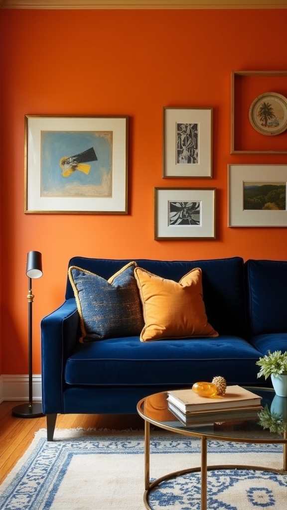
Pairing vibrant orange with the grounded depth of navy achieves a dynamic equilibrium, balancing energy with tranquility in the modern living room.
This sophisticated color synergy amplifies contemporary aesthetics, allowing orange accents to stand out against a rich, stabilizing backdrop.
Designers increasingly leverage this combination to create visually compelling spaces that feel both invigorating and refined.
Balancing Vibrant and Calm
When deep navy blue is introduced as a grounding backdrop, vibrant orange accents are able to command attention without overwhelming the space, resulting in a balanced and visually compelling living room.
The interplay of orange colour with navy blue encapsulates a modern approach, utilizing high-contrast hues to generate both warmth and serenity. This synergy is particularly effective for spaces where visual dynamism and relaxation are equally desired.
- Color Anchoring: Navy blue serves as a visual anchor, allowing burnt orange walls or décor details to stand out with sophistication rather than excess.
- Layered Contrast: Strategic placement of navy furniture against orange colour walls amplifies depth, accentuating architectural lines and contemporary silhouettes.
- Mood Versatility: The pairing energizes the environment while maintaining tranquility—ideal for living areas seeking both vibrancy and calm.
Elevating Contemporary Interiors
While many color combinations aim for equilibrium, the juxtaposition of orange and navy in contemporary interiors achieves a distinctly sophisticated harmony.
In the orange living room, deep navy paint colors act as a stabilizing backdrop, imparting a sense of calm and depth. Against this rich foundation, vibrant orange accents—whether in cushions, feature walls, or curated artwork—inject dynamic energy without overwhelming the space.
This interplay of tones capitalizes on high visual contrast, a hallmark of modern design, while remaining versatile across minimalist and eclectic aesthetics. Thoughtful integration of these hues in furniture and accessories guarantees cohesion and invites warmth into the environment.
The strategic use of orange and navy reflects a trend-forward approach, transforming living areas into visually compelling and elegantly balanced interiors.
Energizing Your Space With Orange and Dark Green
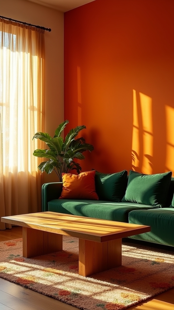
Although design trends continually evolve, the dynamic interplay between burnt orange and dark green endures as a sophisticated choice for contemporary living spaces.
This juxtaposition offers a vibrant contrast, infusing the room with energy while remaining grounded in modern sensibility. Orange walls, paired with dark green accents, cultivate a multidimensional aesthetic ideal for eclectic or rustic environments.
The expert application of these shades can transform ordinary interiors into visually compelling retreats.
Consider these strategies to maximize impact:
- Articulated Contrast: Employ burnt orange as a backdrop with emerald green furnishings to define distinct zones.
- Material Harmony: Integrate natural wood alongside these hues to reinforce a warm, organic ambiance.
- Patterned Layering: Introduce textiles or wall art featuring both orange and green for heightened visual intrigue and cohesion.
Playful Pairings: Orange and Pink
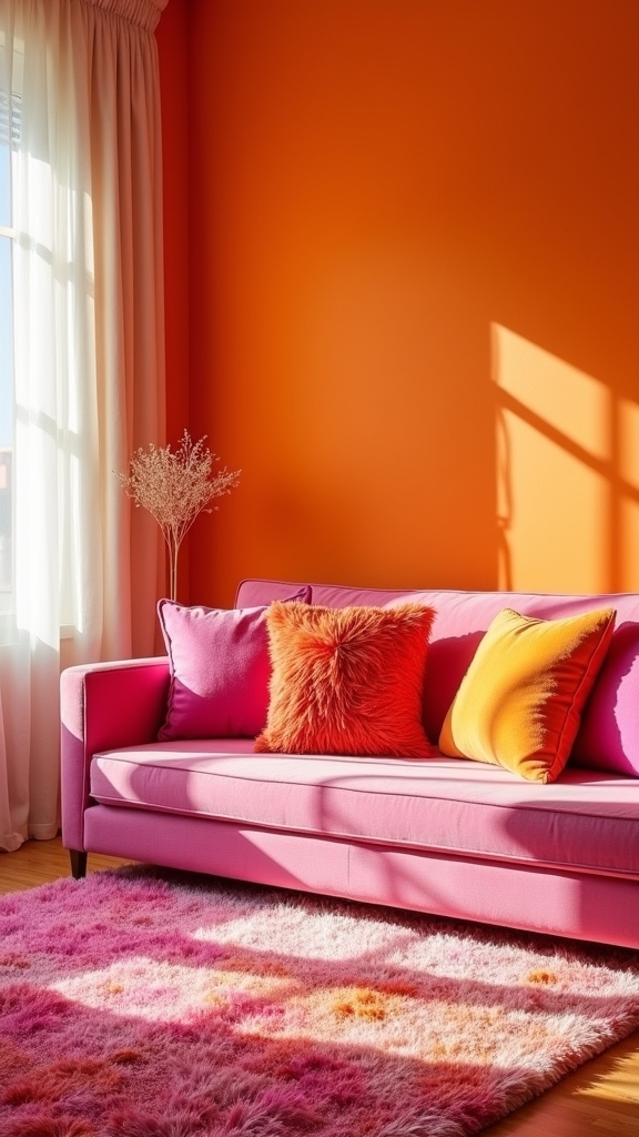
Infusing orange living room walls with pink accents yields a strikingly modern palette that radiates vibrancy and creative flair. When orange paint is juxtaposed with bright pink accents, the space channels a playful energy ideal for eclectic or cottage-style interiors.
Expert designers recommend layering soft dusty rose or blush-toned accessories—such as cushions or curated artwork—against burnt orange backdrops to achieve both visual harmony and a nod to vintage aesthetics. This chromatic pairing amplifies natural light and enhances the perceived warmth of the room, making it especially inviting for social gatherings.
Employing varied shades of pink alongside orange paint guarantees a dynamic yet balanced composition, delivering a cheerful vibe that remains visually sophisticated and on-trend within contemporary living room design.
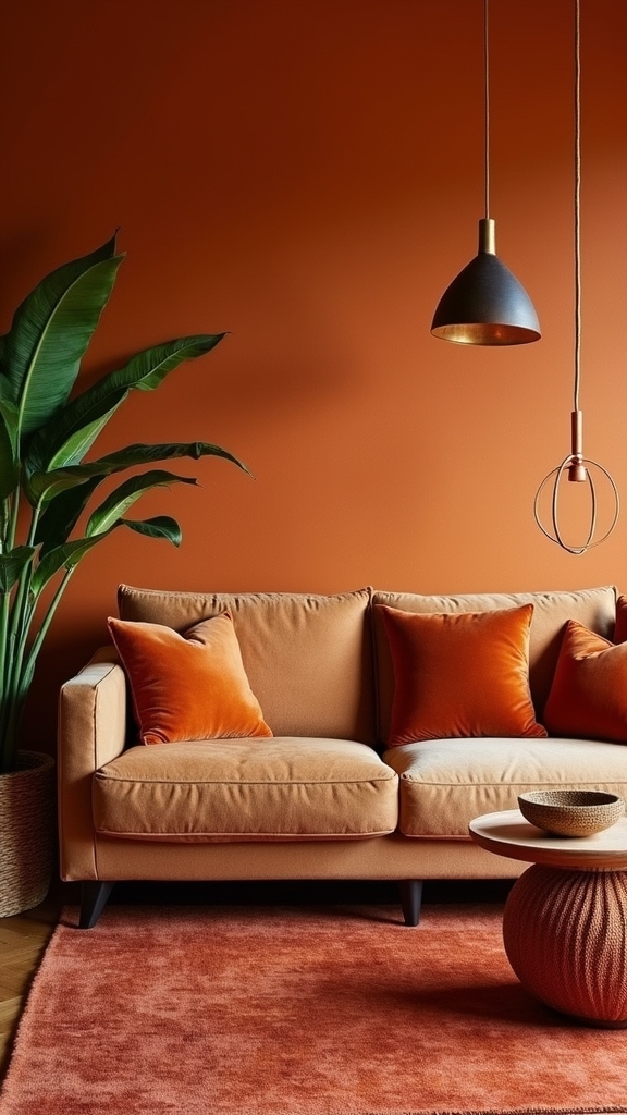
Bringing Warmth With Orange and Brown
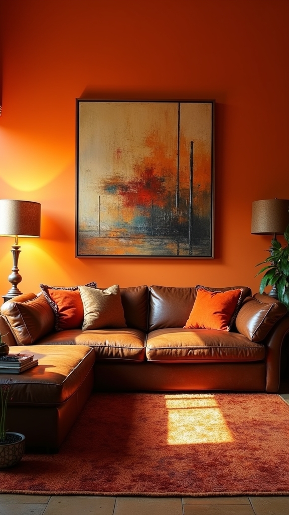
A spectrum of warm browns—ranging from deep mahogany to soft chestnut—serves as an ideal counterpart to orange living room walls, amplifying the sense of coziness and approachability. The interplay between orange and brown anchors the space, establishing an inviting, visually grounded environment. Design professionals emphasize the following strategies for achieving a balanced aesthetic:
- Layering Materials: Brown leather sofas, wooden coffee tables, and accent chairs provide tactile contrast and visual depth against orange walls.
- Textural Accents: Incorporate earthy brown throw pillows or woven rugs to infuse warmth and create a seamless shift between bold orange and surrounding elements.
- Rustic Appeal: Pair burnt orange with rustic brown finishes for a trend-forward nod to traditional or country-inspired interiors.
This dynamic palette underscores both comfort and contemporary style. Adding warm lighting with lower color temperatures can further enhance the space, creating a soothing ambiance that complements the orange and brown tones.
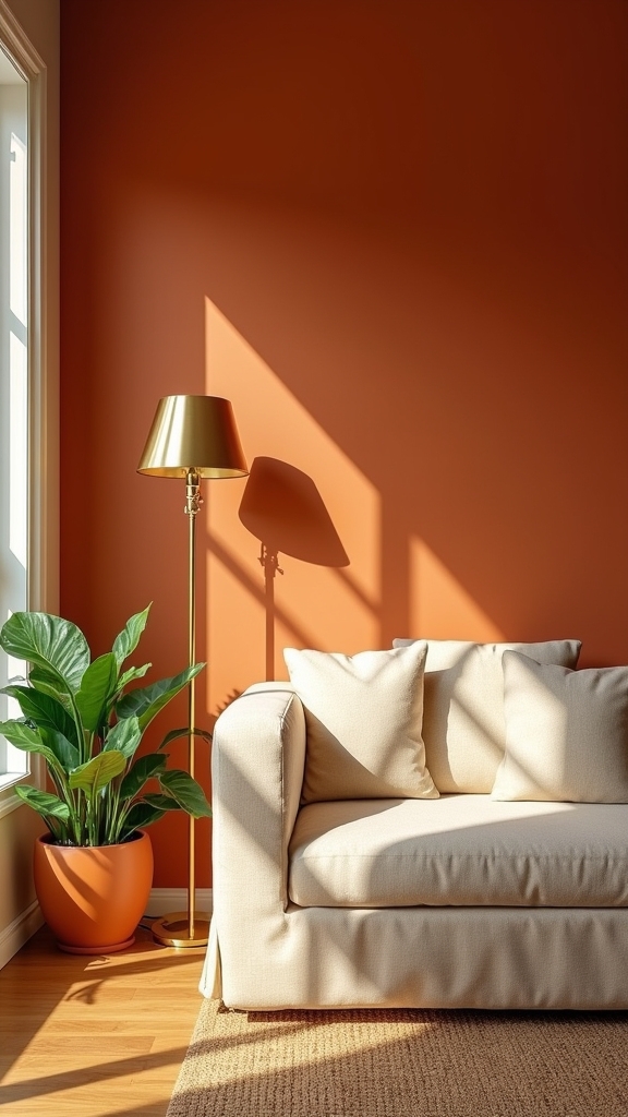
Fresh and Modern: Orange and White Combinations
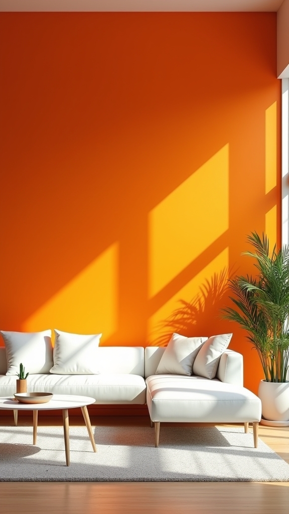
When paired with crisp white accents, vibrant orange walls create a striking interplay of energy and clarity that is emblematic of modern interior design.
This high-contrast palette leverages the inherent luminosity of white to amplify the vivacity of orange, resulting in a fresh, invigorating living room aesthetic.
Orange serves as a bold focal point, while white surfaces provide a sense of openness and airiness, in line with minimalist sensibilities.
Orange commands attention as the room’s centerpiece, while crisp white elements infuse the space with lightness and modern minimalism.
The juxtaposition defines architectural lines and highlights contemporary furnishings, ensuring spatial depth and visual intrigue.
Integrating organic textures, such as wooden decor or furniture, introduces a grounded element that balances the intensity of orange and the purity of white.
This combination remains a favored choice for those pursuing a dynamic yet harmonious living environment.
Dynamic Duos: Orange and Light Blue
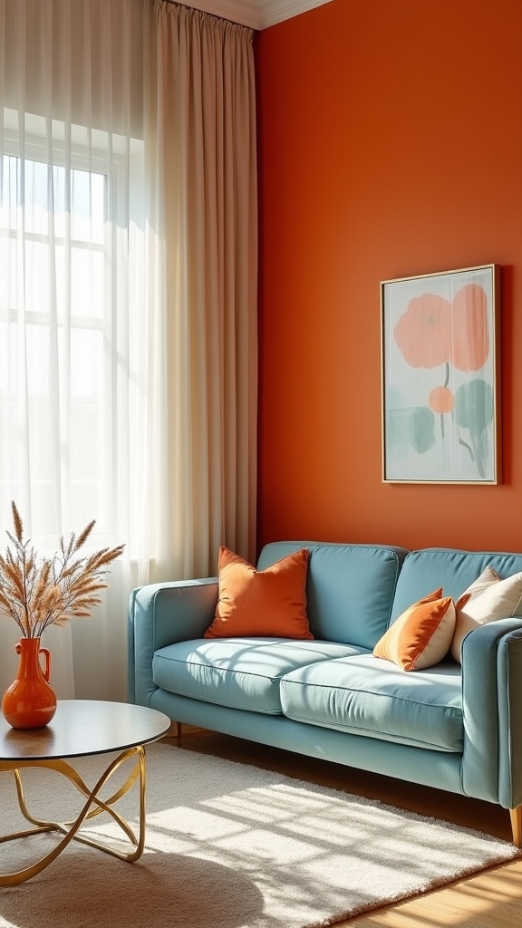
Building upon the clean sophistication of orange and white, the interplay between orange and light blue introduces a compelling chromatic tension that feels distinctly modern.
This high-contrast pairing leverages orange’s kinetic vibrancy and light blue’s calming undertones for a space that is both visually stimulating and balanced. Designers strategically employ this duo to enhance smaller living rooms, as the juxtaposition amplifies spatial depth and luminance.
The following applications exemplify the trend’s versatility:
- Focal Accents: Orange statement walls or art pieces against light blue backgrounds serve as dynamic visual anchors.
- Textile Integration: Patterns in orange and light blue on cushions or curtains inject playful warmth without overwhelming the palette.
- Spatial Perception: The synergy of these hues visually expands the room, creating an inviting and contemporary ambiance.
Timeless Appeal: Burnt Orange and Cream
Rooted in midcentury modern design, the union of burnt orange and cream delivers a harmonious balance between warmth and refinement.
This enduring palette offers visual depth—burnt orange infuses the space with energy and vibrancy, while cream walls introduce a soft, luminous foundation.
The interplay allows burnt orange furnishings or accent pieces to stand out, defining focal points without overwhelming the environment.
Warm wood tones, characteristic of the era, further enhance this scheme, creating a layered, inviting ambiance ideal for living or dining settings.
This color pairing not only underscores a timeless aesthetic but also fosters an atmosphere conducive to relaxation and social gatherings.
Incorporating luxurious fabrics such as velvet or silk for upholstery complements the warmth of burnt orange, adding elegance and comfort to the overall design.
The result is a living room that feels both current and classic, seamlessly blending style with comfort.
High-Energy Spaces With Orange and Emerald Green
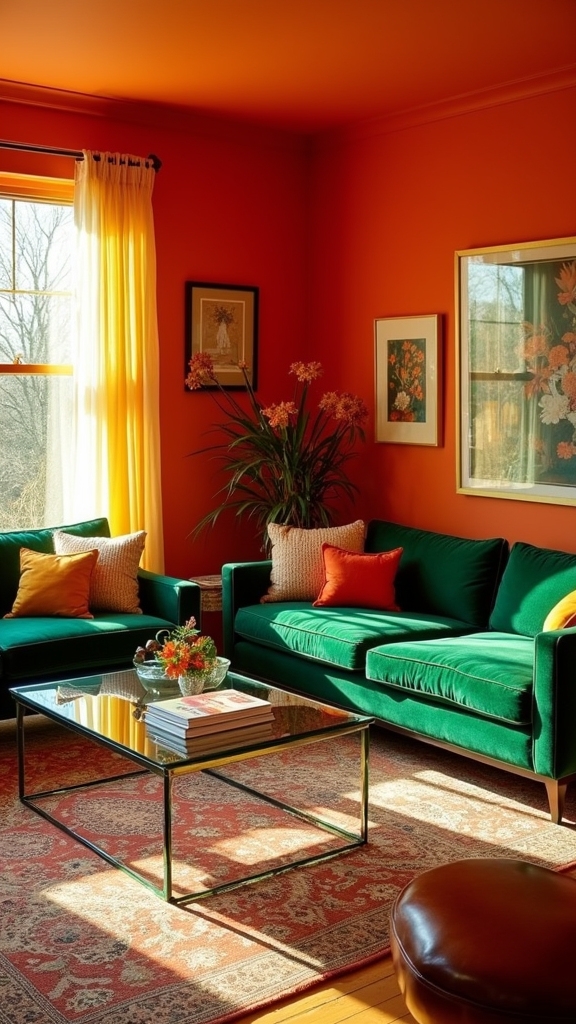
For those seeking a living room palette with maximal visual impact, pairing burnt orange with emerald green introduces a bold, contemporary energy distinct from the understated elegance of burnt orange and cream.
This high-energy color scheme leverages the saturated vibrancy of orange juxtaposed with the lush, sophisticated depth of emerald green, resulting in a visually dynamic environment. The interplay of these hues is further accentuated by layered textiles and statement accessories, making it ideal for eclectic and modern interiors.
To achieve a cohesive yet impactful result, designers recommend:
- Utilizing multiple shades of emerald green to create nuanced depth and visual flow.
- Integrating natural wood elements to harmonize the warmth of orange and the intensity of green.
- Employing patterned fabrics to amplify texture and maintain a lively, curated atmosphere.
Frequently Asked Questions
What Color Goes Well With Orange Walls?
Selecting orange accent colors such as teal, navy, or deep green introduces visual contrast, while warm neutral palettes—think cream and beige—offer a sophisticated counterbalance. Trend-forward combinations include natural wood tones and vibrant fuchsia for enhanced contemporary depth.
What Color Clashes With Orange?
When considering orange color psychology and orange color harmony, hues such as icy blues, deep purples, neon greens, and harsh blacks visually clash with orange, disrupting balance and trending design palettes by undermining its energetic warmth and cohesive vibrancy.
What Color Best Compliments Orange?
When evaluating what color best complements orange, experts in color psychology and color harmonies frequently recommend teal. This visually dynamic pairing leverages the complementary relationship on the color wheel, creating trend-forward, energetic interiors with balanced, striking visual emphasis.
Is Orange a Good Color for a Living Room?
Design experts recognize orange as an effective living room choice due to orange color psychology, which suggests enhanced warmth and sociability. Utilizing orange as living room accents or feature walls aligns with current trends emphasizing inviting, expressive interior atmospheres.
Conclusion
Incorporating orange on living room walls offers a spectrum of design potential, from subtle warmth to daring vibrancy. By employing expert techniques—layering shades, utilizing color blocking, or pairing with trending hues like teal or emerald—homeowners achieve both depth and visual intrigue. Orange’s adaptability guarantees it complements architectural features and modern layouts alike. Ultimately, an orange-infused living room is a bold, on-trend statement, radiating energy and sophistication while remaining inviting and visually harmonious.
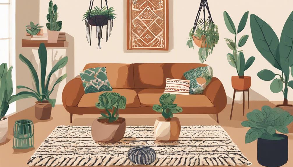
5 Steps to Achieve the Perfect Boho Living Room Decor
Transform your living space with these 5 essential steps for perfect boho decor, from vibrant co
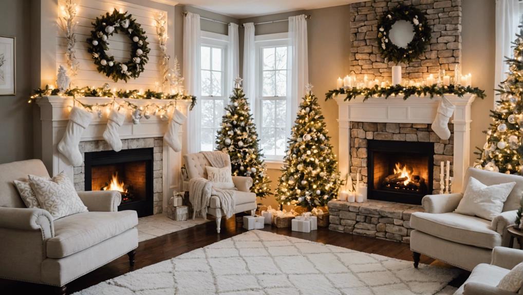
10 Tips for Stunning Living Room White Christmas Decorations
Need inspiration for a breathtaking white Christmas living room? Discover 10 stunning decoration
Stylish Ways to Decorate Your Living Room With a Green Sofa
Keen on transforming your space? Discover stylish ways to decorate your living room with a green
Leave a Reply