15 Best Paint Colors for a White Kitchen That Add Soft Contrast
Designers recommend soft contrast colors like soft gray, warm beige, light taupe, sage green, pale blue, pastel yellow, light olive, muted lavender, and stone gray to add depth and warmth to white kitchens. These hues enhance white cabinetry without overpowering it, foster a tranquil ambiance, and integrate seamlessly with various materials and finishes. Each shade boosts visual interest while maintaining a sophisticated look. Further options and style pairings await for those seeking inspired kitchen palettes.
Key Takeaways
- Soft gray and light taupe offer gentle contrast while maintaining a tranquil, inviting kitchen atmosphere.
- Sage green and light olive introduce nature-inspired tones that harmonize beautifully with white cabinetry and wood accents.
- Warm beige provides subtle warmth and depth, distinguishing architectural features without overpowering the space.
- Dusty rose and pastel yellow add cheerful, understated color for softness and a welcoming ambiance.
- Creamy white and greige enhance cohesion, maximizing light while avoiding starkness in all-white kitchens.
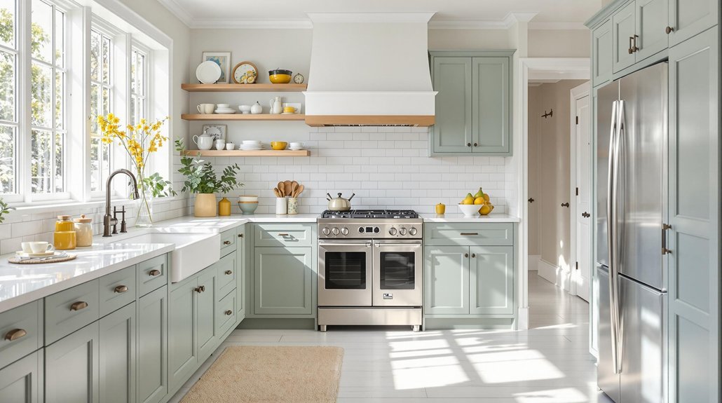
Soft Gray

Soft gray serves as an ideal intermediary tone, providing subtle contrast to white kitchens while preserving a crisp and sophisticated aesthetic. This soft shade is prized for its versatility, seamlessly integrating with modern, farmhouse, and traditional design schemes. Utilizing soft gray paint introduces gentle depth, enhancing architectural details such as crown moldings or coffered ceilings without detracting from the bright, clean impact of white cabinetry. The nuanced undertones of a light gray palette enable white accents to remain prominent, establishing a harmonious color balance. Additionally, the calming nature of soft gray fosters a tranquil atmosphere, supporting a serene and inviting culinary environment. For those seeking to raise a white kitchen with restrained elegance, a soft gray shade delivers both visual interest and enduring appeal through its refined, understated contrast. Consider pairing soft gray with polished concrete floors to create a sleek, modern kitchen space that is both durable and low-maintenance.
Warm Beige
When aiming to infuse a white kitchen with warmth and character, warm beige offers a sophisticated solution that balances comfort with refinement. This nuanced hue enriches white cabinetry by introducing a gentle, inviting undertone that enhances the overall atmosphere without diminishing the space’s inherent brightness.
Warm beige is particularly effective at providing subtle contrast, distinguishing architectural details while maintaining a cohesive, airy aesthetic. Its adaptability allows it to harmonize seamlessly with a variety of materials, especially wood accents and rustic features, further enhancing the kitchen’s visual interest.
Additionally, warm beige serves as a versatile backdrop for metallic fixtures and colorful décor, ensuring flexibility in styling. This color choice is ideal for homeowners seeking to achieve a timeless, elegant look that feels both welcoming and fresh.
Light Taupe

Light taupe introduces warmth to a white kitchen without overpowering the space, offering a nuanced backdrop that supports both classic and modern aesthetics.
Its reflective qualities optimize natural light, ensuring the room remains bright and welcoming throughout the day.
Additionally, light taupe serves as an elegant complement to brass hardware and fixtures, enhancing the overall sophistication of the design.
Warmth Without Overpowering
Although white kitchens remain timeless for their crisp and clean appearance, introducing a nuanced shade like light taupe offers a sophisticated way to infuse warmth without sacrificing the space’s airy quality. As a warm, neutral shade, light taupe subtly balances undertones of gray and beige, delivering gentle contrast to stark white cabinetry. Its restrained elegance guarantees the kitchen does not feel sterile, while still maintaining a light and open ambiance. Light taupe’s versatility allows it to harmonize with both contemporary and classic design schemes, supporting a range of materials and textures. The table below illustrates key style benefits:
| Attribute | Effect on Kitchen | Design Compatibility |
|---|---|---|
| Warmth | Inviting, cozy feel | Modern & traditional |
| Neutral Shade | Soft contrast | Wood, stone, metals |
| Versatility | Pairs with any countertop | Seamless integration |
Enhances Natural Light
A subtle infusion of light taupe on kitchen walls maximizes the effect of natural light, as this nuanced neutral efficiently reflects sunlight while mitigating glare.
The unique blend of gray and beige undertones in light taupe establishes a balanced, soft contrast, enhancing the luminous quality of a neutral kitchen without competing with the crispness of white cabinetry.
This color solution is particularly effective in creating a warm and inviting environment, as it diffuses incoming light evenly throughout the space.
Light taupe also serves as an elegant, adaptable backdrop suited for both traditional and contemporary kitchen designs.
Its versatile nature harmonizes well with natural wood accents, reinforcing visual cohesion while elevating the overall brightness.
Ultimately, light taupe optimizes spatial radiance and highlights the architectural clarity of a neutral kitchen.
Complements Brass Accents
Building on the ability of light taupe to enhance natural light, this nuanced hue also serves as a sophisticated foundation for showcasing brass accents within a white kitchen. Light taupe’s subtle blend of gray and beige offers a warm, neutral backdrop that allows brass accents to stand out, imparting an aura of elegance without overpowering the crispness of white cabinetry. This interplay introduces a tactile contrast, raising both classic and modern kitchen aesthetics. By incorporating light taupe on walls or select surfaces, designers achieve a harmonious balance, allowing brass hardware or fixtures to gleam as focal points. The table below highlights the synergistic qualities of this pairing:
| Feature | Light Taupe Effect | Brass Accent Impact |
|---|---|---|
| Wall Color | Warm, understated contrast | Highlights metallic sheen |
| Cabinet Pairing | Complements white | Raises hardware detail |
| Style Adaptability | Timeless versatility | Adds contemporary flair |
Sage Green
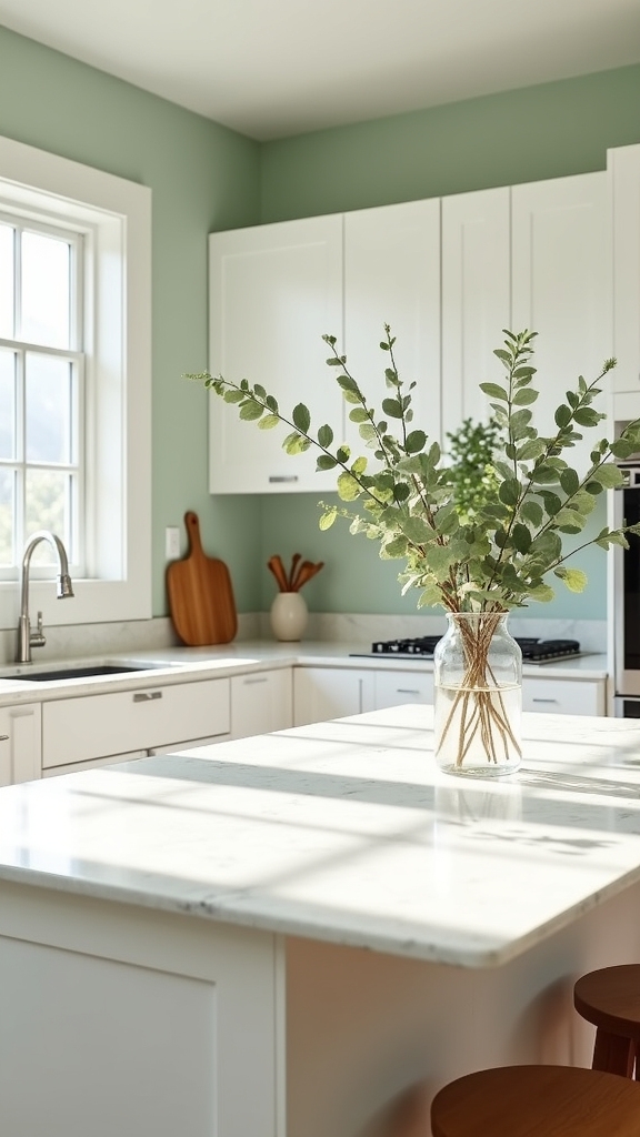
Sage green introduces calming, nature-inspired tones that enhance the tranquility of a white kitchen while maintaining a sophisticated aesthetic. Its versatility allows seamless pairings with both metallic and organic materials, optimizing design flexibility. This muted hue subtly enhances warmth and light, making the space feel both inviting and refreshed. The color psychology of green evokes calmness and sophistication, promoting a serene environment in kitchen design.
Calming Nature-Inspired Tones
Drawing inspiration from the tranquility of nature, muted green hues such as sage introduce a fresh, earthy dimension to white kitchens while maintaining a serene and sophisticated aesthetic. Sage green is renowned for its ability to create a soft contrast against crisp white cabinetry, elevating the kitchen’s visual interest without overpowering its brightness. This calming, nature-inspired tone seamlessly integrates with both modern and farmhouse design schemes, bringing a sense of harmony and balance.
| Design Element | Effect on Kitchen Space |
|---|---|
| Sage green cabinetry | Adds a soft, organic contrast |
| Brass/matte black hardware | Enhances the subtle elegance |
| Soft white walls | Maintains airiness and tranquility |
Sage green’s subtlety encourages relaxation, fostering a calming environment ideal for both cooking and gathering, while its versatility guarantees enduring style appeal.
Versatile Shade Pairings
How does one achieve a sophisticated yet inviting palette in a white kitchen? Introducing sage green as a versatile shade pairing delivers a soft contrast that enriches the overall aesthetic.
This muted, earthy hue imparts a sense of tranquility, making it particularly effective in busy kitchen environments. Sage green’s understated tone is an ideal complement to crisp white cabinetry, offering depth without dominating the visual field.
Its flexibility is evident in its compatibility with both brass and matte black hardware, supporting design schemes from modern minimalism to classic tradition. When paired with natural wood accents, sage green further accentuates a harmonious, balanced look.
For homeowners seeking a natural, calming vibe, sage green offers enduring appeal and sophisticated versatility, redefining the possibilities of white kitchen design.
Enhancing Warmth and Light
Building on the versatility of sage green, its unique ability to enhance both warmth and light within a white kitchen is unmatched.
This muted hue infuses the space with an earthy freshness, balancing the crispness of white cabinetry while cultivating a serene, welcoming atmosphere. Sage green’s subtle undertones reflect ambient light, making kitchens feel brighter and more open without sacrificing coziness.
Its compatibility with brass or matte black hardware provides refined visual interest, elevating the overall aesthetic with understated elegance.
Whether applied to walls, islands, or accent shelving, sage green adapts seamlessly to modern and traditional design frameworks.
Incorporating sage green into a white kitchen not only promotes relaxation but also achieves a sophisticated interplay of contrast and cohesion, supporting both style and functionality.
Pale Blue
Pale blue introduces a refined, tranquil note to white kitchens, providing gentle contrast that enhances spatial brightness without overpowering the design. This hue is celebrated for its ability to impart soft contrast, making it an ideal selection for those seeking a serene yet visually engaging environment.
Pale blue lends refined tranquility to white kitchens, enhancing brightness with gentle contrast for a serene, visually engaging space.
Soft, muted blues, such as Cumulus Y354, deliver a calming backdrop ideal for stress-free cooking and effortless entertaining. Pale blue’s adaptability allows it to partner seamlessly with both warm-toned woods and cool metallic accents, broadening its design versatility.
When applied strategically, especially in compact kitchens, this shade amplifies visual openness and airiness.
- Subtle pale blue walls paired with creamy quartz countertops
- Soft contrast between white cabinetry and delicate blue backsplashes
- Light wood open shelving accentuating serene blue undertones
- Brushed nickel hardware complementing a pale blue feature wall
Charcoal Gray
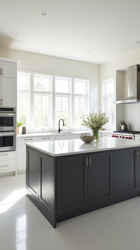
Charcoal gray introduces modern elegance to a white kitchen by imparting visual depth and refined contrast.
This sophisticated shade enhances natural and artificial light, amplifying spatial perception while grounding the overall design.
Its versatility allows it to function as a striking accent or dominant backdrop, optimizing both style and proportion in contemporary spaces.
Modern Elegance With Depth
Sophistication emerges when deep charcoal gray is introduced into a white kitchen, delivering a striking yet balanced contrast that defines modern elegance.
This nuanced shade infuses the space with refined depth, perfectly offsetting the crispness of white cabinets and establishing a visually compelling focal point in a modern kitchen. Charcoal gray’s versatility allows it to harmonize with a spectrum of materials—such as marble countertops and natural wood—while metallic accents like brass or polished chrome further accentuate the palette’s contemporary appeal.
The interplay of light and shadow created by this color enhances the kitchen’s aesthetic without overwhelming its minimalist integrity.
- Matte charcoal gray islands anchoring bright, airy layouts
- Polished chrome fixtures reflecting soft gray undertones
- Brass hardware punctuating sleek cabinetry
- Marble countertops bridging the contrast between bold and light
Enhancing Light and Space
Building upon the refined contrast established by deep charcoal gray, the strategic application of this hue enhances both light and spatial perception within a white kitchen.
Charcoal gray’s inherent depth introduces sophisticated visual interest, delineating boundaries and amplifying the crispness of white cabinetry. Its ability to subtly absorb and reflect light moderates brightness, creating a balanced interplay between illumination and shadow.
In expansive kitchens, employing charcoal gray on select walls or accent features can mitigate the sense of emptiness, fostering an intimate, inviting environment. This approach also accentuates architectural details and harmonizes seamlessly with diverse design elements, from polished metals to rustic woods.
Ultimately, charcoal gray serves as a dynamic solution—amplifying contrast while optimizing the perception of space and light in contemporary kitchen design.
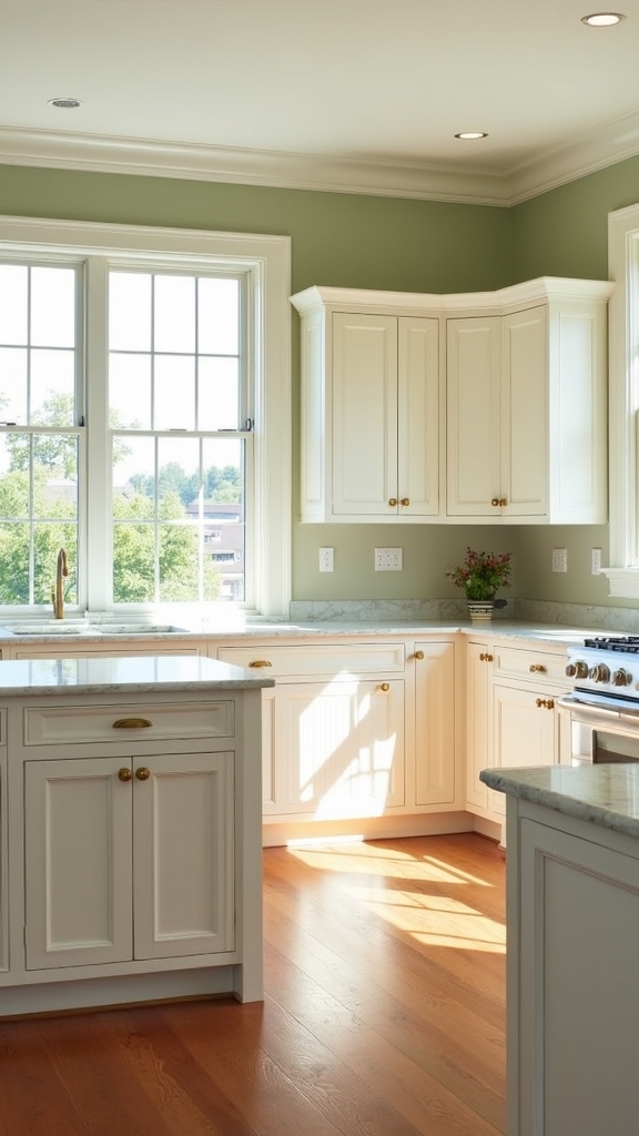
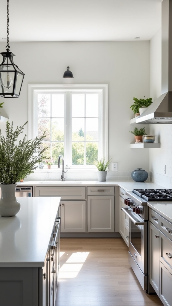
Greige
Although often understated, greige—a harmonious blend of gray and beige—serves as a refined backdrop in white kitchens, introducing both warmth and depth without detracting from the space’s crisp aesthetic.
By pairing seamlessly with white cabinets, greige enhances their luminosity while preserving a contemporary, sophisticated atmosphere. This neutral shade’s versatility allows it to complement a spectrum of design motifs, from sleek modern to timeless traditional.
Greige also harmonizes effortlessly with natural materials, such as warm wood accents or polished brass fixtures, establishing an elegant balance of textures and tones.
Greige pairs beautifully with wood and brass, creating a harmonious interplay of warmth, elegance, and subtle sophistication in any kitchen space.
Applied to kitchen walls, greige maximizes spatial perception, offering a polished, expansive finish that elevates the entire room.
- Muted greige walls enveloping pristine white cabinetry
- Sunlight reflecting softly off a greige-painted backdrop
- Gleaming brass hardware accentuating the neutral palette
- Wood shelving adding organic contrast against greige walls
Greige cabinetry offers practical storage solutions, with easy maintenance and cleaning due to light-colored surfaces, enhancing both functionality and aesthetics in modern kitchen designs.
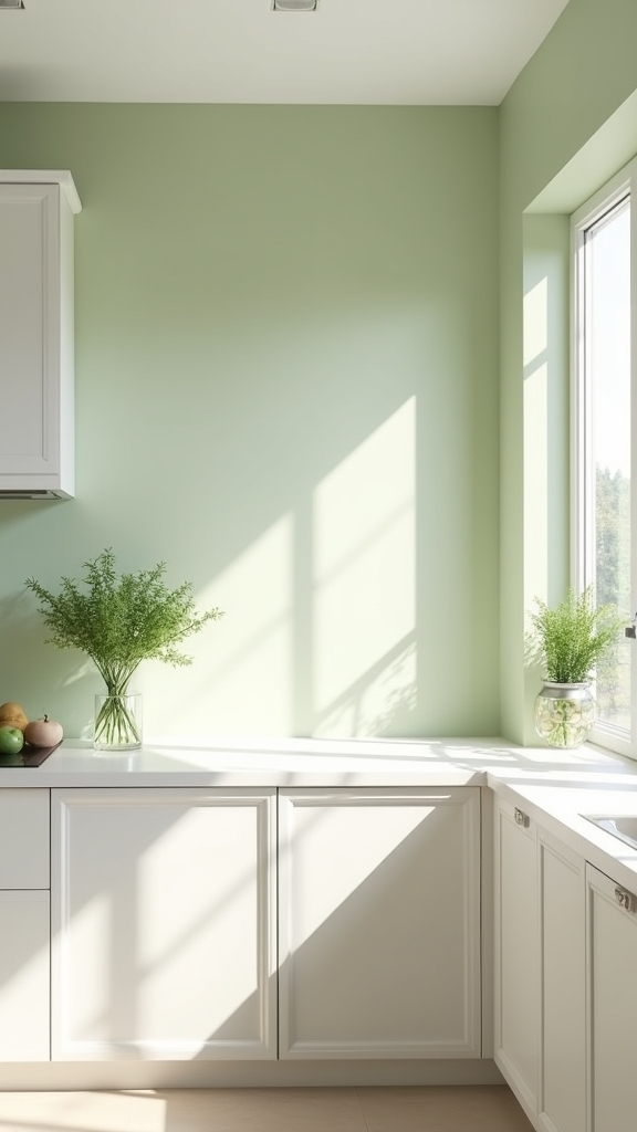
Misty Green
A breath of tranquility, misty green infuses white kitchens with a subtle infusion of color that remains understated yet distinctly rejuvenating. This muted, soft shade introduces a layer of revitalizing calm, enhancing the kitchen’s visual harmony without competing with the crispness of white cabinetry. Misty green’s compatibility with both brass and matte black hardware creates a refined contrast, while its synergy with natural materials—such as wood and stone—amplifies tactile warmth. The shade’s versatility guarantees seamless integration within modern and traditional settings, fostering an atmosphere that feels both serene and sophisticated. Suitable for both compact and expansive spaces, misty green maintains the kitchen’s airy sensibility while adding nuanced depth. Sage green amplifies cozy elegance within kitchens, infusing tranquility while maintaining sophistication and pairing well with various design styles.
Dusty Rose
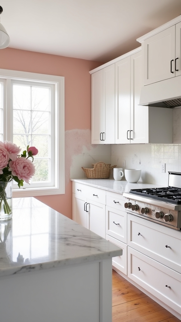
Shifting from the tranquil undertones of misty green, dusty rose introduces a nuanced warmth that enhances the visual interest of a white kitchen. This soft, muted pink infuses the space with sophistication, offering gentle contrast against white cabinets without overwhelming the airy ambiance.
Dusty rose’s adaptability allows it to bridge modern minimalism and traditional elegance, complementing organic textures and metallic finishes alike. Its calming undertones establish a serene, inviting environment ideal for relaxation and daily living. For those seeking a refined yet approachable palette, dusty rose seamlessly integrates with other pastels and neutrals, ensuring versatility for evolving tastes.
- Dusty rose accent walls paired with pristine white cabinets
- Natural wood shelving illuminated by subtle pink undertones
- Brass hardware gleaming against muted, rosy backdrops
- Soft pastel textiles layered within a harmonious kitchen palette
For a lively, balanced look, consider incorporating complementary shades like green alongside dusty rose to enrich the kitchen’s overall aesthetic.
Navy Blue
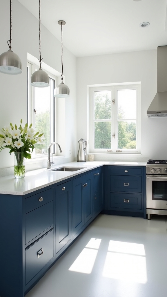
Navy blue offers a classic pairing with white cabinetry, establishing a high-contrast palette that boosts visual interest.
This sophisticated hue enhances the kitchen’s ambiance, especially when complemented by metallic accents such as gold or brass hardware.
Its adaptability supports both modern and traditional design schemes, providing a versatile solution for refined kitchen aesthetics.
Classic Pairing With White
Contrast remains a cornerstone of sophisticated kitchen design, and few combinations deliver this effect as effectively as rich navy blue paired with crisp white cabinetry. This classic pairing provides a visually compelling dialogue between depth and brightness, ensuring the kitchen feels both timeless and contemporary.
Navy blue, with its bold saturation, allows for creative exploration—whether used on an accent wall, lower cabinetry, or an island base. When thoughtfully integrated, it enhances the visual interest of white cabinetry, creating a dynamic yet harmonious environment.
- Gleaming gold or brass fixtures add a luxe accent against the deep navy backdrop
- Light-colored countertops maintain a balanced, airy atmosphere
- Shaker and modern cabinet profiles find versatile synergy with navy blue
- Strategic placement of navy blue offers both subtlety and visual punctuation
Enhances Kitchen Sophistication
Building upon the timeless pairing of navy blue and white, the application of this deep, saturated hue greatly enhances kitchen sophistication.
Navy blue walls introduce a striking contrast to white cabinetry, instantly elevating the space with a refined, modern edge. This bold color achieves a delicate balance: it delivers substantial visual depth while retaining a sense of calm, making it suitable for both compact and expansive kitchens.
When paired with light-toned countertops, navy blue creates a harmonious, contemporary aesthetic that appeals to a broad spectrum of design preferences. Its versatility allows it to complement diverse styles, from coastal retreats to classic interiors, ensuring enduring appeal.
For homeowners seeking to enhance kitchen sophistication, navy blue walls offer a solution that is both elegant and timeless.
Works With Metallic Accents
When paired with metallic accents such as gold or brass, deep blue hues introduce a refined sense of luxury to white kitchens. Navy blue provides a bold yet balanced contrast against white cabinets, amplifying depth and visual intrigue within the space.
This sophisticated color solution seamlessly accommodates both contemporary and traditional kitchen aesthetics, especially when metallic accents are incorporated. Navy blue is particularly effective for accent walls or select cabinetry, where it serves as a dramatic focal point without overwhelming the overall palette.
Light countertops further enhance the interplay between navy blue and metallic finishes, ensuring a cohesive and modern visual narrative.
- White cabinets juxtaposed with navy blue island cabinetry and brass pulls
- Gold pendant lighting reflecting off deep blue accent walls
- Sleek stainless or gold faucets against navy blue backsplashes
- Marble countertops unifying navy and metallic elements
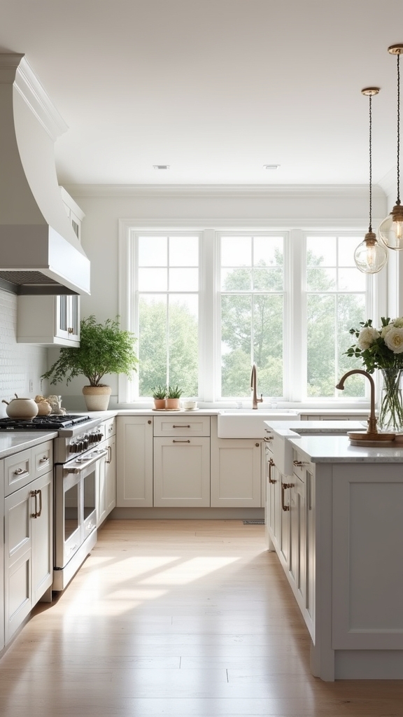
Creamy White
Creamy white, exemplified by shades like Coconut Y456, introduces subtle yellow undertones that infuse a white kitchen with warmth and luminosity.
This versatile shade enhances the elegance of white cabinetry by delivering a nuanced contrast that avoids visual starkness. Creamy white is particularly effective in both contemporary and classic kitchen designs, offering a refined backdrop that seamlessly integrates with natural wood accents and metallic fixtures.
Its ability to improve spatial perception makes it ideal for open-plan layouts, where maximizing light and achieving cohesive flow are priorities. By selecting creamy white for walls or trim, designers can create a harmonious change between adjoining living areas while supporting a sense of spaciousness.
The end result is a sophisticated, inviting kitchen environment with enduring appeal.
Pastel Yellow
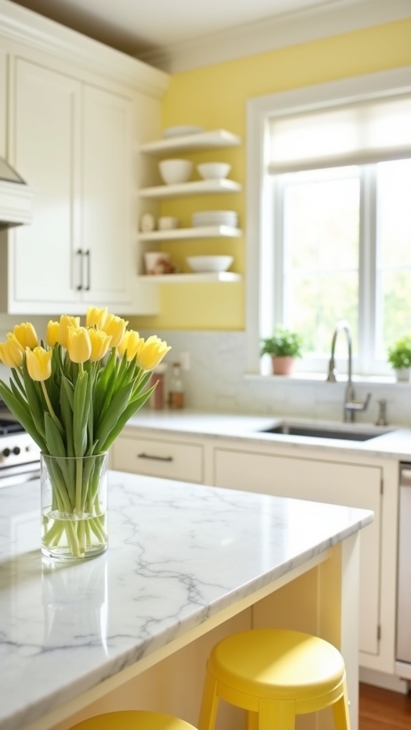
Among the spectrum of inviting hues for a white kitchen, pastel yellow stands out for its ability to inject subtle warmth and cheerful energy without overpowering the space. This soft, sunlit shade is particularly effective at providing gentle contrast against crisp white cabinetry, preserving the kitchen’s airy ambiance while enhancing visual interest.
Pastel yellow’s versatility allows it to harmonize with natural wood accents and neutral elements, making it an astute choice for both traditional and contemporary settings. By integrating this hue through painted walls, backsplashes, or accent décor, designers can uplift the environment with understated vibrancy and a welcoming tone.
- Sun-kissed walls that softly reflect natural light
- Pastel yellow barstools creating a playful focal point
- Delicate yellow ceramics atop open white shelving
- Warm undertones blending seamlessly with white cabinetry
Light Olive
Light olive introduces a sophisticated, earthy palette to a white kitchen, offering a refined balance between subtle contrast and serene harmony.
This nuanced shade of green complements white cabinets by infusing the space with understated depth, making the kitchen feel both inviting and luminous. The muted undertones in light olive serve to enhance natural light, while the gentle contrast against white cabinetry preserves a clean, uncluttered aesthetic.
Additionally, light olive integrates seamlessly with organic materials such as wood or brass, enriching the overall design narrative with warmth and texture.
Versatile by nature, this color adapts easily to modern, evolutional, or farmhouse styles, providing a contemporary solution for homeowners seeking visual interest without sacrificing tranquility or cohesion in their kitchen environment.
Muted Lavender
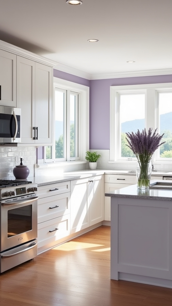
A subtle infusion of muted lavender introduces a refined yet tranquil dimension to a white kitchen, balancing cool sophistication with understated warmth.
This nuanced pastel functions as a complementary colour, providing a gentle contrast that enhances the luminance of white cabinetry and surfaces. Its soft hues integrate seamlessly with a variety of design aesthetics, from contemporary minimalism to classic traditionalism, offering versatility without visual clutter.
Muted lavender’s ability to harmonize with both natural wood accents and metallic fixtures—such as brushed brass—elevates spatial depth and invites an elegant cohesion. Designers often specify muted lavender to create a cohesive palette, utilizing its affinity for other soft hues to produce a serene, welcoming environment.
- Delicate lavender walls juxtaposed with crisp white cabinetry
- Brushed brass fixtures gleaming against soft lavender undertones
- Natural wood shelving paired with subtle lavender accents
- Sunlight filtering through a space of serene, pastel contrast
Stone Gray
For those seeking a sophisticated alternative to pastels, stone gray introduces a grounded elegance to white kitchens.
This versatile shade achieves a soft contrast against crisp white cabinetry, enhancing the kitchen’s visual interest without overpowering the space.
Stone gray’s adaptability allows it to harmonize seamlessly with diverse materials—natural wood, brushed metal, or marble—supporting both modern and traditional design narratives.
Its muted undertones sustain a serene, inviting ambiance, ideal for both culinary tasks and social gatherings.
Application of stone gray, whether as a wall treatment or accent feature, injects depth and timeless sophistication, elevating the kitchen’s overall aesthetic.
The color’s ability to complement warm and cool palettes guarantees stone gray remains a solution-oriented choice for those prioritizing longevity and refined style.
Frequently Asked Questions
Which Color Combination Is Best With White for a Kitchen?
When considering color trends and kitchen palettes, experts recommend pairing white with soft gray, warm beige, sage green, navy blue, or light taupe. These hues offer balanced contrast, promote visual harmony, and enhance contemporary or classic kitchen aesthetics.
How Do You Add Contrast to a White Kitchen?
To add contrast to a white kitchen, designers recommend integrating accent colors through cabinetry, backsplashes, or décor. Incorporating textured materials such as natural stone, wood, or matte finishes further enhances depth and visual interest while preserving sophistication.
How Do You Soften a Bright White Kitchen?
To soften a bright white kitchen, one might incorporate textured kitchen accessories and layered lighting options. Strategically chosen pendant lights, warm under-cabinet illumination, and organic materials introduce visual warmth, depth, and a sophisticated ambiance without overpowering the minimalist aesthetic.
How Do You Make a White Kitchen Feel Cozy?
To create a cozy atmosphere in a white kitchen, designers recommend layering cozy textures through textiles, introducing warm accents with wood or brass, and employing ambient lighting solutions, effectively transforming a stark space into a more inviting, comfortable environment.
Conclusion
Selecting the ideal paint color for a white kitchen hinges on achieving nuanced contrast without overwhelming the space. Expertly curated hues like soft gray, warm beige, and muted lavender infuse depth and visual interest, elevating the kitchen’s aesthetic. These sophisticated palettes enhance cabinetry and fixtures, fostering a harmonious environment. For homeowners seeking timeless elegance, these paint options deliver subtle distinction, ensuring the white kitchen remains both versatile and inviting, seamlessly blending style with enduring functionality.
7 Tips for a Stunning Black Kitchen Ceiling
Curious about transforming your kitchen? Discover 7 tips for a stunning black ceiling that will

20 Black and White Kitchen Ideas That Are Timeless and Stylish
Navigate striking contrasts and classic charm with these 20 black and white kitchen ideas—discover
Essential Kitchen Wall Decor Ideas for 2024: Top 10 Must-Haves
Boost your kitchen's style in 2024 with these 10 essential wall decor ideas that blend functiona
Leave a Reply