18 Grey Living Room Ideas With a Pop of Color to Brighten the Space
Grey living rooms achieve striking vibrancy when paired with bold accents, such as electric blues, olive greens, or pops of citrus. Layering textured furnishings—like velvet cushions, woven throws, and patterned rugs—adds depth and visual interest. Balanced with warm lighting and natural materials, grey establishes a serene yet contemporary base. Charcoal grey window frames and statement artwork provide intentional focal points. For further techniques to energize grey interiors and master color play, additional inspiration can be found.
Key Takeaways
- Layer vibrant cushions or throws in bold hues like teal or mustard onto grey sofas for an easy, eye-catching pop of color.
- Incorporate statement artwork featuring bright colors to transform grey walls and create a dynamic focal point.
- Pair grey with colorful accent furniture, such as a cobalt blue armchair or a vivid olive-green side table, to energize the space.
- Use patterned rugs with colorful motifs to break up grey flooring and inject personality into the living room.
- Add natural wood or bamboo elements alongside pops of terracotta or warm brown to balance grey’s coolness and introduce cozy, organic warmth.
Make Grey Part of a Vibrant Colour Scheme

Many contemporary living rooms in 2025 leverage grey as a foundational neutral, functioning as a sophisticated backdrop for vibrant accent colors such as red, blue, and green. Designers strategically utilize grey tones across walls and flooring, establishing visual calm and allowing vibrant colours to become focal points. The application of the 60-30-10 color rule—where grey tones dominate, complemented by 30% secondary hues, and punctuated by 10% accent shades—ensures a dynamic yet balanced palette. Integrating complementary colours, such as warm oranges or vibrant yellows, prevents the grey scheme from appearing sterile, infusing energy and warmth. Layered greys paired with citrus or dusty pink highlights generate depth and interest, enhancing both aesthetic appeal and functional cohesion within the modern living room environment. A popular design approach is incorporating bold pops of color to electrify the subdued grey tones, creating a striking contrast that energizes the space.
Incorporate Grey Through Soft Furnishings
Integrating grey through soft furnishings enables flexible color expression, with seasonal cushion changes offering effortless palette updates. Layering textiles in varied textures—such as velvet, wool, and linen—creates visual depth and tactile interest. This approach maintains a contemporary aesthetic while optimizing comfort and adaptability in the living room. By choosing neutral colors, a calming ambiance is created, allowing for the seamless incorporation of grey elements into the decor.
Seasonal Grey Cushion Switch
A strategic refresh of soft furnishings through a seasonal grey cushion switch offers an efficient method for updating living room aesthetics without structural changes.
Utilizing cushions in soft grey establishes a tranquil foundation, seamlessly accommodating dynamic introductions of seasonal color. Designers recommend a 60-30-10 ratio for ideal balance: 60% soft grey, 30% secondary seasonal color, and 10% vibrant accent. This proportional approach delivers cohesion while amplifying visual interest.
For autumn, incorporate cushions in warm ochre or rust, while spring or summer may benefit from lighter, brighter hues. The flexibility of swapping out cushions guarantees that the living space reflects the evolving atmosphere throughout the year.
Additionally, integrating patterned or boldly colored cushions among the soft grey base further enlivens the scheme and maintains a fresh, inviting look.
Layered Textures for Depth
When grey is introduced through soft furnishings, such as cushions, throws, and rugs, the living room gains adaptable layers that enhance depth and visual intrigue without dominating the scheme.
Layering different textures—think plush velvet cushions juxtaposed with woven natural fibre rugs—creates a tactile dimension that heightens both comfort and style. This approach allows for subtle shifts in the atmosphere: soft furnishings can be seasonally updated, with warmer, tactile options in autumn and lighter, breathable fabrics in spring.
Maintaining a cohesive color palette is essential; varying shades of grey within this spectrum prevent the space from appearing monotonous or flat.
Minimal yet strategic placement of textured grey accessories guarantees the design remains sophisticated, inviting, and responsive to evolving trends and personal preferences.
Pair Grey With Trendy Shades

Combining grey with olive green introduces an organic, contemporary palette that enhances visual harmony in the living room. Strategic use of Mocha Mousse accents adds warmth and depth, preventing the space from appearing monochromatic or austere. This approach leverages tonal layering to create a balanced, inviting environment with modern appeal. Adding a statement blue sofa can effectively contrast with the subtler greys, enhancing natural light in the living room setting.
Mix Grey With Olive
Elevating a grey living room with olive green introduces a sophisticated, on-trend palette that balances cool neutrality with inviting warmth.
In expertly designed grey interiors, olive green is strategically applied through accent pieces—such as cushions, rugs, and curated artwork—to infuse depth without overpowering the serene base. This color pairing thrives on versatility, as olive green complements both light and dark greys, adapting seamlessly to various design schemes.
Layering textures, like velvet or woven olive fabrics, against structured grey furnishings amplifies visual interest and tactile appeal. Functionally, olive green as a secondary hue—adhering to the 60-30-10 rule—ensures proportional harmony, while warm lighting further accentuates the cozy ambiance.
The result is a dynamic, visually engaging living space defined by modern sophistication.
Add Mocha Mousse Accents
Introducing Mocha Mousse accents to a grey living room establishes a sophisticated interplay between cool neutrality and contemporary warmth. This expert pairing enhances grey living room ideas by infusing the space with warm undertones, while maintaining a sleek, modern palette. Mocha Mousse, a rich brown shade, is effectively integrated through key furnishings and accessories, ensuring visual harmony and tactile contrast. Utilizing this trendy color in textiles—cushions, throws, or rugs—adds dimensionality, enhancing both comfort and style.
| Element | Visual/Functional Impact |
|---|---|
| Mocha Mousse Sofa | Anchors space, adds warmth |
| Cushions/Throws | Introduce layered texture |
| Grey Walls | Provide cool, modern backdrop |
| Wooden Accents | Complement warm undertones |
| Area Rug | Grounds design, unifies colors |
This combination aligns with the evolving shift toward inviting, layered interiors.
Add Warm Lighting for a Cozy Atmosphere
To counteract the potentially cool undertones of grey palettes, warm lighting is essential for cultivating a cozy atmosphere in the living room. In grey living rooms, soft white or warm white bulbs are recommended to mitigate the starkness of grey and infuse the space with an inviting glow. Oversized table lamps equipped with diffuser shades distribute light evenly, fostering a relaxing ambience while ensuring effective illumination. Arc floor lamps offer a stylish, space-efficient alternative to ceiling fixtures, enhancing both functional lighting and visual warmth. Selecting the correct bulb color temperature is critical; cooler bulbs complement blue-based greys, while warmer options pair seamlessly with yellow or red undertones. Layering lighting sources—such as wall sconces and accent lighting—adds depth and dimension, making grey living rooms feel comfortably inviting. Consider introducing ambient fragrances like bergamot and amber to elevate the room’s warmth and create a truly inviting environment.
Combine Grey With Natural Materials
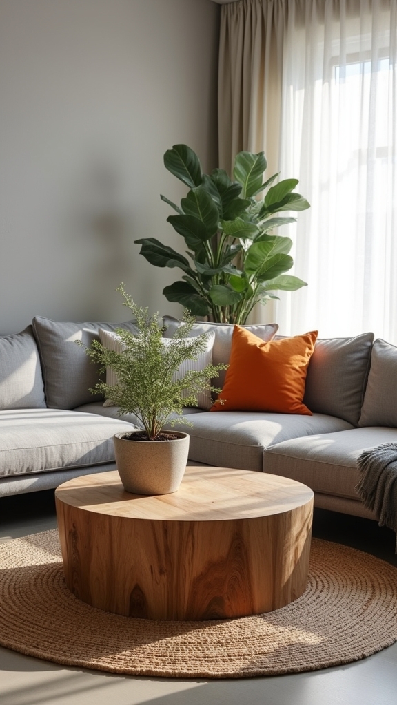
Integrating wood elements with grey surfaces introduces organic warmth and tactile contrast, elevating spatial harmony. Bamboo accents and stone details offer biophilic appeal while maintaining a cohesive, contemporary palette. Layering linen textiles further enhances depth and comfort, ensuring the living area remains visually dynamic and inviting. Incorporating houseplants to balance the decor adds a natural vibrancy, enhancing the overall aesthetic and creating a more inviting space.
Pair Grey With Wood
A synergy of grey hues and natural wood elements establishes a living room environment that is both visually harmonious and functionally inviting.
The integration of wood accents with a neutral shade like grey introduces warmth and tactile depth, shifting the ambiance from austere to welcoming. Warm-toned woods—such as walnut or oak—balance the coolness of grey, ensuring neither element dominates.
Strategic use of wooden flooring, side tables, or shelving can soften clean, modern lines, helping to create a cosy retreat. This interplay of materials grounds the overall aesthetic, enhancing spatial cohesion and visual intrigue.
- Wood accents anchor the neutral shade of grey, preventing sterility.
- Oak or walnut finishes introduce organic warmth and tactile richness.
- Wooden furniture elements promote a layered, multidimensional look.
- Grey backdrops allow wood grains to stand out as focal points.
- Combining these materials helps create a cosy, balanced sanctuary.
Add Bamboo Accents
When bamboo accents are introduced into a grey living room, the interplay between organic texture and cool-toned surfaces produces a visually refined and inviting atmosphere.
Bamboo’s pale, natural hues soften the severity of grey palettes, while its tactile qualities provide a sophisticated counterpoint to sleek, modern finishes.
Strategically integrating bamboo furniture, woven baskets, or blinds introduces subtle patterning and dimensionality, enriching the overall composition of the space.
The sustainable nature of bamboo aligns with contemporary preferences for eco-friendly materials, reinforcing a modern yet conscientious design ethos.
When paired with colourful accessories—such as vibrant cushions or artwork—bamboo accents help ground the room, ensuring that bold pops of colour remain balanced and harmonious within the serene, neutral context of a well-designed grey living room.
Layer Linen and Stone
Several natural materials—particularly linen and stone—consistently enhance the tactile and visual complexity of a grey living room.
The interplay of soft linen textiles with the robust presence of stone guarantees both warmth and structural contrast, counterbalancing the inherent coolness of grey tones.
Linen cushions and throws introduce a soft, inviting touch, while stone accents—ranging from coffee tables to fireplace surrounds—anchor the space with a grounded, organic character.
Employing a darker shade of grey on walls or furnishings can further accentuate the nuanced textures of these elements, avoiding monotony and enriching the visual palette.
This sophisticated layering strategy merges modern elegance with rustic charm.
- Layer soft linen textiles for comfort and tactile appeal
- Integrate stone surfaces for grounding visual depth
- Contrast with a darker shade of grey for added drama
- Blend natural materials for cohesive, inviting design
- Prevent flatness through varied textures and finishes
Use the 60-30-10 Rule for Colour Balance
Harnessing the 60-30-10 rule provides a strategic framework for achieving ideal colour balance in a grey living room. This design principle dictates that 60% of the space should feature the dominant shade—grey—imparting a cohesive base to the overall colour scheme. The secondary colour, occupying 30%, introduces complementary tones, subtly enhancing depth and warmth without overwhelming the palette. The remaining 10% is dedicated to an accent color, a calculated injection of vibrancy that enlivens the space and prevents monotony. Incorporating textured fabrics like velvet and leather can add depth and richness to the living room design. Applying the 60-30-10 rule guarantees structured colour distribution, mitigating the risk of a flat or outdated aesthetic. This methodology enables effortless incorporation of accent colors, delivering dynamic visual contrast while maintaining a harmonious and intentionally curated living environment.
Warm up Grey With Earthy Tones
Strategic application of the 60-30-10 rule establishes a strong foundation for colour balance, yet elevating a grey living room requires thoughtful integration of warmth and texture.
Introducing earthy tones—such as terracotta, olive green, and warm browns—alongside warm grey infuses the space with a cozy atmosphere, offsetting any sterility often associated with monochromatic palettes.
Employing natural materials like wooden tables or clay accessories grounds the design and layers tactile interest. Accents including plant life and organic textiles further reinforce the earthy motif, while warm lighting choices soften the overall environment.
Incorporating vintage pieces and antique furniture can add history and charm, seamlessly blending with the natural materials to create a cohesive farmhouse-inspired environment.
For ideal effect, these elements should be deliberately placed to enhance both function and visual harmony.
- Integrate terracotta, olive, or warm brown accents
- Select wooden or clay décor for tactile depth
- Layer greenery to animate the palette
- Use organic textiles for added comfort
- Employ warm lighting to enrich ambiance
Choose Your Grey Shade Based on Room Orientation
Although grey is celebrated for its versatility, its true effect within a living room hinges on the orientation of the space.
Room orientation dictates how grey shades interact with natural light, influencing both mood and depth. In southern-facing rooms, abundant sunlight allows for a broad spectrum of grey shades; light greys amplify brightness, while cooler greys appear crisp and vibrant.
The impact of grey in a living room depends on sunlight; southern exposure brings out the brilliance and clarity of lighter and cooler greys.
North-facing rooms, conversely, benefit from darker or warmer greys containing red or yellow undertones, which counterbalance cool daylight and impart a sense of coziness.
East-facing spaces, with gentle morning light, are best suited to mid-tone greys that sustain equilibrium as light shifts.
West-facing rooms, bathed in afternoon warmth, complement cooler greys, achieving visual harmony as the sun moves through the space.
To further enhance the ambiance, consider using statement lighting to achieve a sophisticated and visually appealing look.
Embrace Greige for a Softer Neutral Look

Greige, a sophisticated fusion of grey and beige, introduces a nuanced neutral that seamlessly adapts to multiple design palettes. This adaptable hue supports versatile pairings with both muted and bold accents, enabling tailored aesthetics. Incorporating greige enhances spatial warmth and softness, effectively mitigating the starkness often linked to pure greys. Warm wood accents and elements like leather add depth and richness to a greige-based design, further enhancing its inviting atmosphere.
Blending Grey and Beige
When seeking a neutral foundation that bridges cool and warm undertones, the subtle blend of grey and beige—known as greige—delivers remarkable versatility and sophistication.
This nuanced, versatile colour harnesses the understated elegance of neutral grey while infusing a gentle warmth, making it ideal for living rooms requiring both comfort and refinement.
Greige’s adaptability enables seamless integration into diverse design schemes, from contemporary minimalism to traditional aesthetics.
Its muted character supports natural materials, such as wood and clay, enhancing tactile appeal and visual harmony.
As both a primary palette and an accent, greige fosters a calming environment without sacrificing depth or interest.
- Enhances connection between cool and warm color schemes
- Promotes visual softness and balance in furnishings
- Complements organic textures and materials
- Serves as a flexible backdrop for layered decor
- Optimizes adaptability for future color updates
Versatile Greige Color Pairings
Building on greige’s capacity to harmonize cool and warm elements, thoughtful color pairings further enhance its role as a foundational neutral.
Greige’s nuanced blend of grey and beige enables seamless integration with diverse materials—wood, clay, and natural fibers—while maintaining a soft, sophisticated ambiance.
Expert use of undertones is fundamental; cooler greige variants complement blues and greens, whereas warmer options are best paired with reds and yellows.
The strategic layering of multiple greige shades with other neutral colours introduces visual depth and cohesion, preventing monotony in the living room palette.
As a backdrop, greige amplifies the impact of a pop of colour—teal, mustard, or coral accents punctuate the scheme, offering vibrancy without detracting from the room’s tranquil, balanced aesthetic.
Enhancing Warmth With Greige
Within contemporary interior design, the nuanced blend of grey and beige—known as greige—serves as an improved alternative to standard neutrals, delivering a softer, more inviting ambiance to living spaces.
Greige’s adaptable undertones effectively counterbalance the coolness of traditional greys, infusing warmth where natural light is limited, as in north-facing rooms. This versatile shade, when applied to walls, upholstery, or textiles, preserves a tranquil atmosphere while introducing visual interest.
Paired with organic materials such as wood or clay, greige accentuates tactile depth and enhances the room’s overall sophistication. Layering greige with other neutrals and strategic accent colors results in a harmonious yet dynamic environment.
- Enhances perceived warmth in low-light spaces
- Integrates seamlessly with natural materials
- Softens the impact of cooler greys
- Maintains a serene, cohesive backdrop
- Enables nuanced layering with accent hues
Paint Your Ceiling Grey for Added Depth
Although often overlooked, painting the ceiling grey introduces architectural depth and unifies a living room’s palette. Utilizing charcoal grey on the ceiling imparts warmth and intimacy, particularly in spaces with high ceilings, transforming vastness into a cocooning atmosphere. Light grey ceilings, conversely, subtly lower the perceived height of a room, promoting comfort while maintaining luminosity. Strategic selection of ceiling color can accentuate vertical dimensions, allowing for a harmonious shift between structural elements. To prevent visual monotony, integrating jet black accents in furnishings or décor provides sophisticated contrast. Consider using matte black finishes for a sleek, non-reflective surface that enhances the elegance of the room. The following table demonstrates effective combinations for ceiling treatments:
| Ceiling Shade | Effect on Space | Ideal Complement |
|---|---|---|
| Charcoal Grey | Enhanced intimacy | Black décor accents |
| Light Grey | Airy yet grounded | Bright textiles |
| Mid-tone Grey | Balanced depth | Metallic finishes |
| Glossy Grey | Reflective, modern | Glass accessories |
| Matte Grey | Soft, muted depth | Natural wood tones |
Layer Different Grey Tones for Visual Interest
By integrating multiple shades of grey—ranging from pale dove to deep charcoal—a living room gains pronounced depth and visual complexity.
Strategic layering of different shades of grey prevents a flat or monotonous appearance, instead generating dynamic visual interest.
Expert designers often mix warm and cool greys, introducing nuanced undertones that enrich both texture and atmosphere.
Textural contrasts, such as pairing a smooth greige accent with a chunky charcoal knit throw, further amplify tactile dimension.
Adhering to the 60-30-10 colour rule with muted colour schemes guarantees a harmonious, balanced effect without overwhelming the senses.
- Incorporate warm and cool undertones for depth
- Balance contrasting textures for tactile engagement
- Integrate greige for cohesive shifts
- Apply the 60-30-10 rule using layered greys
- Curate muted colour palettes to avoid visual overload
Limit Grey to Key Accent Pieces
Restricting grey to select accent pieces—such as cushions, throws, and rugs—introduces the hue with intention, preserving a fresh, dynamic ambiance and avoiding a flat, monotonous scheme.
In a grey space, this strategic restraint transforms grey from a dominant backdrop to a versatile, functional accent, enhancing adaptability for evolving trends and personal style shifts.
Accent wall placement in bolder hues can punctuate the room, while subtle grey accessories like picture frames maintain cohesion and sophistication.
This approach amplifies visual contrast, allowing vibrant colours to energize the environment and ensuring the room remains inviting.
Incorporating grey through cushions and throws allows for effortless seasonal updates, empowering homeowners to experiment with colour combinations and creative arrangements without committing to an overwhelming monochromatic palette.
Coordinate Grey Walls With a Colourful Sofa
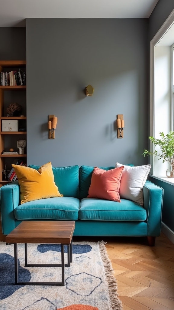
When a colorful sofa is positioned against grey walls, it establishes an immediate focal point and injects visual energy into the living space. The dynamic interplay between muted grey and a vibrant sofa—such as burnt orange or sapphire blue—creates a sophisticated, yet inviting atmosphere.
A vibrant sofa against grey walls becomes the room’s instant focal point, infusing your space with style and lively energy.
Selecting a colorful sofa that resonates with the undertones of the grey walls guarantees visual coherence, while accessories like throw pillows and blankets introduce additional accent colors and tactile contrast. To achieve a harmonious balance, designers often reference the 60-30-10 rule, utilizing grey as the dominant hue, the colorful sofa as a secondary element, and accent colors as highlights.
- Choose sofa hues that echo grey wall undertones
- Implement the 60-30-10 color rule
- Layer accent colors via accessories
- Prioritize textural variation on the sofa
- Use color contrast to define spatial zones
Team Grey With Black Accents for Modern Edge

While vibrant sofas inject personality into grey spaces, integrating black accents introduces a modern edge defined by contrast and structure.
In a living room, the juxtaposition of a grey sofa with jet black furniture or decor elements—such as coffee tables, picture frames, or light fixtures—creates a visually compelling dynamic that speaks to a refined modern aesthetic.
Black accents serve not only as focal points but also as grounding features, anchoring a primarily grey palette with sophistication and architectural clarity.
Layered textures, like soft upholstery set against sleek black finishes, reinforce cohesion while elevating tactile interest.
A grey wall complemented by black trim or moldings further accentuates depth, delivering a sense of elegance and contemporary definition.
This strategic palette guarantees visual harmony without sacrificing bold, modern impact.
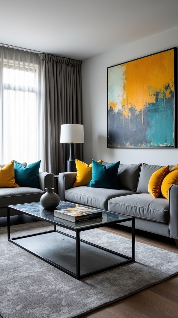
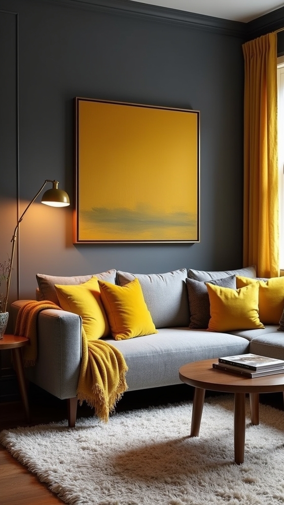
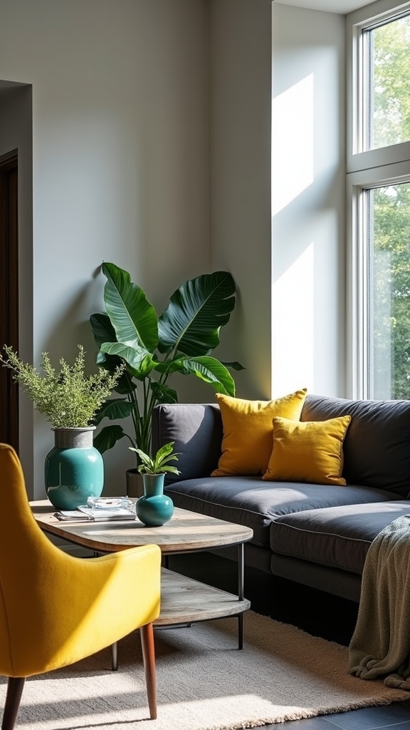
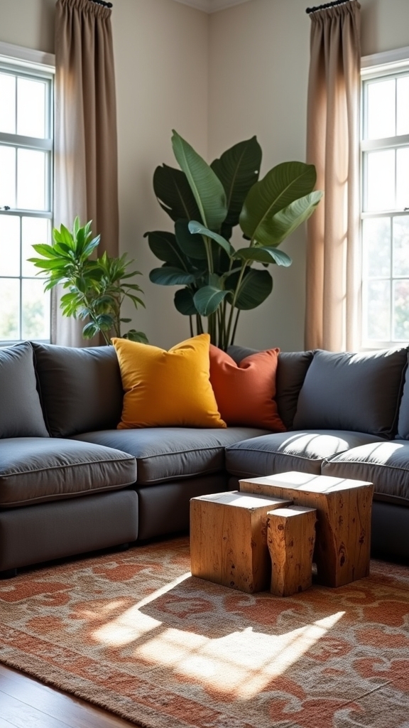
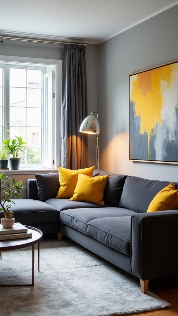
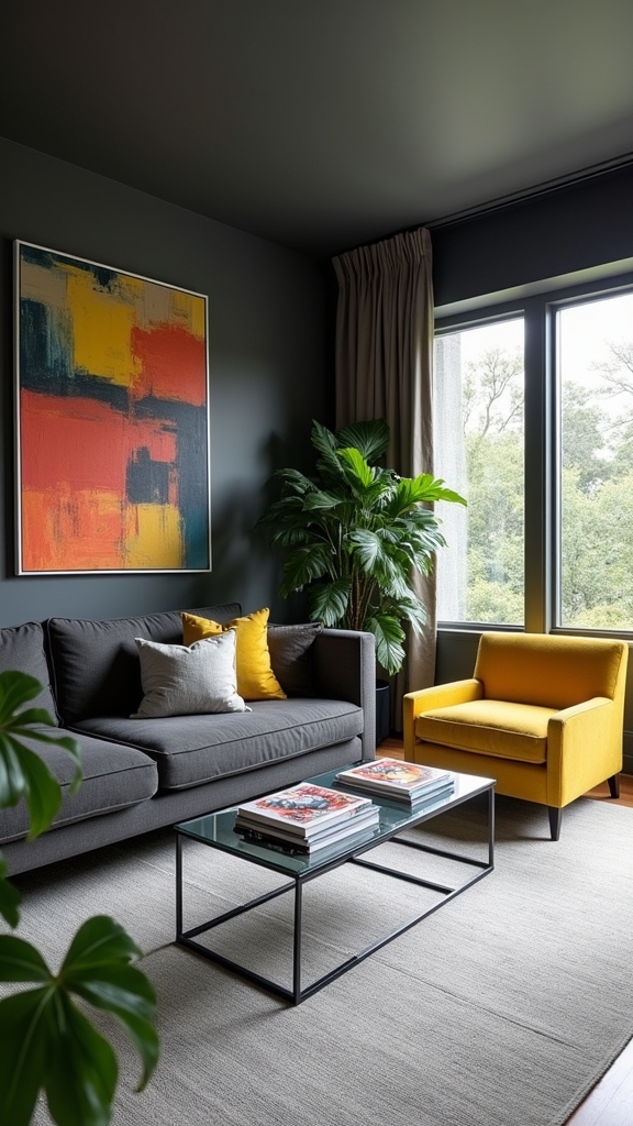
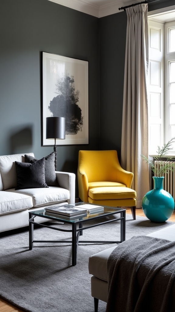
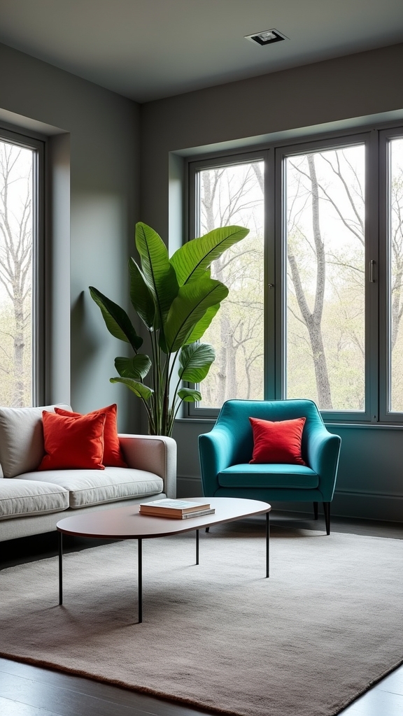
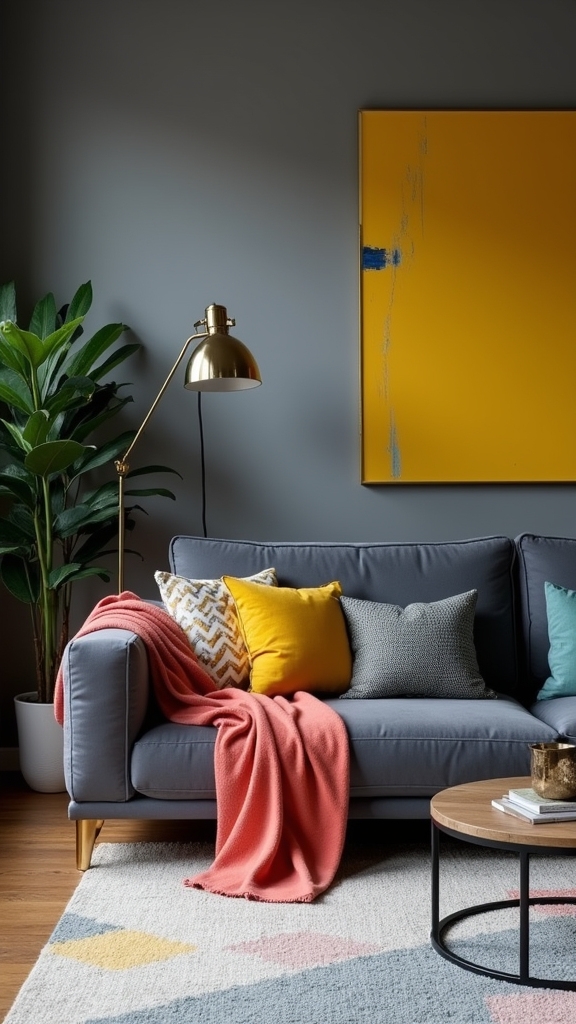
Introduce Pops of Citrus for Energy

Pairing grey with yellow introduces a high-impact chromatic contrast, infusing the living room with vibrancy and visual intrigue.
Strategic placement of citrus decor—such as cushions, vases, or accent chairs—creates intentional focal points that stimulate energy while preserving cohesion.
This approach leverages the neutrality of grey to amplify the warmth and positivity inherent in citrus accents, resulting in a balanced yet dynamic interior.
Pair Grey With Yellow
A sophisticated interplay between grey and yellow infuses a living room with vibrancy, utilizing the warmth of yellow to balance the cool neutrality of grey.
In a grey living room, strategically placed accents in shades of yellow—such as cushions, throws, or curated artwork—inject dynamic energy while maintaining design cohesion.
Larger interventions, like a statement rug or an upholstered chair in bold mustard, function as visual anchors that invigorate the spatial palette.
Varied shades of yellow, from soft butter to vivid lemon, provide depth and nuance, ensuring the space remains engaging.
This chromatic synergy fosters an inviting atmosphere ideal for social gatherings and daily relaxation.
- Enhanced spatial depth through tonal variation
- Visual focal points via yellow statement pieces
- Boosted warmth and sociability
- Cohesive integration of accents
- Balanced composition for modern aesthetics
Accentuate With Citrus Decor
Many designers recommend integrating citrus-hued accents—such as lemon yellow or vibrant orange—to inject energy and visual contrast into a grey living room.
Introducing citrus accents through textiles like cushions, throws, and curated artwork effectively brightens the space and counteracts the cool undertones of a neutral backdrop. The strategic use of these vivid colors infuses warmth and vibrancy, transforming a potentially monotonous environment into a dynamic and welcoming setting.
When paired with mid to dark grey, citrus decor offers a striking balance, preventing the grey palette from appearing cold or austere. Feature walls or statement pieces in citrus tones can also serve as focal points, ensuring the overall design remains visually compelling and functionally inviting, while promoting a sense of cheerfulness and modern sophistication.
Extend Grey to Window Frames and Trim
Extending grey to window frames and trim establishes a unified visual framework that accentuates the architectural lines of the living room while reinforcing a cohesive design narrative.
Grey window frames serve as integral elements in modern design, introducing subtle contrast and visual interest without overwhelming the space. Employing varied shades or finishes—matte, satin, or gloss—can leverage color blocking techniques, layering depth across the room’s perimeter.
Grey window frames introduce subtle contrast and depth, adding visual interest while maintaining a sophisticated, modern edge in any living space.
The use of grey in these architectural details balances natural light, particularly in rooms with diverse orientations, supporting an adaptable ambiance. Furthermore, a monochromatic trim provides a versatile backdrop for pops of color elsewhere, while pairing grey with warm wood tones softens the overall effect and enhances spatial warmth.
- Defines structural clarity
- Promotes cohesive color continuity
- Enhances adaptability to accent colors
- Supports modern design principles
- Balances light and ambiance
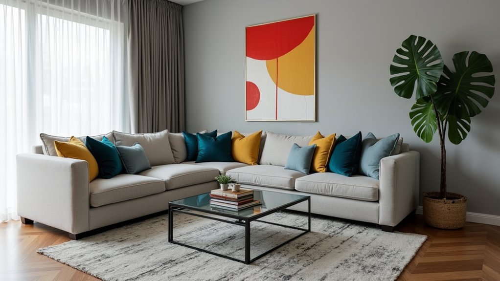
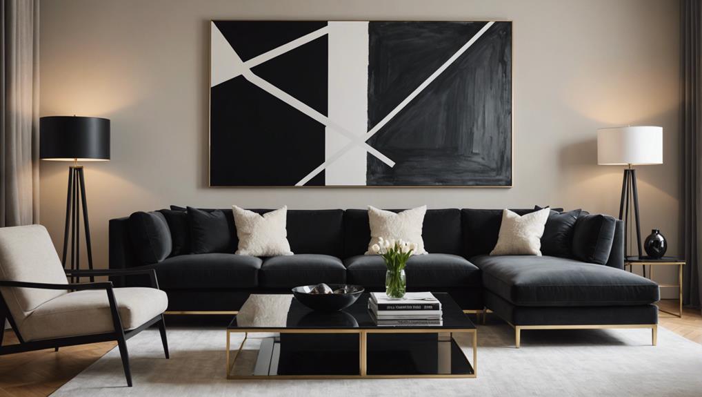
Create a Focal Point With Colourful Artwork
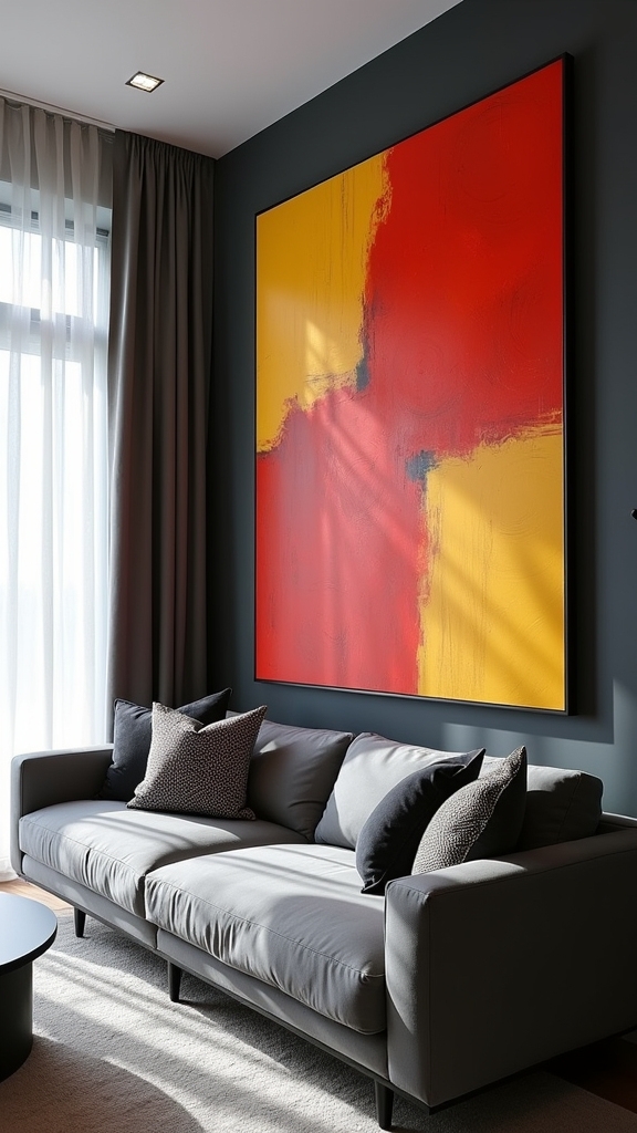
While grey interiors establish a serene and versatile foundation, introducing colourful artwork strategically transforms the living room into a visually compelling environment. Utilizing colourful artwork as a focal point injects vibrancy, instantly drawing attention and contrasting the neutral grey room palette. Large-scale pieces, especially those with bold, saturated hues, generate maximum impact and energize the space. Selecting artwork that complements the undertones of the grey room—warmer or cooler shades—ensures visual cohesion. Positioning key pieces at eye level enhances their prominence, anchoring the room’s design without overwhelming it. For heightened dynamism, curating a gallery wall with varied artwork styles—abstracts, sceneries, or graphic prints—fosters a layered, curated atmosphere.
| Artwork Style | Colour Palette | Placement Strategy |
|---|---|---|
| Abstract | Bold Primaries | Central Wall |
| Scenery | Warm Tones | Above Sofa |
| Graphic Print | Cool Accents | Entryway Focus |
| Mixed Media | Vibrant Contrasts | Opposite Windows |
| Minimalist | Monochrome + Pop | Adjacent Corners |
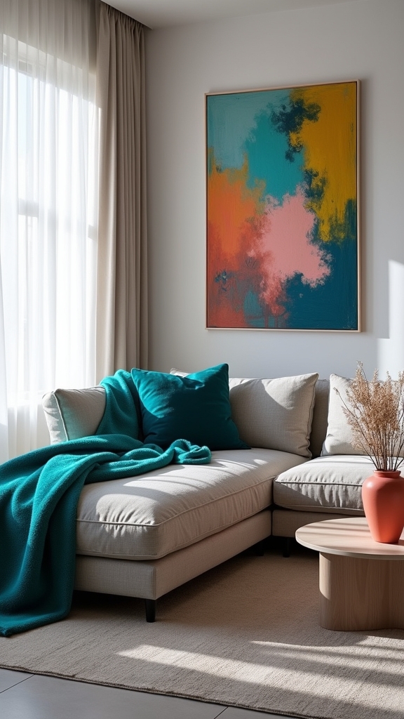
Brighten the Space With Patterned and Textured Accessories
Balancing the visual impact of colourful artwork, the integration of patterned and textured accessories further animates a grey living room.
Through strategic deployment of woven throws, plush scatter cushions, and patterned rugs, designers can infuse depth and tactile warmth that counteracts the inherent coolness of grey palettes.
Woven throws, scatter cushions, and patterned rugs bring warmth and depth, transforming the coolness of a grey living room palette.
The addition of vibrant hues via multi-coloured cushions and bold-patterned textiles establishes focal points, enhancing both aesthetic richness and spatial harmony.
Layering textured fabrics—such as velvet or linen—in various shades of grey provides subtle sophistication without visual overload.
Functional curation of these elements guarantees a contemporary yet inviting environment.
- Woven throws introduce visual layering and warmth.
- Scatter cushions in vibrant hues create dynamic accent points.
- Patterned rugs delineate zones and anchor furnishings.
- Velvet and linen textures increase tactile interest.
- Bold geometric accessories infuse personality and modernity.
Frequently Asked Questions
How Do You Brighten up a Grey Living Room?
To brighten a grey living room, one integrates grey accent furniture with vibrant artwork for visual contrast. Colorful throw pillows introduce dynamic focal points, while strategically layered textures and balanced lighting enhance spatial depth and uplift the overall ambiance.
What Color Goes Best With Grey in a Living Room?
When evaluating ideal grey color combinations, experts recommend integrating warm accent colors such as mustard yellow, terracotta, or emerald green. These selections align with current grey decor trends, enhancing visual interest and fostering a functional, inviting living environment.
What Pop of Color Goes With Grey Walls?
When considering accent colors for grey walls, designers recommend complementary shades like mustard yellow, teal, or blush pink. Color psychology suggests these hues introduce vibrancy, warmth, and balance, elevating visual interest while maintaining functional harmony within the living space.
How Do You Make a Grey Room Pop?
To make a grey room pop, experts recommend integrating accent furniture ideas in vibrant hues, utilizing artwork selection tips for bold statement pieces, and applying lighting enhancements to highlight color contrasts, enhancing spatial depth and visual interest.
Conclusion
Incorporating grey as a foundational element in living rooms enables a sophisticated, versatile backdrop that enhances accent colors and textures. Strategic use of vibrant hues, tactile furnishings, and layered lighting transforms the space into a dynamic, inviting environment. Integrating natural materials and bold artwork further raises visual interest, while thoughtful detailing—such as colored trims or patterned accessories—ensures functional cohesion. Ultimately, expertly balanced grey schemes offer both timeless elegance and opportunities for personalized color expression.
Designing a Luxury Home Living Room: A Step-by-Step Guide
On the journey to create an opulent living room, discover the intricate steps to achieve unparal
15 Green and Yellow Living Room Ideas That Are Bright and Cheerful
Need inspiration for a bright and cheerful space? Discover 15 green and yellow living room ideas tha
10 Stylish Black Sofa Living Room Decor Ideas
Join us to discover 10 stylish black sofa living room decor ideas that will transform your space int
Leave a Reply