16 Navy and Burnt Orange Living Room Ideas That Are Warm and Bold
Bold navy and burnt orange living rooms employ textured sofas, crisp color-blocked walls, and patterned rugs to create inviting, dramatic focal points. Metallic accents, layered textiles, and curated abstract artwork add visual depth and warmth. Strategic color placement distinguishes zones while contrasting cushions and throws provide functional comfort. Lighting, from dimmable LEDs to warm-toned pendants, enhances ambiance. Together, these techniques define a cohesive, sophisticated space; further inspiration can be found through a curated collection of standout design approaches.
Key Takeaways
- Use burnt orange accent walls paired with crisp white trim to create a bold, inviting focal point in the living room.
- Incorporate a navy sofa with burnt orange cushions for a sophisticated and cozy interplay of color and texture.
- Layer navy and burnt orange patterned rugs to unify the palette and add warmth and visual interest to the space.
- Curate vibrant abstract artwork in orange tones against navy walls to create compelling visual anchors and depth.
- Select warm-toned lighting and metallic fixtures to amplify the richness of navy and burnt orange, enhancing the room’s cozy ambiance.
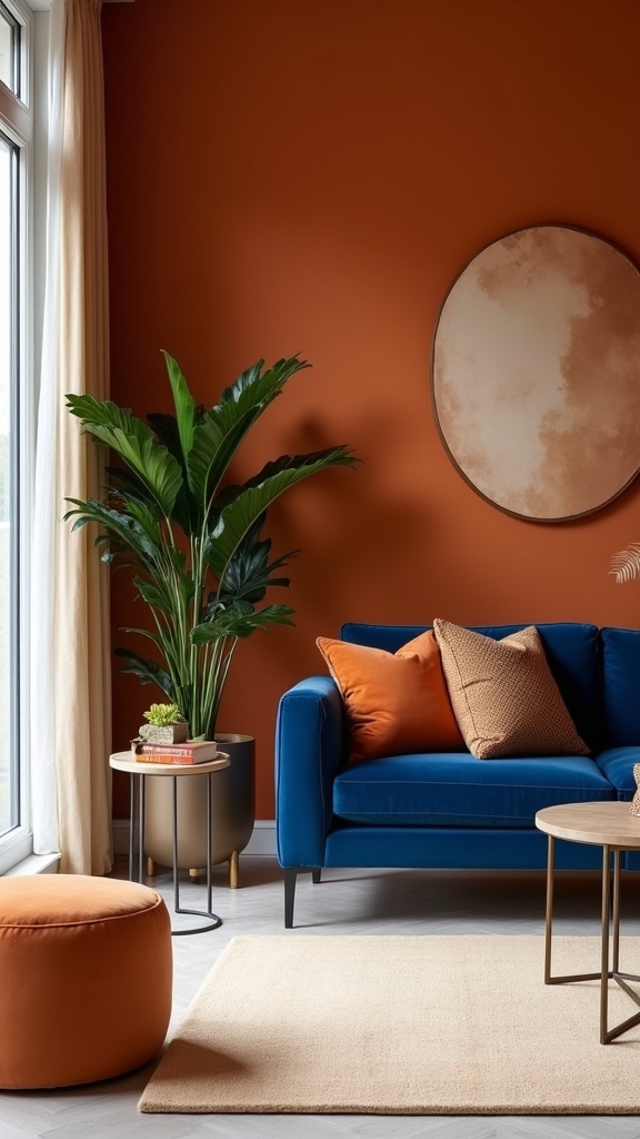
Embrace Burnt Orange Accent Walls

When incorporated as an accent wall, burnt orange establishes a commanding focal point that infuses the living room with warmth and visual energy.
Burnt orange accent walls, particularly in refined shades like Toasted Clay, transform interiors into warm and inviting environments while maintaining a sense of sophistication.
Refined burnt orange shades like Toasted Clay create interiors that feel both welcoming and sophisticated, elevating the atmosphere of any living space.
Strategically applying burnt orange to highlight architectural elements—such as beams or mantelpieces—adds depth and visual intrigue, reinforcing the bold focal point.
Utilizing crisp white for ceilings and trim introduces contrast, ensuring the vibrant hue is emphasized without overwhelming the space.
Adjacent walls painted in pale neutral tones enable the burnt orange feature to stand out, achieving a sense of balance and harmony throughout the room.
This approach enhances both visual impact and overall livability in contemporary living spaces.
For an even cozier atmosphere, consider incorporating plush fabrics through throw blankets and cushions to complement the warmth of burnt orange.
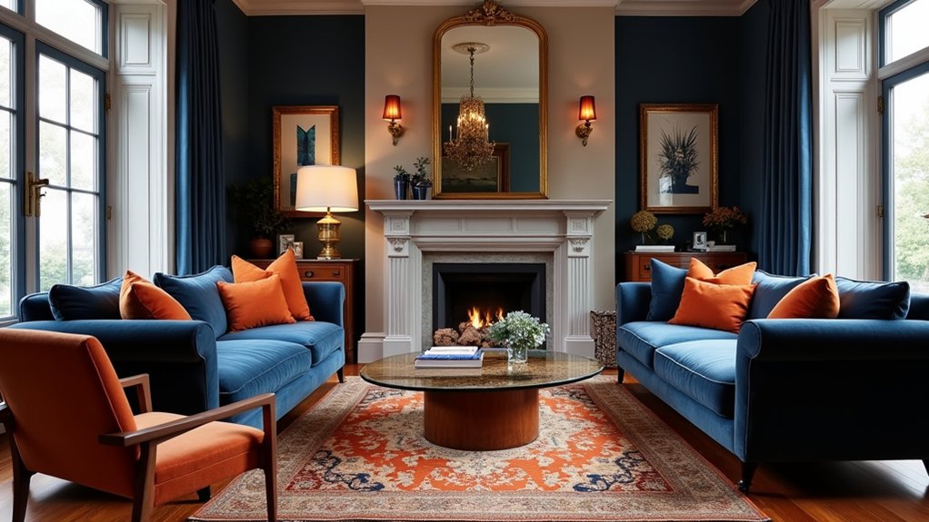
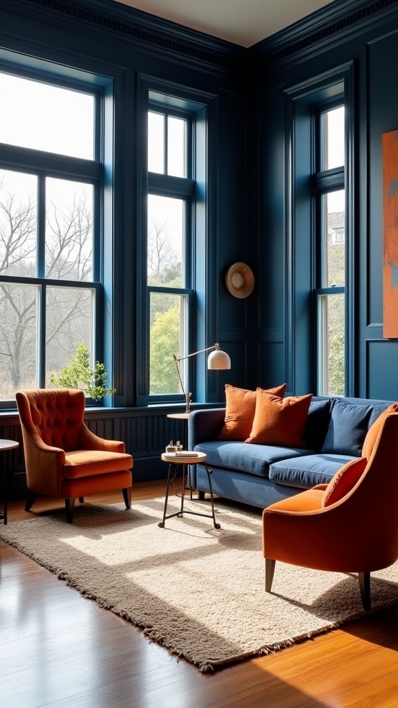
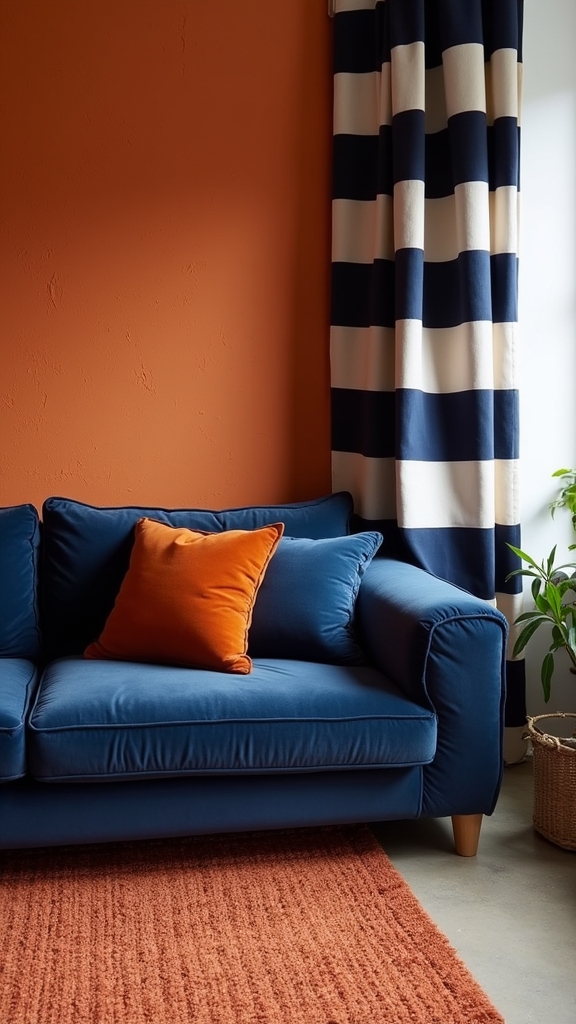
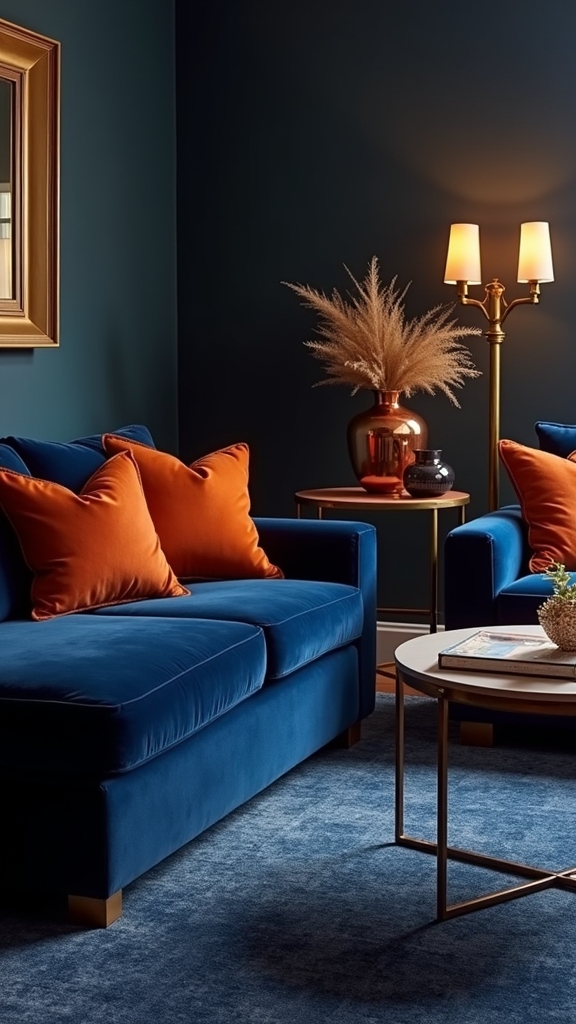
Pair a Navy Sofa With Burnt Orange Cushions
Building on the dynamic energy established by a burnt orange accent wall, integrating a navy sofa with burnt orange cushions introduces a striking interplay of color within the living room.
The navy sofa offers a sophisticated foundation, while burnt orange cushions infuse warmth and energy, achieving a bold yet harmonious contrast. Utilizing various shades, from tangerine to rust, enhances visual interest and adds depth to the decor.
Incorporating different textures—such as velvet or woven fabrics—within the burnt orange cushions further contributes to a cozy atmosphere without sacrificing a contemporary, chic aesthetic.
This color pairing remains versatile, allowing for effortless updates through seasonal or trend-driven cushion changes, while maintaining a cohesive and visually appealing space that promotes both comfort and inviting vibrancy. Consider incorporating layering brown tones alongside the navy and burnt orange to create a balanced palette that embodies comfort and elegance.
Highlight Architectural Features With Orange

Strategically applying burnt orange to accent walls introduces visual depth and draws attention to key architectural elements within the living room. Highlighting woodwork such as beams or trims with this bold hue further emphasizes structural details and infuses warmth. Incorporating metallic accents like gold and brass enhances the visual appeal of the space by adding sophistication and contrast. These techniques, especially when paired with pale neutral backdrops, create a balanced and inviting environment.
Accent Walls for Depth
How can a living room’s architectural features become the centerpiece of the space? Introducing an accent wall in a burnt orange shade, such as Toasted Clay, immediately draws the eye and enhances the room’s depth and character.
This technique serves to visually anchor architectural focal points—like nooks, beams, or a statement fireplace—by enveloping them in warmth and vibrancy. To maximize the effect, professionals recommend pairing the burnt orange accent wall with pale neutral tones, such as Timeless, on adjacent walls.
This contrast guarantees the bold hue stands out, creating a layered visual experience. Incorporating a secondary warm hue, such as Frosted Papaya, can further amplify the snug ambience.
Ultimately, this approach raises the living room’s design, transforming structural features into alluring highlights.
Emphasize Woodwork With Orange
Beyond accent walls, integrating burnt orange into woodwork enhances a living room’s architectural identity. Highlighting features such as door frames, skirting boards, or ceiling beams with burnt orange introduces dynamic focal points that complement navy backdrops and inject warm tones throughout the space.
This technique not only accentuates the craftsmanship of the woodwork but also draws the eye to unique structural elements without visual clutter. When paired with pale neutrals—creamy whites or soft greys—burnt orange achieves maximum visual impact, creating a sophisticated contrast that feels inviting.
Additionally, incorporating burnt orange into woodwork boosts the natural warmth of rustic wooden components, enriching the overall ambiance. The result is a balanced, energetic space where color and architecture work in concert to define and enhance the living room.
Create Contrast With Navy and Orange Color Blocking
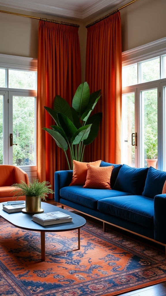
Color blocking with navy and burnt orange introduces a dynamic interplay between bold wall treatments and crisp accent details, resulting in a visually compelling living area.
Strategic placement of these contrasting hues—such as pairing a navy backdrop with burnt orange textiles—optimizes both depth and warmth.
Incorporating white trim or delineating color zones further enhances spatial definition and maintains aesthetic balance.
Bold Walls, Crisp Accents
By employing strategic color blocking, a living room can achieve striking visual contrast and functional definition through the use of navy and burnt orange. A rich burnt orange feature wall serves as a bold statement, instantly drawing attention and enhancing the room’s warmth.
Adjacent walls clad in navy blue deepen the spatial perception, introducing a dynamic interplay of hues. Crisp white ceilings and trim act as brightening elements, ensuring that the saturated tones remain vibrant without overpowering the environment.
Integrating textiles—such as burnt orange cushions on navy blue sofas—reinforces the color scheme, adding tactile interest and cohesion. The inclusion of metallic accents, particularly gold or brass, punctuates the palette with subtle luxury, balancing the vibrancy of burnt orange and the depth of navy blue.
Balanced Color Zone Placement
Strategic placement of navy and burnt orange zones introduces purposeful contrast and spatial clarity within the living room.
Color blocking with these complementary colors can delineate functional areas and enhance the balanced look of an open-plan space. For instance, painting a singular wall in burnt orange while utilizing navy on adjacent walls establishes a bold focal point surrounded by harmonious color combinations.
Incorporating crisp white ceilings and trim guarantees the warm and cool tones remain visually distinct without overwhelming the environment. Neutral furniture, such as beige or light grey, grounds the vibrant palette, maintaining cohesion and visual order.
Layering various shades of navy and burnt orange through textiles—such as cushions and throws—adds depth and texture, reinforcing the intentional color-blocking strategy for a sophisticated, dynamic interior.
Incorporate Orange and Navy Patterned Rugs
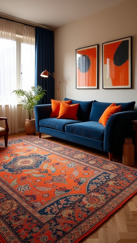
Elevating a living room’s design, navy and burnt orange patterned rugs introduce a striking focal point while unifying the space’s color palette. A navy patterned rug with burnt orange accents enlivens the color scheme, offering a warm and cohesive foundation for the living room. Strategic selection of geometric or abstract motifs guarantees sophisticated visual interest without overwhelming the environment. Opting for textured weaves adds depth, enhancing the room’s tactile and visual appeal. For ideal effect, layering a navy patterned rug over a neutral base amplifies contrast, allowing burnt orange highlights to stand out. The table below outlines essential considerations:
| Feature | Visual Impact | Functional Benefit |
|---|---|---|
| Patterned Design | Dynamic Focal Point | Harmonizes Color Scheme |
| Texture Variation | Enhanced Depth | Inviting Warmth |
| Color Balance | Cohesive Aesthetics | Prevents Overwhelm |
| Layering | Increased Contrast | Defines Living Area |
Use Navy Blue Painted Woodwork With Rust Accents
Navy blue painted woodwork establishes a bold architectural framework, delivering a refined backdrop that highlights rust accents throughout the living room. The deep, saturated tones of navy blue contrast sharply with burnt orange elements, infusing the living room design with both warmth and visual dynamism. Rust accents—whether through cushions, throws, or select decorative accessories—serve as vibrant focal points that invigorate the space. Integrating natural materials in rust hues, such as terracotta pottery or warm-toned wooden furniture, enhances cohesion and balances the dramatic navy backdrop. This strategic color pairing of Navy Blue and Orange offers versatility, adapting seamlessly to both modern and rustic aesthetics. The result is a sophisticated yet inviting environment, ideal for a variety of functions and adaptable to evolving seasonal decor. Incorporate multi-functional furniture to maximize usability and maintain an organized environment, adding both practicality and aesthetic appeal to the space.
Style With Luxe Velvet Orange and Navy Cushions
A selection of luxe velvet cushions in burnt orange and navy introduces tactile richness and visual contrast to a living room scheme. The plush texture of velvet cushions immediately enhances the ambiance, reinforcing both warmth and sophistication. Utilizing bold orange and deep navy tones in soft furnishings creates a dynamic interplay of color, making orange accents stand out while navy tones anchor the space. The versatility of these cushions allows for effortless adjustment, ensuring the design remains current with minimal intervention. To further elevate the living room decor, consider incorporating metallic accents such as gold or brass in decorative elements, which add luxury and sophistication to the space. Consider the following functional strategies:
- Mix various cushion sizes and shapes for layered visual depth and enhanced comfort.
- Combine solid and patterned velvet cushions to add dimension and interest.
- Rotate arrangements seasonally to refresh the living room’s warmth and vibrancy with ease.
Mix Earthy Tones for a Scandi-Inspired Look
A Scandi-inspired living room benefits from the strategic layering of warm neutral shades, providing a serene foundation for the space. Integrating natural wood accents introduces organic visual interest and reinforces the minimalist aesthetic. Cozy textures, such as woven textiles and plush throws, contribute both tactile comfort and functional warmth to the overall design. Embracing natural materials like wood and stone can further enhance the rustic charm and authenticity synonymous with a farmhouse aesthetic.
Layer Warm Neutral Shades
When warm neutral shades such as beige, taupe, and soft browns are layered with navy and burnt orange, the result is a balanced, Scandi-inspired living room that feels both serene and inviting.
Layering warm neutral shades introduces subtle depth, allowing earthy tones to ground the space while burnt orange accents inject boldness without overpowering the palette.
Soft textures—think knitted throws and plush rugs—add tactile interest and comfort. Utilizing natural materials in neutral hues further enhances the tranquil ambiance and emphasizes the cohesive design language.
For visual clarity and functional application, consider the following:
- Mix muted earth tones on upholstery and walls for a harmonious foundation.
- Introduce burnt orange accents through cushions or art for dynamic contrast.
- Incorporate soft textures using throws and rugs in neutral shades.
Incorporate Natural Wood Accents
Natural wood accents introduce essential warmth and texture to a navy and burnt orange living room, grounding the bold palette with earthy undertones.
Integrating natural wood furniture, such as coffee tables or shelving, infuses rustic charm and enhances the Scandi-inspired aesthetic. The interplay between bold colors and earthy tones balances visual interest, preventing the space from feeling overwhelming.
Utilizing varying wood finishes—ranging from light oak to deep walnut—adds layered texture and enhances the overall design. Select wooden accessories, like decorative trays or wall art, to reflect the warmth of burnt orange, while contrasting effectively against navy hues.
This strategic mix of natural wood elements not only harmonizes with vibrant colors but also reinforces a cohesive, inviting atmosphere through organic materiality and understated elegance.
Add Cozy Textures
Building upon the grounding presence of natural wood, layering cozy textures and earthy tones further refines the Scandi-inspired aesthetic in a navy and burnt orange living room.
Integrating tactile elements such as knitted throws, woven baskets, and plush cushions enhances comfort while bringing visual depth. The interplay of earthy browns, beiges, and vibrant burnt orange accents creates a warm, inviting backdrop, balancing bold color with natural calm.
Soft, natural fabrics in curtains and upholstery amplify the cozy ambiance, while minimalist furniture guarantees the space remains uncluttered and functional. Indoor plants can soften the vivid palette and introduce organic warmth.
- Layer knitted throws and textured cushions in earthy hues.
- Incorporate woven baskets and wooden furniture for functional texture.
- Add indoor plants for warmth and a cohesive, vibrant look.
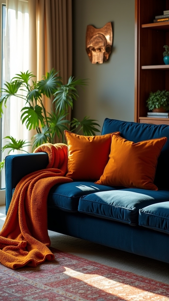
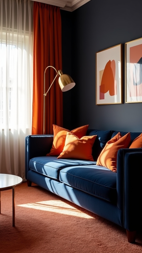
Combine Burnt Orange Throws With Navy Armchairs
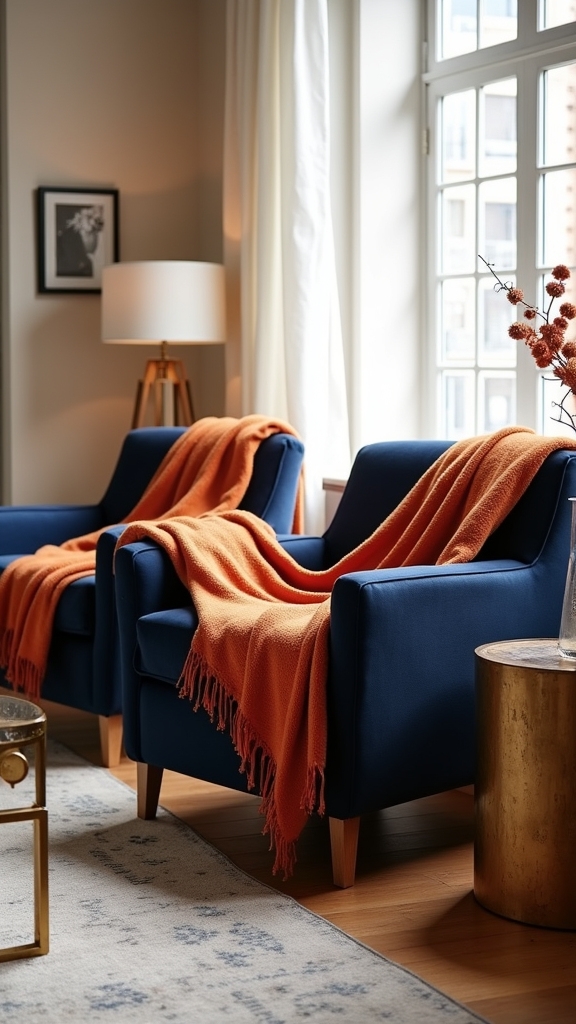
By layering burnt orange throws over navy armchairs, a visually compelling contrast is achieved that both enlivens and warms the living space.
The dynamic interplay between burnt orange and navy armchairs leverages the power of complementary color theory, ensuring each element is accentuated while maintaining overall cohesion.
The rich, saturated tones of burnt orange introduce immediate warmth and vibrancy, counterbalancing the deep, grounding presence of navy.
This strategic layering technique not only enhances visual interest but also provides tangible texture and dimension, lending a sense of comfort and sophistication to the seating area.
Additionally, incorporating burnt orange throws allows for functional versatility—seasonal updates or style shifts can be made quickly, ensuring the living room remains fresh, on-trend, and inviting without disrupting the established color palette.
A cohesive color scheme across the room’s elements creates harmony, further enhancing the visual appeal and maintaining a balanced aesthetic.
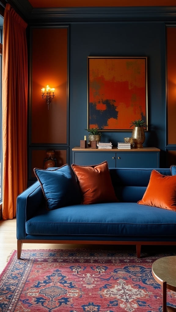
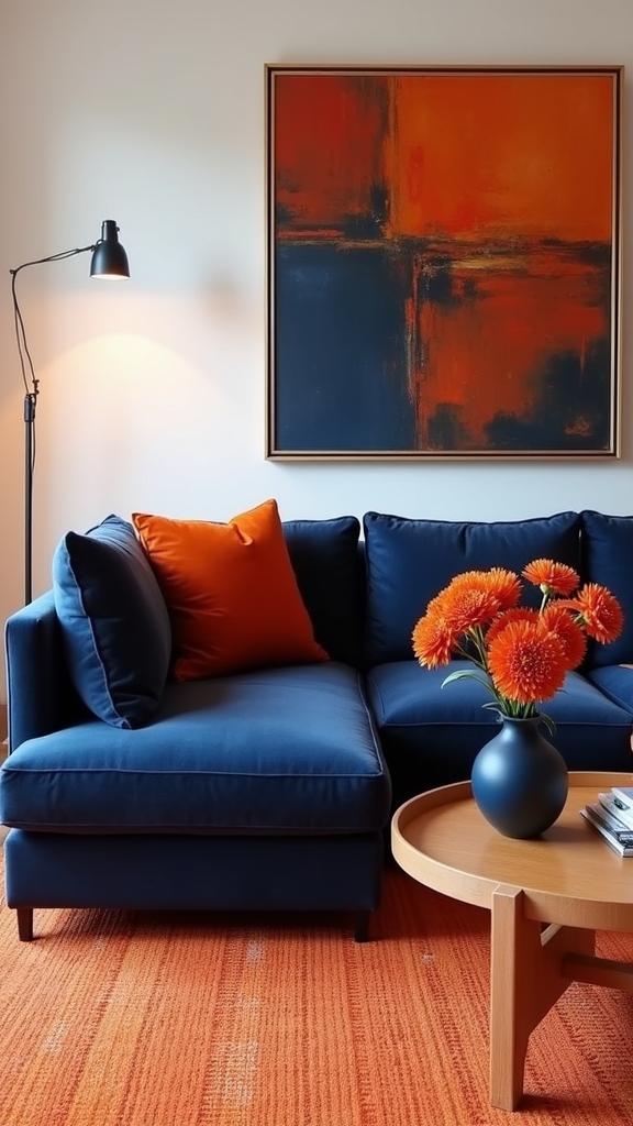
Add Depth With Orange Artwork on Navy Walls
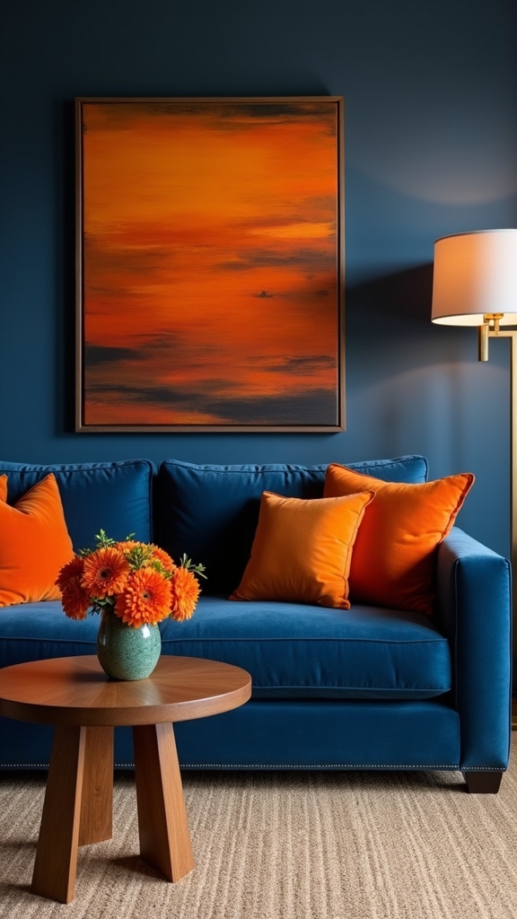
Integrating vibrant abstract orange artwork on navy walls introduces a compelling interplay of color and form, establishing a visually dynamic environment.
Framed statement art in bold burnt orange acts as an impactful centerpiece, while thoughtfully arranged gallery walls guarantee balanced composition.
Strategic placement and scale of these pieces optimize spatial depth and reinforce the room’s cohesive design narrative.
Curate Vibrant Abstract Pieces
Introduce striking visual depth to a navy living room by selecting vibrant abstract artwork in bold orange tones. The juxtaposition of orange against navy walls creates compelling focal points, infusing the space with vibrant energy and layered dimension.
Abstract artwork featuring dynamic textures and patterns achieves visual cohesion and enhances the overall warmth of the living room. For ideal integration of navy and burnt orange, consider the following strategies:
- Feature Large-Scale Abstracts: Opt for expansive canvases with sweeping orange accents to maximize visual impact and establish a commanding presence.
- Layer Textures and Patterns: Choose abstract artwork that incorporates varied surfaces and intricate motifs to complement the sleekness of navy walls.
- Coordinate Dual-Toned Palettes: Select pieces blending both navy and burnt orange to reinforce a cohesive, inviting ambiance while maintaining bold, energetic contrasts.
Highlight Framed Statement Art
Framed statement art in vibrant orange tones against navy walls establishes a powerful visual anchor, instantly heightening the room’s depth and sophistication.
The deliberate use of orange artwork introduces a bold contrast, infusing warmth and vibrancy into the space while maintaining a refined aesthetic.
Oversized pieces serve as a focal point, drawing the eye and enhancing visual interest amid the deep, moody backdrop of navy walls.
Selecting artwork that incorporates varying shades of orange adds layered dimension, preventing the space from feeling flat and enriching the overall composition.
This strategic color pairing balances the seriousness of navy with the energizing quality of burnt orange, resulting in a chic, harmonious environment that feels both dynamic and inviting.
The approach guarantees lasting impact and functional cohesion.
Balance Gallery Wall Arrangements
Building upon the impact of statement art, a thoughtfully composed gallery wall offers an opportunity to layer visual interest and dimension within a navy and burnt orange living room.
Curating orange artwork against navy walls achieves a bold contrast, infusing vibrancy while avoiding visual monotony. To maintain balance and prevent the gallery wall from overwhelming the space, careful variation in scale, shape, and medium is essential.
Incorporating neutral elements, such as white or beige frames, grounds the collection and accentuates the interplay between navy and orange. The overall arrangement should feel cohesive, inviting the eye to move harmoniously across the display.
- Select orange artwork in varying tones to add depth against navy walls.
- Vary frame sizes and shapes, ensuring balanced composition.
- Integrate neutral elements for a harmonious, grounded presentation.
Layer Textures Using Blue and Orange Textiles
Layering diverse textiles in navy and burnt orange establishes both depth and warmth within a living room, cultivating a visually engaging and inviting environment.
By intentionally layering textures through blue and orange textiles—such as navy velvet cushions paired with burnt orange woven throws—designers generate tactile richness and a sense of comfort.
Incorporating patterned fabrics, like a geometric blue and orange rug, further amplifies visual interest and can serve as a compelling focal point.
The juxtaposition of smooth navy silk curtains with rustic burnt orange linen pillows harmonizes elegance with casual appeal, enhancing the room’s overall aesthetic.
Rotating accessories, such as patterned blankets or throws, allows for seasonal updates while maintaining a cohesive palette, ensuring both functional adaptability and enduring style within the space.
Start with a base texture like plush rugs to provide a foundational layer that complements the navy and burnt orange textiles, enhancing the depth and personality of the room.
Balance Bold Hues With Neutral Furniture
When bold navy and burnt orange tones serve as the primary palette in a living room, introducing neutral furniture—such as beige or cream sofas—establishes a sophisticated foundation that prevents the space from feeling visually overwhelming. Neutral elements, including light wood or white pieces, balance the bold hues, grounding the overall composition and offering a calming contrast to the energetic navy and orange. Employing textural diversity in neutral furniture—like plush upholstery or woven finishes—enhances visual interest and complements the warmth of orange while tempering the intensity of navy. Neutral rugs and cushions unify the space and facilitate effortless seasonal updates. Strategically placed bold accents, such as an orange armchair, maximize visual balance. Black sofas, like those discussed in Stylish Sofa Aesthetics, offer diverse design possibilities that can enrich the decor and enhance aesthetic appeal.
- Integrate light-toned furniture for contrast.
- Layer neutral textures for depth.
- Highlight bold accents to create visual focal points.
Experiment With Teal, Navy, and Orange Palettes
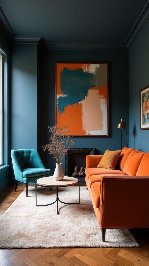
Beyond the grounding influence of neutral furnishings, integrating teal alongside navy and burnt orange introduces a sophisticated interplay of warm and cool tones in the living room.
Teal, employed as a wall color or upholstery, establishes a calming foundation, while navy elements—such as sofas or drapery—contribute depth and refined contrast.
Burnt orange accents, strategically placed through cushions or wall art, infuse bold energy and invigorate the space.
Layering varying shades within the teal and navy spectrum enhances dimensionality and visual interest.
Textural diversity, including velvet or woven fabrics, amplifies warmth, ensuring tactile richness.
Consider incorporating natural elements like wooden furniture and indoor plants to enhance the aesthetic and create a harmonious environment.
The palette’s adaptability allows designers to shift between seasons effortlessly, pairing bold hues with lighter textiles for a cohesive yet dynamic aesthetic that remains inviting and visually balanced year-round.
Introduce Metallic Accents for Added Warmth
Accentuating a navy and burnt orange living room with metallic finishes—such as gold or brass—introduces both warmth and sophistication to the space.
These metallic accents bridge the gap between the boldness of burnt orange and the depth of navy, elevating the decor’s visual interest and fostering an inviting atmosphere.
Strategic use of metallic elements not only reflects ambient light but also adds texture and luxury without overwhelming the palette.
Consider integrating metallic accents in the following ways:
- Furniture Selection: Opt for gold coffee tables or brass lamps to reflect light and enhance warmth.
- Decorative Accessories: Incorporate metallic vases or picture frames for cohesive focal points within the navy and burnt orange scheme.
- Textile Embellishments: Utilize throw pillows with gold threading to add subtle sheen and tactile dimension.
Define Zones in Open Spaces With Orange and Navy
Color zoning serves as a practical strategy for defining distinct areas in open-plan living rooms, utilizing the dynamic interplay of navy and burnt orange to create visual boundaries without the need for physical partitions. Employing color blocking with these hues guarantees both visual separation and an inviting, energetic ambiance. For example, a burnt orange accent wall can signify a relaxation zone, while adjacent navy walls or furniture delineate social or entertainment spaces. Incorporating burnt orange area rugs, navy upholstered seating, and artwork blending both shades further reinforces spatial definition. The following table highlights practical applications of orange living room ideas to define zones:
| Zoning Element | Burnt Orange Application | Navy Application |
|---|---|---|
| Accent Wall | Relaxation Area | Social Gathering Wall |
| Area Rug | Reading Nook Anchor | Entertainment Zone Border |
| Upholstery | Accent Cushions/Throws | Sofa/Chairs |
| Artwork | Abstract Motifs | Geometric Patterns |
| Accessories | Decorative Vases | Framed Mirrors |
Play With Lighting to Enhance Navy and Orange Decor
Strategic lighting selection further refines the impact of navy and burnt orange in a living room, building on clearly defined zones to enhance both function and atmosphere.
Utilizing warm tones in lighting, such as amber or gold, amplifies the coziness and richness of the color palette. Dimmable LED fixtures allow precise control over ambiance, ensuring the interplay between navy and burnt orange remains visually compelling at any time.
Thoughtful placement of lamps and layering of lighting sources adds both depth and sophistication.
- Warm-Toned Lamps: Use amber or gold bulbs in floor or table lamps with orange shades to enhance the warmth of navy and burnt orange.
- Adjustable Ambiance: Install dimmable LEDs to tailor lighting intensity and mood throughout the day.
- Layered Lighting: Combine wall sconces, string lights, and metallic pendant fixtures for added dimension and dynamic appeal.
Frequently Asked Questions
Do Burnt Orange and Navy Blue Go Together?
The combination of burnt orange and navy blue demonstrates effective color psychology and bold aesthetics in interior design. This pairing utilizes warm tones and visual contrast, resulting in dynamic color combinations that enhance spatial ambiance and functional visual interest.
What Colors Go With a Burnt Orange Living Room?
When selecting complementary colors for a burnt orange living room, designers recommend integrating burnt orange accents with neutral palettes, such as beige or cream, while contrasting hues like teal or deep brown enrich the room atmosphere, enhancing visual harmony and functional sophistication.
What Color Goes With a Navy Blue Living Room?
When selecting complementary colors for a navy blue living room, designers often recommend incorporating warm neutrals or muted earth tones. Strategic navy blue accents, varied fabric textures, and thoughtful room lighting enhance diverse design styles while maintaining visual balance.
Is Burnt Orange a Warm Color?
Burnt orange is classified as a warm color, often leveraged in burnt orange psychology to evoke comfort and energy. In burnt orange decor, fabrics, accents, and trends, its rich undertones provide visual warmth and functional vibrancy to interiors.
Conclusion
Integrating navy and burnt orange in a living room delivers a visually striking and inviting environment. Through strategic use of accent walls, textiles, and patterned elements, the palette creates depth and warmth. Architectural highlights and metallic finishes further enhance the scheme’s sophistication. Thoughtful lighting and spatial zoning maximize both style and functionality. Collectively, these design approaches guarantee the living area remains cohesive, dynamic, and perfectly suited for both relaxation and entertaining.
5 Clever Hidden Toy Storage Ideas for a Tidy Living Room
Organize your space effortlessly with these 5 clever hidden toy storage ideas for a tidy living room
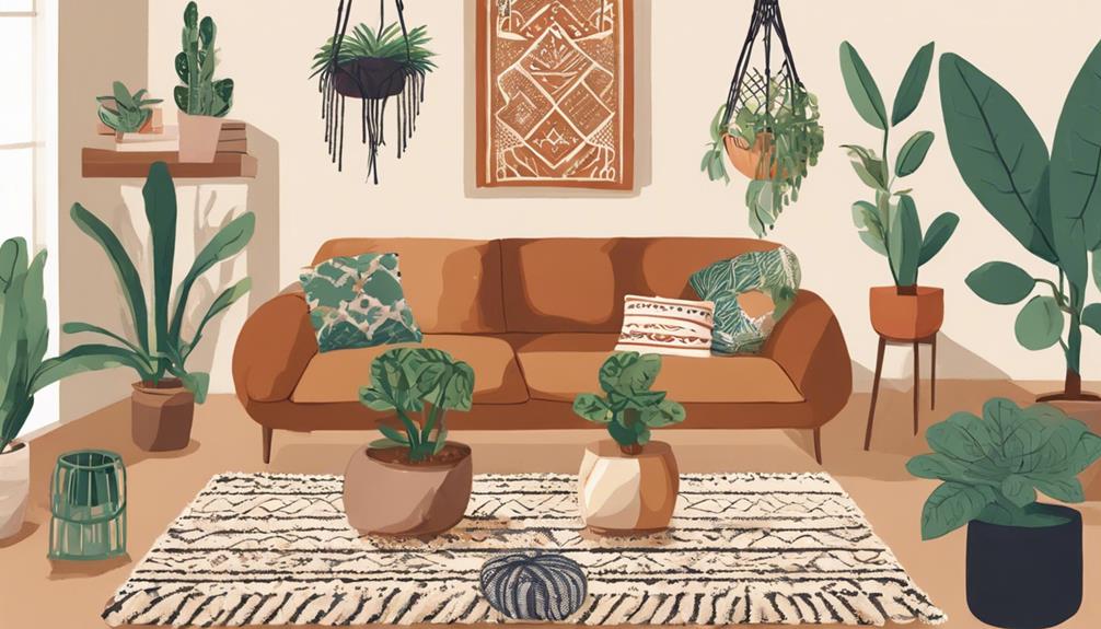
5 Steps to Achieve the Perfect Boho Living Room Decor
Transform your living space with these 5 essential steps for perfect boho decor, from vibrant co
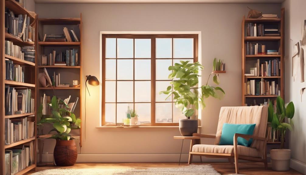
10 Affordable Home Library Setup Tips
Optimize your reading nook on a budget with these 10 savvy tips, and discover how to create a co
Leave a Reply