18 Orange Living Room Decor Ideas That Feel Energetic and Playful
Eighteen orange living room decor ideas use architectural accents, bold textiles, and color blocking to invigorate spaces with energy and playful contrast. Strategic placement of orange on walls, trims, and statement furniture provides dynamic visual movement, while layered textiles in coral and terracotta promote cohesion. Balanced with creamy neutrals, taupes, or metallic finishes, orange elements create both harmony and focal points. Thoughtful application of orange illuminates spatial zones and establishes inviting warmth, with further creative approaches awaiting discovery.
Key Takeaways
- Use bold orange accent walls or trims to energize and highlight architectural features in your living room.
- Layer orange textiles like pillows, throws, and rugs in varied patterns and tones for playful visual interest.
- Anchor the space with a statement orange sofa or accent chair, balanced by neutral backgrounds and textured accessories.
- Pair orange accents with contrasting cool hues like teal or blue to create vibrant, harmonious focal points.
- Soften orange’s intensity by grounding it with creamy whites, taupe, or warm wood tones for a welcoming, balanced look.
Explore Orange Through an Architectural Lens

When integrated thoughtfully, orange acts as a dynamic instrument for accentuating architectural features, infusing spaces with both energy and warmth.
In Interior Design, Orange Decor can be strategically applied to highlight structural elements such as accent walls or metallic trims, especially within contemporary or mid-century modern contexts. Shades like terracotta and russet introduce visual rhythm, establishing cohesion and reinforcing a natural palette.
Decorating With Orange at both the ceiling and baseboard levels softens the vibrancy, achieving balance through juxtaposition with organic materials like wood.
In compact environments, such as powder rooms, bold orange wallpaper transforms spatial limitations into opportunities for playful expression.
In open-plan layouts, orange delineates zones, fostering creativity while ensuring energetic flow, and seamlessly integrates architectural intent with aesthetic significance.
Lean Into the Organic Beauty of Orange
Building on orange’s role as an architectural accent, its organic shades—ranging from clay to harvest—anchor living spaces in warmth and depth.
Designers leverage the inherent richness of earthy tones, introducing orange accents through terracotta tiles, wood furnishings, or textured textiles to reinforce a sense of natural cohesion. This palette, when integrated with grounding hues such as rust, cultivates visual balance and imparts a calming, modern feel despite the color’s energetic undertones.
In smaller spaces, a vibrant orange accent allows for playful experimentation, infusing personality without visual overload. Conversely, a maximalist approach—layering bold orange patterns and tactile materials—celebrates the color’s organic beauty, establishing a vibrant environment that remains grounded by its connection to nature and thoughtfully curated design elements. Geometric wallpaper, with its endless pattern choices, can complement orange decor by adding depth and modern vibes to living spaces.
Perfect the Placement of Your Orange Tones

Strategically distributing orange tones throughout a living room is crucial for achieving visual equilibrium and spatial harmony. Design professionals recommend balancing vibrant shades of orange both vertically and horizontally—consider painting the ceiling or introducing orange accent furniture paired with grounding hues on lower walls. The interplay between bold orange tones and natural wooden elements not only tempers intensity but also introduces warmth and grounded sophistication. For cohesive open-plan environments, employing a spectrum of shades of orange delineates functional zones while preserving unity. The following table illustrates ideal pairings for orange placement:
| Zone | Orange Element | Grounding Hue |
|---|---|---|
| Upper Walls | Orange Paint | Terracotta |
| Furniture | Orange Sofa | Walnut Wood |
| Accent Zone | Orange Wallpaper | Rust Accessories |
Strategic placement guarantees intentional, balanced vibrancy.
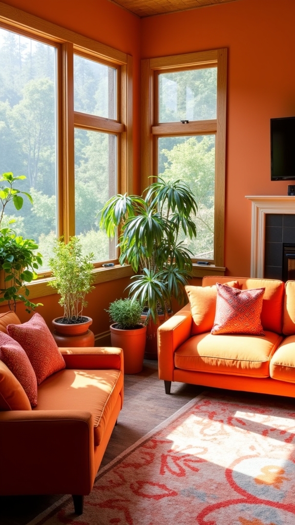
Bring Energy and Light Into Smaller Spaces
Many compact living spaces benefit from the invigorating presence of orange, which, when thoughtfully applied, transforms limited square footage into vibrant, inviting environments.
Smaller rooms are ideal canvases for bold experimentation—orange accents, such as cushions or throws, inject color in a measured yet impactful way, amplifying brightness and fostering an energetic atmosphere without visual clutter.
Strategic use of orange wallpaper in powder rooms or alcoves establishes a lively focal point, enhancing both warmth and personality.
For visual equilibrium, grounding tones like rust or terracotta temper orange’s vibrancy, producing a harmonious interplay between energy and calm.
Placing orange elements at varying heights, from rugs to artwork, distributes color evenly, creating a sense of balance and depth that makes smaller rooms feel more expansive and dynamic.
Introducing houseplants to balance the vibrant orange decor can further enhance the room’s aesthetic, contributing to a lively and refreshing atmosphere.
Take a Maximalist Approach With Orange

While minimalism relies on restraint, adopting a maximalist approach with orange in living room decor leverages visual abundance to create dynamic, expressive spaces.
This design philosophy encourages bold prints, layered patterns, and a vibrant palette, using the versatility of orange to establish both focal points and overall cohesion.
By integrating fluorescent orange elements with deeper hues such as sapphire or teal, designers achieve striking contrast and amplify visual rhythm.
Mixing multiple shades of orange—from bright tangerine to burnt sienna—fosters depth and a sense of joyful movement.
Maximalist living rooms thrive on eclectic combinations and expressive details, reflecting individual creativity and personality.
A maximalist living room celebrates eclectic style, where bold combinations and unique details showcase personality and creative flair.
- Layer diverse orange textiles and prints for visual interest.
- Incorporate unexpected orange accent furniture to anchor the space.
- Balance multiple bold colors and patterns for curated eclecticism.
Add Orange Accents With Bold Wall Art
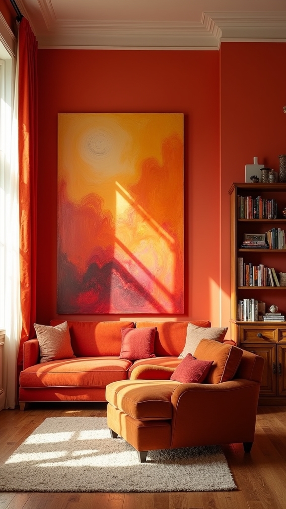
Integrating orange through bold wall art introduces a controlled yet impactful application of color, complementing the maximalist ethos without overwhelming the spatial balance.
Expertly curated orange accents act as visual anchors, drawing the eye and imparting a vibrant energy to the living room. Oversized prints—particularly those reminiscent of Gustav Klimt—offer a sophisticated statement, uniting modern sensibilities with artful dynamism.
Burnt orange floral motifs in wall art harmonize with earthy tones, achieving a cohesive palette that feels both contemporary and inviting.
Strategically distributed, these vibrant orange elements generate rhythm and movement within the space. Pairing the wall art with fresh greenery further enhances the vibrancy, ensuring the orange accents stand out while fostering a playful yet curated atmosphere in the living room’s overall design.
Style With Unexpected Shades Like Coral and Russet
Integrating pink-toned coral introduces a nuanced warmth, establishing a soft yet invigorating foundation for the living room palette.
Layering with russet hues enriches visual depth, while the addition of warm metallics such as brass or copper enhances luminosity and textural contrast.
This strategic interplay of unexpected shades and reflective accents achieves a sophisticated balance and dynamic cohesion within the space.
Embrace Pink-Toned Coral
A nuanced approach to orange living room decor involves the use of pink-toned coral, a hue that introduces both warmth and sophistication without overwhelming the palette.
This softer alternative to classic orange blends seamlessly with warm tones such as yellow, cream, and ivory, achieving a cohesive and inviting ambiance. Designers often harness coral’s versatility to establish visual balance and contemporary elegance, whether in bohemian or modern settings.
For those seeking to maximize the impact of this color, consider the following strategies:
- Integrate pink-toned coral into monochromatic themes, allowing for nuanced layering of textures and shades.
- Pair coral textiles with warm-toned furnishings for a harmonious and uplifting effect.
- Utilize coral accents to create focal points that enliven the space while maintaining aesthetic cohesion.
Layer With Russet Hues
Strategic layering with russet hues introduces a grounded, earthy dimension to orange living room decor, enhancing visual depth and establishing a sophisticated color interplay.
Utilizing russet’s rich undertones alongside orange creates a compelling contrast that enlivens the space while maintaining visual balance. Incorporating unexpected shades such as coral into the palette results in a vibrant yet cohesive environment, preventing monotony and encouraging an energetic ambiance.
Employing russet hues through varied textures—such as woven textiles, velvet cushions, or expressive artwork—intensifies tactile interest and reinforces the dynamic character of the room.
This nuanced approach to layering not only amplifies the warmth and playfulness inherent to orange but also cultivates a design narrative that feels intentional, creative, and visually stimulating within the living area.
Mix Warm Metallics
When warm metallics such as copper and gold are juxtaposed with unexpected hues like coral and russet, the result is a living room that exudes depth, dynamic contrast, and refined cohesion.
Design experts recognize that orange is the perfect anchor for this palette, allowing metallics to shimmer while coral introduces a soft, lively edge and russet grounds the composition with earthy warmth.
The strategic interplay of these tones not only enhances visual balance but also improves textural interest throughout the space.
- Layer metallic accents: Incorporate warm metallics in lighting, frames, and decorative objects to distribute light and create focal points.
- Integrate coral textiles: Use coral pillows and throws to soften the metallic sheen and enliven the color scheme.
- Balance with russet furnishings: Ground the room with russet-toned upholstery for a cohesive, inviting feel.
Pair Orange With Contrasting Colors Like Blue or Teal
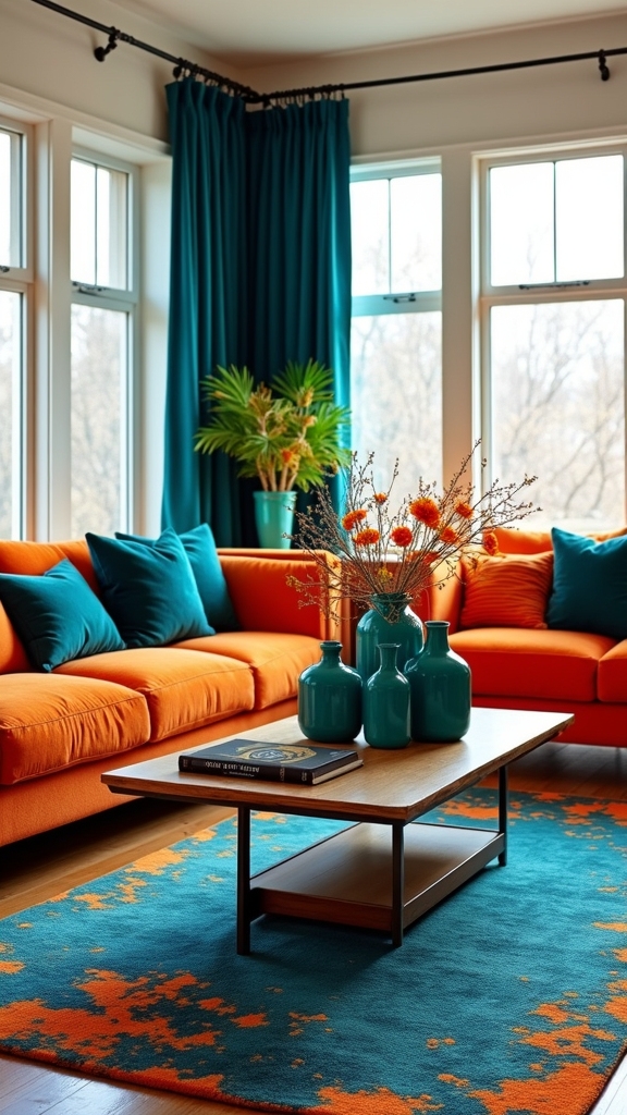
Although orange exudes warmth and vibrancy, its true potential is realized when paired with contrasting hues like blue or teal, establishing a dynamic interplay between warm and cool tones.
In living room design, this expert use of contrasting colors enhances visual balance and infuses the space with a sense of energy and creativity. Designers frequently deploy bold orange accents—such as chairs, cushions, or artwork—against a rich teal or deep blue backdrop to create striking focal points that command attention.
The equilibrium between the invigorating qualities of orange and the calming influence of blue results in a harmonious yet playful environment. This chromatic juxtaposition is particularly effective in contemporary and eclectic living rooms, enabling expressive design statements while maintaining overall cohesion and sophisticated visual interest.
Use Orange to Zone Open Plan Living Areas

By integrating orange into open plan living areas, designers can delineate functional zones without resorting to physical barriers.
Strategic use of orange—whether through accent walls, furnishings, or decor—creates strong visual cues that subtly define areas within a living space. This approach encourages a dynamic yet cohesive flow, reinforcing the intended purpose of each zone.
Orange infuses energy and warmth, enhancing both creativity and comfort in multifunctional environments while fostering intimacy in expansive layouts. For ideal visual balance, pairing orange with neutral tones tempers its vibrancy and maintains a playful, sophisticated aesthetic.
- Accent Walls: Utilize orange paint or wallpaper to clearly demarcate a lounge or reading zone.
- Textiles & Decor: Distinctive orange rugs or cushions can anchor designated areas.
- Furniture Placement: Orange-hued furniture pieces subtly separate zones within the living space.
Embrace Boho Style With Warm, Earthy Oranges
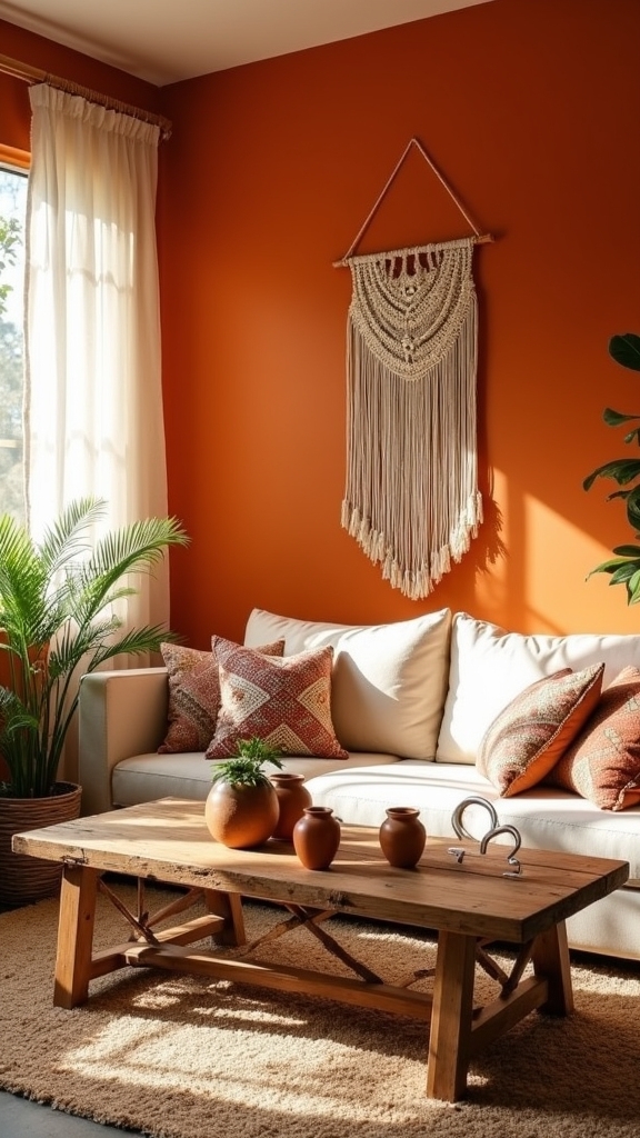
A multitude of bohemian interiors harness the expressive power of warm, earthy oranges to cultivate a space that radiates both energy and comfort. Boho style thrives on layered textiles, where variations of orange—from burnt orange to coral—introduce depth through tone and tactile contrast. Carefully curated cushions, throws, and patterned rugs in earthy oranges anchor the room, infusing a vibrant atmosphere without overwhelming visual harmony. Eclectic furniture selection in boho spaces often includes unique shapes and textures that reflect a personalized aesthetic. Integrating spiritual motifs such as mandalas in orange hues provides dynamic focal points and reinforces the eclectic, free-spirited sensibility characteristic of boho style. When combined with terracotta or deep browns, these orange accents achieve cohesive color blocking, balancing vibrancy with grounded warmth. The result is a living room that feels both invigorating and inviting, celebrating artistic expression and comfort.
Create a Cozy Atmosphere With Burnt Orange
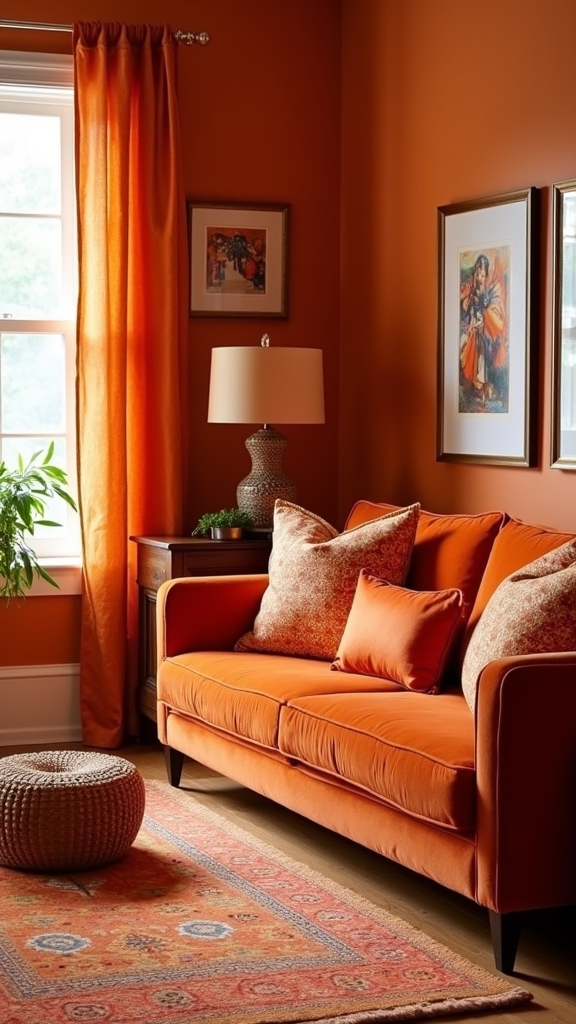
A harmonious palette can be achieved by pairing burnt orange with soft neutrals, allowing the vibrant hue to stand out while maintaining visual balance.
Integrating layered textures—such as woven throws, velvet cushions, and natural fibers—enhances tactile warmth and depth.
This approach fosters an inviting environment where color and comfort coexist seamlessly.
Pair Burnt Orange Neutrals
When integrated thoughtfully, burnt orange introduces a sophisticated warmth to living room decor, especially when balanced with neutral tones such as creams, beiges, and soft browns.
This color palette leverages contrast and harmony, allowing burnt orange to serve as a focal point while maintaining visual equilibrium. Interior designers frequently utilize burnt orange through strategic elements, such as accent walls or textiles, to invigorate the space without overwhelming the senses.
The interplay of burnt orange and neutral tones guarantees that the room feels inviting yet refined.
- Accent Walls: Employing burnt orange on a single wall creates a striking backdrop that anchors the room while complementing neutral furnishings.
- Textiles and Accessories: Cushions, throws, and ceramics in burnt orange punctuate the space, introducing energy with restraint.
- Wood and Earthy Elements: Incorporating natural wood or terracotta supports a grounded, cohesive aesthetic.
Layer Textures for Warmth
By thoughtfully layering diverse textures—such as velvet cushions, woven throws, and plush rugs in burnt orange—a living room achieves an enhanced sense of warmth and visual richness.
Employing a range of tactile materials, including suede and angora, introduces depth and tactile contrast, fostering both coziness and an energetic vibe.
The interplay of these surfaces, when paired with earthy tones like rust and terracotta, promotes a harmonious and grounded design scheme.
Expert placement of textured burnt orange elements, such as an accent chair or patterned curtains, serves as dynamic focal points, drawing the eye and contributing to spatial cohesion.
Integrating playful patterns within these layers further enlivens the atmosphere, reinforcing visual balance while ensuring the living space remains inviting, vibrant, and comfortably intimate.
Experiment With Playful Patterns in Orange Textiles
Infusing a living room with playful patterns in orange textiles leverages the color’s inherent vibrancy to transform the atmosphere, energizing the space and evoking creativity.
Design experts recommend integrating a spectrum of orange—from vivacious coral to subdued terracotta—within textiles to achieve both visual cohesion and dynamic interest.
A spectrum of orange textiles, from lively coral to mellow terracotta, brings cohesion and dynamic energy to any living space.
Employing principles of contrast and rhythm, orange textiles in geometric or floral motifs animate neutral furnishings and backgrounds, producing an energetic vibe without overwhelming the eye.
For ideal visual balance and spatial definition, consider the following:
- Patterned Accents: Use orange patterned pillows and throws to inject movement and create focal points on sofas and chairs.
- Textile Layering: Combine orange patterns with warm neutrals like yellow and cream for harmonious shifts.
- Zoning through Rugs: Define open-plan areas with orange patterned rugs, enhancing both structure and playfulness.
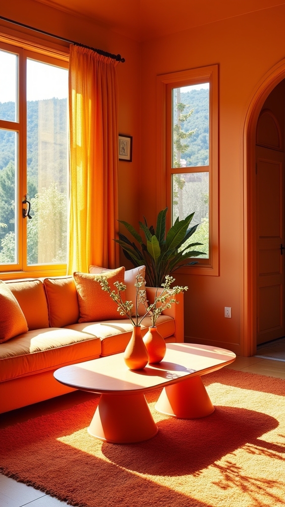
Add Energy With Orange Feature Walls
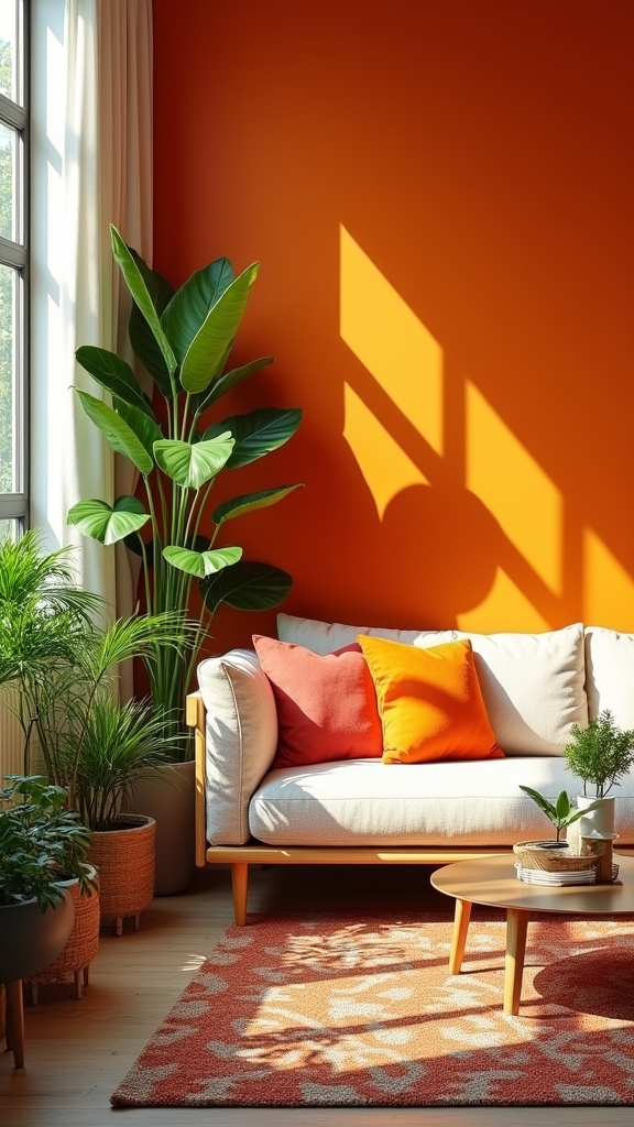
As a strategic application of color theory, orange feature walls serve as vibrant focal points that amplify spatial energy and warmth while enhancing the perception of natural light.
Selecting a suitable shade of orange—whether bold tangerine or burnt sienna—can invigorate smaller living rooms, providing an energetic and playful ambiance.
Painting both walls and woodwork in a cohesive orange hue creates a cocooning effect, particularly effective in minimalist or mid-century modern interiors.
To achieve visual balance, designers often pair orange feature walls with complementary colors such as muted blues or neutral tones, establishing a harmonious and dynamic composition.
Beyond aesthetics, orange feature walls inject personality, fostering creativity and positivity within the space.
This targeted approach guarantees the room remains both visually stimulating and inviting.
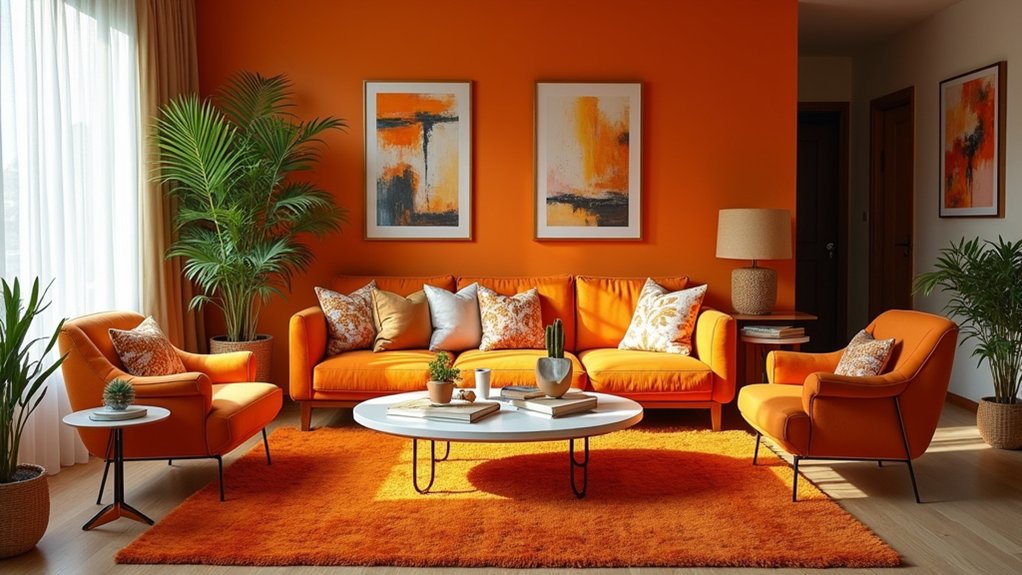
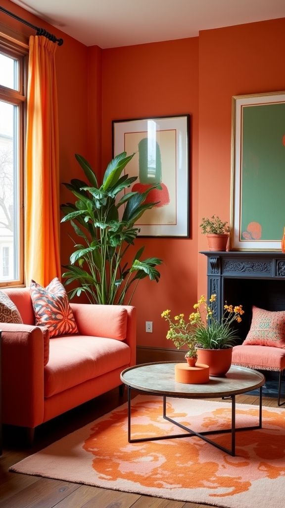
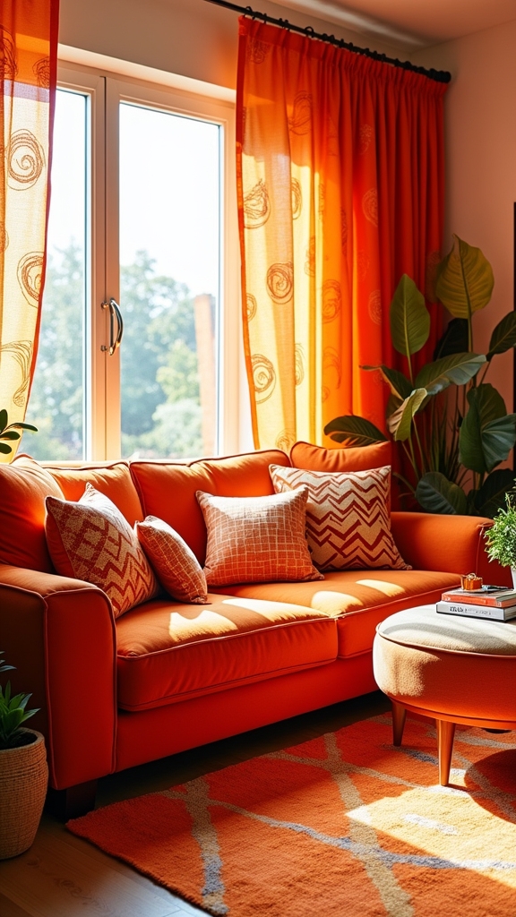
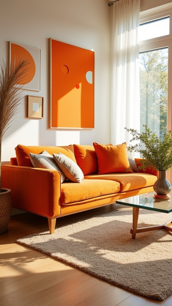
Incorporate Orange Through Statement Furniture
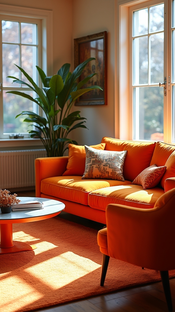
Strategically selecting bold orange sofas or accent chairs establishes a compelling focal point, infusing the living room with vibrancy and visual interest.
Mixing textures such as velvet or suede and layering various orange tones enhances tactile richness while reinforcing color harmony.
This approach leverages statement furniture to achieve both dynamic contrast and cohesive design balance.
Choose Bold Orange Sofas
A bold orange sofa acts as a dynamic anchor in living room design, immediately drawing the eye and infusing the space with energy. As statement furniture, bold orange sofas establish a vibrant focal point that sets the tone for an energetic and playful aesthetic.
Designers leverage the inherent warmth of burnt or blood orange hues to make interiors feel inviting yet modern. For ideal visual balance and cohesion, consider these expert strategies:
- Color Harmony: Pair bold orange sofas with neutral or earthy tones to moderate intensity and maintain visual equilibrium.
- Textile Layering: Introduce patterned cushions or textured throws to enhance the sofa’s dynamic presence without overwhelming the space.
- Stylistic Integration: Use orange sofas within minimalist or mid-century modern settings to showcase creative expression while preserving a sophisticated, contemporary vibe.
Accent Chairs as Highlights
One striking approach to infusing vibrancy into a living room involves the use of orange accent chairs as statement furniture. Designers often utilize these pieces to establish a dynamic focal point, especially when working within neutral or earthy palettes.
The application of orange through accent chairs injects warmth and energy, seamlessly aligning with maximalist sensibilities and providing a playful counterbalance to subdued backdrops. In a home office setting, an orange chair not only enlivens the workspace but also enhances visual interest without overwhelming the room’s composition.
Strategic placement of such statement furniture can ground the space, contributing to a harmonious color story while allowing for seasonal or stylistic flexibility. Selecting accent chairs in materials like velvet or suede further amplifies tactile sophistication and depth.
Mix Textures and Tones
When incorporating orange through statement furniture, the interplay of textures and tones becomes essential for achieving visual balance and depth within the living room. A curated mix of textures—such as pairing a velvet orange sofa with a woven accent chair—introduces tactile richness and dynamic contrast.
This method allows for an enhanced aesthetic, avoiding monotony and fostering a cohesive, playful ambiance. To further improve your interior, designers recommend intentionally blending different orange tones, from vibrant tangerine to earthy terracotta, while integrating complementary hues for equilibrium.
- Layer contrasting textures: Combine smooth leathers, plush velvets, and organic weaves to create visual and tactile intrigue.
- Vary orange tones: Use multiple shades for statement pieces, ensuring cohesion without overwhelming the space.
- Balance with complementary colors: Introduce blues or greens to harmonize the orange and maintain sophisticated energy.
Mix Orange With Metallic Finishes for Modern Glam
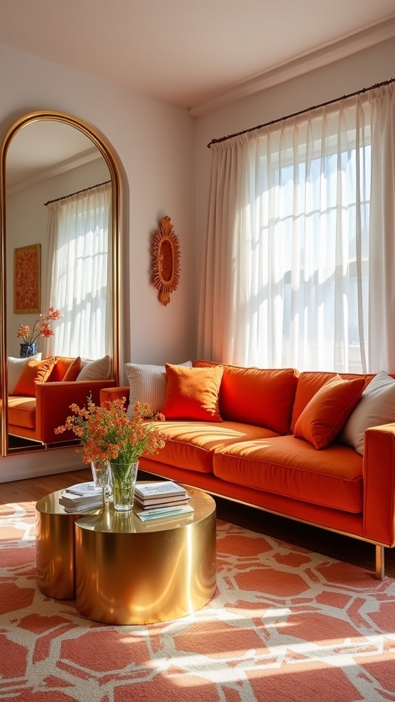
Embracing the interplay of orange and metallic finishes introduces a sophisticated modern glamor to living room decor, utilizing color theory and material contrast for maximum visual impact.
Integrating metallic finishes—such as copper, gold, or brass—against vibrant orange establishes a compelling juxtaposition that enlivens the space. Expert designers often recommend incorporating these finishes through accent lighting, furniture trim, or decorative accessories to foster a visually dynamic environment.
Pairing copper, gold, or brass with vivid orange creates a lively contrast, infusing living spaces with modern elegance and visual energy.
Textured metallic surfaces, whether brushed or polished, effectively complement a spectrum of orange shades, from tangerine to burnt orange, increasing depth and refinement. Additionally, metallic elements reflect natural and artificial light, amplifying the room’s luminosity and creating an energetic yet inviting ambience.
Statement orange furnishings paired with metallic details anchor the space with creative focal points.
Layer Orange With Neutrals for Balance
Balancing soft orange with beige introduces a harmonious interplay of warmth and subtlety, anchoring the room’s palette.
Creamy whites further enhance this effect, amplifying natural light and contributing to an inviting ambiance.
Taupe provides a grounding backdrop, allowing vibrant orange accents to command attention without overpowering the overall design.
Soft Orange Meets Beige
By thoughtfully layering soft orange with beige, designers achieve a harmonious balance that introduces warmth while preserving a sense of visual calm.
This nuanced pairing is especially effective in the living room, where the interplay between soft orange and beige can enhance spatial lightness and foster an inviting yet sophisticated environment.
The strategic use of soft orange as an accent—through textiles or accessories—provides controlled vibrancy, ensuring the beige foundation remains refined and versatile.
This color story supports both contemporary and mid-century modern aesthetics by allowing for creative juxtapositions of texture and motif.
- Contrast and Cohesion: Soft orange accents punctuate beige backdrops, establishing focal points without disrupting overall unity.
- Amplified Natural Light: The combination reflects and diffuses daylight, heightening brightness and visual comfort.
- Playful Grounding: Textured layers and patterns in both hues create a lively yet grounded ambiance.
Creamy Whites Enhance Warmth
When layered with creamy whites, orange hues gain enhanced luminosity and depth, resulting in a living room scheme that feels both vibrant and inviting. Creamy whites act as a refined neutral backdrop, amplifying the brightness of orange while ensuring the palette remains balanced and the overall ambiance warm. This interplay between creamy whites and orange prevents visual overwhelm, creating a harmonious environment that feels sophisticated yet playful. Design professionals often employ this approach in open plan layouts, where creamy whites help define zones yet allow the energetic presence of orange to remain cohesive throughout the space. The following table outlines the key effects of this color pairing:
| Design Element | Visual Impact |
|---|---|
| Creamy whites | Softens, brightens, unifies |
| Orange accents | Injects energy, focal interest |
| Overall warm atmosphere | Inviting, comforting, visually rich |
Taupe Grounds Vibrant Orange
A foundation of taupe in living room design serves as a stabilizing canvas for the vibrancy of orange, harnessing the latter’s energy without overwhelming the space.
Taupe, with its nuanced neutrality, expertly balances bold orange accents, offering a harmonious interplay between warmth and sophistication. This approach leverages taupe’s adaptability, enabling designers to explore a spectrum of orange shades—from vivid tangerine to subdued burnt sienna—while maintaining visual equilibrium.
Layering is key: taupe establishes a unified backdrop, allowing orange elements to punctuate the living room with playful yet controlled energy.
The following strategies illustrate this principle:
- Anchor the space with taupe sofas or walls to ground dynamic orange accessories.
- Introduce orange cushions or artwork for focal points.
- Balance proportions by distributing orange thoughtfully throughout the room.
Try Colour Blocking With Multiple Orange Shades

Although orange is often associated with boldness, employing colour blocking with multiple orange shades introduces nuanced depth and visual rhythm to a living room’s design. By layering distinct shades of orange—such as bright tangerine, warm burnt orange, and delicate coral—designers can establish a dynamic and energetic atmosphere. Color blocking with these hues not only infuses vibrancy but also delineates functional zones within open-plan spaces, enhancing spatial organization. Pairing orange with neutral tones or complementary blues achieves visual balance and prevents overstimulation, adhering to foundational design principles. Incorporating orange through textiles, like cushions or throws, allows for flexible adjustments in the color palette.
| Shade of Orange | Placement | Visual Effect |
|---|---|---|
| Bright Tangerine | Accent Wall | Lively Focal |
| Burnt Orange | Upholstery | Warmth & Depth |
| Coral | Cushions/Throws | Soft Contrast |
| Terracotta | Area Rug | Grounded Energy |
Use Orange to Enhance a Welcoming Entryway
Integrating a bold orange accent wall in the entryway establishes an immediate focal point, offering visual warmth and dynamic energy.
Statement entryway furniture in vibrant orange tones introduces both functionality and artistic impact, grounding the space through intentional color placement.
Enhancing the scheme with warm lighting further amplifies the inviting atmosphere, promoting a harmonious shift into the living areas.
Bold Orange Accent Walls
When applied thoughtfully, a bold orange accent wall in the entryway establishes an immediate sense of energy and warmth, effectively setting a vibrant visual tone upon arrival.
Interior designers often recommend a warm shade of orange, such as burnt orange, to cultivate an energetic atmosphere while maintaining visual harmony with neutral surroundings. The dynamic interplay between orange and natural light amplifies brightness, making compact spaces appear more expansive and inviting.
For ideal visual balance and architectural emphasis, experts suggest the following:
- Strategic Placement: Position bold orange accent walls adjacent to door frames or architectural features to draw attention and enhance spatial definition.
- Contrast and Cohesion: Pair vibrant orange with natural wood, greenery, or muted neutrals for a cohesive, grounded palette.
- Light Amplification: Leverage orange’s reflective qualities to maximize entryway illumination and spatial perception.
Statement Entryway Furniture
A strategically placed orange entryway table or bench introduces a vibrant focal point that instantly energizes the transformative space.
Statement entryway furniture in bold orange tones serves both visual and functional roles, establishing an inviting threshold that defines the home’s overall atmosphere.
The juxtaposition of orange accent pillows atop a bench not only amplifies comfort but also reinforces chromatic cohesion.
Integrating earthy accents—such as terracotta planters or natural wood décor—grounds the composition, lending warmth and organic texture to balance the saturated hue.
Practical elements, including orange-hued storage baskets or a statement orange coat rack, provide organizational efficacy while enhancing visual interest.
This interplay of color, texture, and utility creates a welcoming entryway that is both playful and energetically harmonious, setting a dynamic tone for the entire living space.
Warm Lighting Enhancements
Although often overlooked, thoughtfully curated orange lighting in the entryway enhances both ambiance and spatial composition.
Warm lighting immediately establishes a cozy atmosphere, guiding guests into a space that feels both inviting and dynamic. Expertly selected orange lighting—whether through tinted bulbs, glass fixtures, or subtle LED strips—can amplify wood tones, highlight architectural details, and foster visual harmony with natural elements.
Strategic placement supports a sense of depth and hierarchy, ensuring the entryway becomes a focal connection zone.
- Layered Illumination: Combine ceiling fixtures with orange-toned wall sconces to generate balanced, multidimensional lighting.
- Highlighting Details: Use directional orange lights to accentuate arches or moldings, enhancing architectural interest.
- Organic Integration: Pair orange lighting with wood furnishings and greenery for a unified, nature-inspired entryway experience.
Frequently Asked Questions
How Can I Prevent Orange Decor From Fading in Sunlight?
Preventing fading of vibrant decor requires implementing color fastness techniques, applying UV protective coatings to surfaces, and selecting window treatment options such as UV-filtering shades. These strategies preserve visual balance and guarantee long-lasting color integrity within dynamic interior environments.
What Lighting Works Best With Orange Living Room Decor?
Ideal lighting for orange living room decor utilizes ambient lighting techniques, favoring warm color temperature choices around 2700K-3000K. Layered fixture styles—such as recessed lights, floor lamps, and sconces—enhance visual balance, accentuating orange hues while maintaining design principles.
Are There Eco-Friendly Paint Options for Orange Walls?
When selecting eco-friendly paint options for orange walls, designers recommend eco friendly brands utilizing non toxic finishes and sustainable materials. These choices guarantee visual balance and align with design principles promoting health, air quality, and environmental responsibility in interior spaces.
How Do I Clean and Maintain Orange Upholstery?
To guarantee longevity, orange upholstery requires proper upholstery cleaning techniques such as regular vacuuming, prompt stain removal, and gentle detergents. Orange fabric care also involves maintenance tips like rotating cushions to preserve visual balance and vibrant design principles.
What Flooring Types Complement Orange Living Rooms?
Selecting flooring for orange living rooms involves considering visual balance and design principles. Wooden flooring options offer warmth, while intricate tile patterns ideas introduce texture. Neutral or muted carpet color choices guarantee harmony, preventing competition with vibrant wall or furniture tones.
Conclusion
To conclude, orange living room decor offers dynamic visual interest, harnessing both energy and warmth through strategic application of color theory and spatial composition. By balancing bold orange hues with neutrals, metallics, or organic textures, designers can achieve harmonious environments that feel both playful and sophisticated. Whether through architectural elements, layered textiles, or intentional color blocking, orange injects vibrancy and modernity—transforming living spaces into inviting, expressive showcases of thoughtful design principles and expert curation.
16 Grey Living Room Furniture Ideas That Are Sleek and Modern
Be inspired by these 16 sleek grey living room furniture ideas—discover which modern twist will tr
Why Choose Nail-Free Methods for Your Gallery Wall?
Preserve your walls and embrace flexibility with nail-free methods for gallery walls, offering a
15 Living Room Grey Couch Ideas That Are Sleek and Cozy
Find fresh inspiration for your space with 15 sleek and cozy grey couch ideas—discover which trans
Leave a Reply