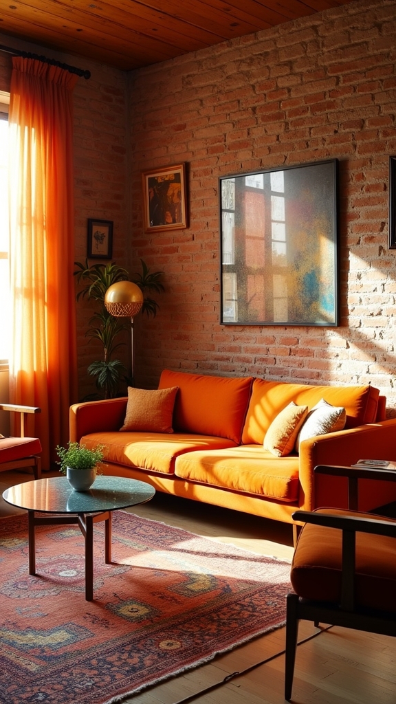
20 Orange Living Room Ideas That Are Warm and Inviting
A contemporary orange living room can feel both invigorating and welcoming by selecting earthy terracottas, vibrant coppers, or subtle peach tones tailored to the room’s light and architecture. Designers recommend balancing bold burnt orange walls or statement sofas with teal or navy accents, layered textures, and natural materials for warmth and cohesiveness. Clever contrast, color-blocking, and focus on architectural features shape inviting, trend-forward spaces. Explore expert ways to style orange that maximize comfort and visual interest.
Key Takeaways
- Choose rich burnt orange or earthy copper tones to create a cozy, welcoming atmosphere in your living room.
- Pair orange walls or accents with cool complementary colors like teal or navy for balanced, visually striking spaces.
- Highlight architectural features using saturated shades of orange and layer textures for added depth and warmth.
- Incorporate statement furniture, such as a burnt orange sofa or ottoman, and accent with pillows and throws for a modern touch.
- Combine orange hues with natural materials like wood and stone to enhance warmth and achieve a cohesive, inviting look.
Choosing the Perfect Shade of Orange

When selecting the ideal shade of orange for a living room, designers consider the spectrum from vibrant burnt hues to subdued, earthy tones such as Earths Core, Copper Blush, and Brick Red.
Designers choose from vibrant burnt oranges to earthy tones like Earths Core, Copper Blush, and Brick Red for living room palettes.
The process of choosing the right orange color involves evaluating the room’s orientation, natural light, and existing architectural features. Deeper tones like Brick Red can ground a space, while mid-range options such as Copper Blush lend warmth without overwhelming.
Incorporating layered shades of orange color adds depth, creating a dynamic visual narrative. Feature walls in bold orange can accentuate focal points, while more muted tones integrate seamlessly with natural materials like wood and metal.
Ultimately, spatial planning with the right shade of orange color guarantees a cohesive, trend-forward, and inviting living room environment.
Creating Contrast With Complementary Colors
While expertly planned color schemes are essential in interior design, integrating complementary hues with orange can enhance a living room’s aesthetic and spatial impact.
Burnt orange accents, when paired with complementary colours such as teal or navy blue, create a visually dynamic equilibrium between warm and cool tones. A feature wall in a saturated shade like Toasted Clay establishes a strong focal point, while introducing Teal Lux on a smaller accent wall injects depth and sophistication. Thoughtful color choices create a cohesive and polished aesthetic, enhancing the overall harmony of the space.
By incorporating a crisp white ceiling and trim, the boldness of burnt orange and its complementary colours is amplified, ensuring the palette remains vibrant without overwhelming the space.
Warm neutrals further balance the scheme, producing a cohesive ambiance and reinforcing the room’s inviting, contemporary appeal through strategic spatial planning.
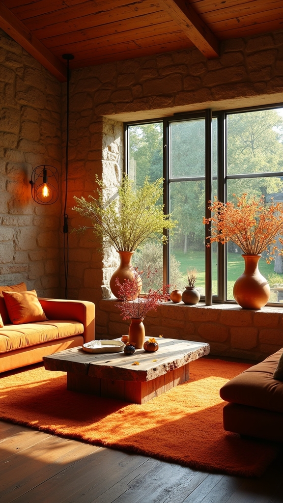
Highlighting Architectural Features With Burnt Orange

Balanced color pairings raise spatial dynamics, but thoughtful application of burnt orange can also accentuate architectural features. In a burnt orange living room, painting a single wall, alcove, or niche in a saturated shade such as Toasted Clay draws the eye toward unique architectural features—be it exposed wooden beams or a distinctive mantelpiece. Expert spatial planning recommends pairing burnt orange with pale neutrals like Timeless, ensuring the highlighted elements maintain prominence without overwhelming the composition. Integrating warm accents such as Frosted Papaya further defines focal points, creating a layered, cohesive environment. This approach transforms conventional spaces, using color to articulate and celebrate architectural features while preserving visual balance. Incorporating geometric patterned rugs contributes to the overall aesthetic, enhancing the inviting atmosphere. The result is a curated, inviting atmosphere that capitalizes on both contemporary color trends and classic design principles.
Embracing Color Blocking for a Bold Look
How does one infuse vibrancy and spatial clarity into a living room design? Color blocking with burnt orange provides a sophisticated solution. This technique, rooted in contemporary spatial planning, employs distinct shades—such as a muted burnt orange on lower wall sections (think Copper Blush) paired with lighter hues above—to achieve dynamic contrast and zone definition.
Key strategies include:
- Define zones: Use color blocking to demarcate relaxation, reading, or entertainment areas within open-plan layouts.
- Balance intensity: Offset bold burnt orange with neutral furnishings and natural wood to ground the palette.
- Layer accents: Integrate black pendant lighting or copper/gold metallics for added depth and refinement.
- Shape atmosphere: Employ color blocking to foster a vibrant, inviting living room suited for both socializing and unwinding. Deep oranges envelop living spaces in autumn warmth, enhancing the ambiance with rich earthy tones that add depth and a stylishly inviting atmosphere.
Pairing Orange With Earthy Tones for a Scandi Vibe

Current Scandinavian design trends emphasize the synergy of burnt orange with soft neutrals, achieving warmth through strategic layering of natural textures such as wood, linen, and wool.
In spatial planning, a neutral backdrop provides visual clarity, allowing orange accents and earthy tones to create depth without overwhelming the room. This approach fosters a balanced yet inviting aesthetic, aligning with the minimalist ethos of contemporary Scandi interiors.
Layering Natural Textures
A strategic approach to Scandinavian-inspired design involves layering natural textures alongside a curated palette of burnt orange and earthy tones.
Expert spatial planning leverages the interplay between tactile materials and color to establish a harmonious, inviting atmosphere. The use of organic surfaces and thoughtfully selected finishes allows the vibrancy of burnt orange to serve as a focal point while maintaining visual cohesion with deep browns, muted greens, and soft beiges.
- Integrate wooden furniture and accents to ground the space in warmth and authenticity.
- Incorporate woven textiles—think chunky knitted throws and textured cushions—for added comfort and visual interest.
- Use stone or terracotta elements to introduce subtle variation and reinforce the earthy palette.
- Layer jute rugs and natural fiber accessories to enhance the relaxed, Scandi-inspired vibe.
Soft Neutrals Meet Orange
When soft neutrals such as beige, taupe, and creamy whites are layered with burnt orange accents, the resulting palette embodies the understated warmth central to Scandinavian design.
The strategic juxtaposition of burnt orange with earthy tones—like olive green and muted browns—reinforces a sense of tranquility and groundedness, essential for a Scandi-inspired living room.
Utilizing color-blocking techniques, such as a burnt orange accent wall paired with neutral furnishings, achieves spatial definition while preserving an open, airy ambiance.
The inclusion of textural elements—woven throws, natural wood, and subtle metallic finishes in brass or copper—introduces tactile depth and visual interest.
This approach to spatial planning guarantees a harmonious balance, with soft neutrals and burnt orange working in concert to create a cohesive, inviting living environment.
Designing a Cozy Rust-Inspired Living Room
By utilizing rich burnt orange shades such as Earths Core and Copper Blush on walls, designers establish a foundation of warmth that envelops the living space in a rust-inspired ambiance.
This palette fosters a warm and inviting environment, aligning with current trends favoring earthy, saturated hues. The strategic integration of materials and textures further enhances the spatial experience, resulting in a visually cohesive and inviting room.
Incorporating natural materials like wood, stone, and metal accents enhances rustic charm and authenticity, complementing the overall design.
Key elements include:
- Natural Materials: Incorporate wooden furnishings and metal accents to reinforce rustic charm and complement burnt orange tones.
- Layered Textures: Use knitted throws, plush pillows, and woven rugs in earthy tones for depth and tactile comfort.
- Accent Colors: Introduce teal or navy for dynamic contrast without sacrificing coziness.
- Architectural Highlights: Emphasize beams or fireplaces with warm hues to add visual interest.
Using Orange Accent Walls as a Focal Point
Selecting the ideal shade of orange, such as Burnt Orange or Toasted Clay, is vital for establishing a welcoming focal point within the living room’s spatial hierarchy.
Strategic use of complementary hues like navy or teal enhances visual interest while maintaining equilibrium with neutral furnishings.
Employing an orange accent wall to frame architectural elements, such as fireplaces or exposed beams, further amplifies depth and delineates zones within the space.
Choosing the Perfect Shade
How does one determine the ideal orange for an accent wall that commands attention without overwhelming the living room’s spatial harmony? Selecting the perfect shade involves expert consideration of undertones, ambient light, and architectural features.
Burnt orange, for example, offers a sophisticated depth, particularly in finishes like Earths Core or Toasted Clay, creating a warm focal point while retaining contemporary appeal. Strategic placement and pairing with neutral trims can amplify the impact of the accent wall.
- Assess room orientation and natural light to determine whether deeper or lighter orange tones will optimize spatial perception.
- Evaluate architectural elements—beams, mantels, or alcoves—that could be enhanced by a burnt orange accent wall.
- Layer multiple orange shades, such as muted copper or brick red, for added dimension.
- Opt for a crisp white ceiling and trim to brighten and frame the feature wall.
Balancing With Complementary Colors
Color synergy defines the success of an orange accent wall as a focal point—especially when juxtaposed with cooler complementary hues such as teal or navy blue. This calculated pairing leverages the vibrancy orange offers, enhancing spatial energy while guaranteeing visual equilibrium.
In contemporary spatial planning, burnt orange feature walls are often balanced with crisp white ceilings and trims, which prevent the space from feeling saturated and maintain a luminous interior. Adjacent walls painted in light neutrals, like beige or taupe, reinforce openness and prevent the orange from dominating the room.
Designers may also strategically position orange in smaller accent zones, using complementary colors to create depth and cohesion. This approach guarantees the living area feels both inviting and expertly curated, reflecting current color trends.
Highlighting Architectural Features
When thoughtfully applied, burnt orange accent walls serve as strategic visual anchors, transforming ordinary architectural features into compelling focal points within the living room.
Design professionals utilize this dynamic hue to highlight architectural features such as exposed beams, alcoves, or a fireplace surround. Rich shades like Toasted Clay or Earth’s Core lend depth and definition, contrasting beautifully against pale neutrals like Timeless, which amplify the vibrancy without overpowering the space.
This approach is especially effective in spatial planning, ensuring feature elements are celebrated rather than lost.
- Use burnt orange behind a mantelpiece to intensify its presence.
- Highlight architectural features—like built-in shelving—by framing them with saturated orange.
- Pair burnt orange with crisp white ceilings and trim for contrast.
- Integrate warm undertones to complement rustic wood accents.
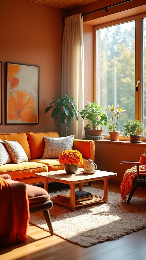
Layering Textures and Patterns in Orange Hues
By strategically layering textures and patterns in orange hues, designers can achieve a living room that balances visual depth with inviting warmth.
Layering textures—such as knitted throws, plush cushions, and woven rugs—introduces tactile complexity, turning an ordinary space into a multidimensional environment. Patterns in burnt orange, whether showcased on accent chairs or decorative pillows, add rhythmic visual interest while maintaining a cohesive palette.
Layering knitted throws, plush cushions, and woven rugs creates a multidimensional space with vibrant orange patterns and cohesive visual intrigue.
Spatial planning benefits from the interplay of earthy and vibrant orange shades, creating an engaging ambiance without overwhelming the senses. Incorporating natural wood elements and metallic finishes alongside these layers enhances contrast and sophistication.
Patterned curtains in orange further frame the space, utilizing natural light and reinforcing the room’s warmth. This methodology guarantees a balanced, contemporary, and welcoming living area.
Incorporating Orange Through Statement Furniture

A singular statement furniture piece in burnt orange, such as a sculptural sofa or mid-century armchair, anchors the living room with a curated sense of vibrancy and intent.
Capitalizing on statement furniture in this saturated hue injects dynamic energy while serving as a focal point in contemporary and transitional interiors.
Strategic spatial planning guarantees these pieces command attention without disrupting flow.
For a sophisticated approach, designers often recommend:
- Selecting a burnt orange sofa to establish a bold centerpiece and set the color narrative.
- Incorporating functional accents like ottomans or coffee tables in burnt orange for multipurpose use and cohesive style.
- Layering with textiles—such as throw pillows or blankets—to introduce warmth and comfort.
- Utilizing accent pieces like side tables or stools to punctuate the design and encourage playful experimentation.
Incorporating rich textures and luxurious materials such as velvet or silk in the living room can enhance the overall aesthetic appeal and create an indulgent atmosphere.
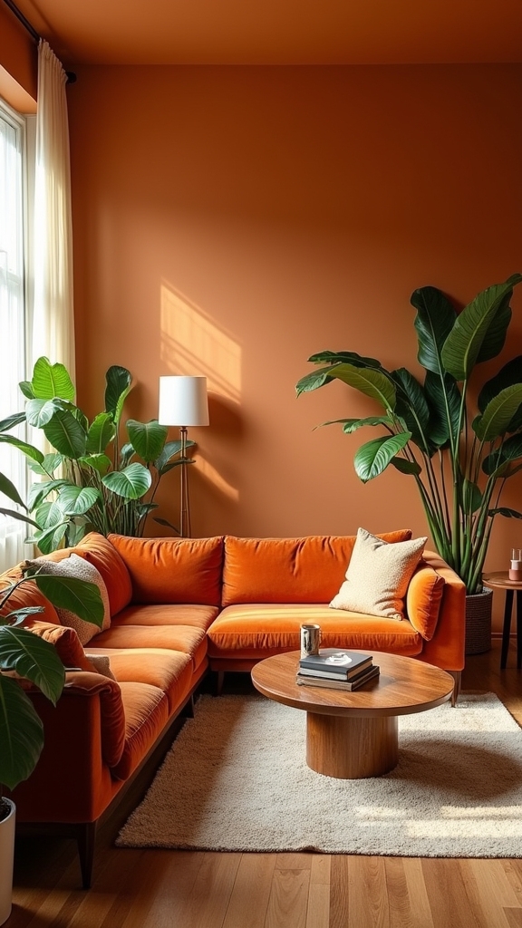
Balancing Orange With Soft Neutrals
Although burnt orange introduces dynamic warmth to living room design, its full potential is realized when juxtaposed against a foundation of soft neutrals such as beige, cream, and light grey.
Burnt orange shines brightest when paired with soft neutrals, bringing both warmth and balance to modern living room design.
In contemporary interiors, the interplay between orange and neutral tones achieves visual equilibrium, ensuring the space feels welcoming rather than overstimulating.
Strategic spatial planning recommends anchoring the room with neutral furniture—such as a light grey sectional or cream armchair—while employing orange as a calculated accent.
This approach supports a cohesive aesthetic, allowing the vibrancy of orange to serve as a sophisticated focal point.
Layering these hues not only enhances spatial depth but also aligns with current trends favoring understated elegance.
Adding Warmth With Burnt Orange Textiles
Building on the harmonious foundation established by soft neutrals, the strategic incorporation of burnt orange textiles introduces tactile warmth and a curated sense of comfort into contemporary living rooms. Designers leverage this rich hue to reinforce spatial cohesion and enhance the ambiance. Burnt orange works especially well when applied to soft furnishings and accent textiles, further improving the room’s inviting character. For a sophisticated yet approachable result, consider these expert strategies:
- Layering plush pillows and throws: Utilize various textures in burnt orange to add visual depth and warmth to seating.
- Anchoring with area rugs: A burnt orange rug grounds the space, offering both color and comfort underfoot.
- Framing with curtains: Burnt orange draperies filter natural light, casting a soft, warm glow.
- Curating accent decor: Select burnt orange vases or objects for cohesive color continuity.
Consider using wooden furniture to complement burnt orange textiles, as it adds warmth and character while maintaining the room’s inviting atmosphere.
Enhancing Natural Materials With Orange Accents
When natural materials such as wood, stone, and metal form the architectural backbone of a living room, the introduction of burnt orange accents provides a thoughtfully curated counterbalance, amplifying both warmth and visual interest. Burnt orange, especially in shades like Earths Core, brings out the richness of wood grains and complements the cool undertones of metal or stone. Strategic color-blocking—where natural wood meets burnt orange walls—can delineate zones in open-concept layouts. Accessories such as knitted throws or velvet pillows in burnt orange modernize rustic furniture, while drapes in this hue frame wooden windows, enhancing organic cohesion and maximizing daylight. The integration of these elements raises spatial harmony and on-trend sophistication.
| Natural Material | Orange Accent | Effect |
|---|---|---|
| Wood | Burnt orange wall paint | Highlights architectural grain |
| Stone | Orange textiles | Enhances warmth |
| Metal | Orange drapes | Softens industrial edge |
Bringing Energy to Small Living Spaces
Vibrancy defines the successful use of orange in compact living rooms, where spatial constraints demand intentional color placement. Bold orange tones, when skillfully applied, invigorate small spaces without overwhelming the environment.
Interior designers increasingly leverage burnt orange living room ideas to infuse a warm hue while maintaining visual balance. The strategic placement of orange, whether in textiles or as a focal wall, enhances energy and livability.
For ideal spatial planning, experts recommend the following techniques:
- Utilize burnt orange throw pillows or rugs to introduce warmth without dominating the palette.
- Highlight a single wall with orange paint or wallpaper to create a compelling focal point.
- Select complementary colors, such as teal or navy, to heighten contrast and modern aesthetic.
- Incorporate orange decorative objects to reflect personality and uplift ambiance.
Additionally, incorporating vertical shelving can maximize storage opportunities while maintaining the room’s spacious feel, allowing for both functionality and aesthetic appeal.
Integrating Metallics for a Sophisticated Touch
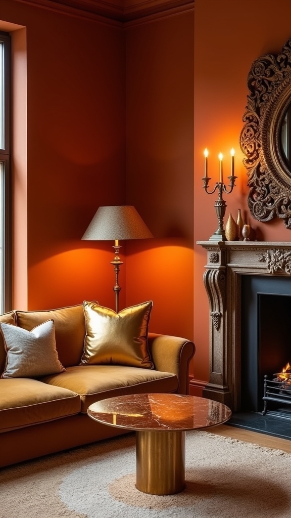
Although burnt orange inherently radiates warmth and depth, the integration of metallic accents—such as gold, brass, or copper—raises the palette with a contemporary sophistication prized in current design trends.
These metallic elements, strategically incorporated via light fixtures, decorative objects, or furniture hardware, introduce visual contrast and enhance the richness of burnt orange. The reflective qualities of metallic finishes amplify available light, resulting in brighter, more dynamic spatial perception—an advantage in living rooms with darker orange walls.
Achieving equilibrium requires careful spatial planning: selecting complementary textures and colors guarantees harmony between the boldness of burnt orange and the luster of metallic accents. Incorporating polished metals for fixtures adds an elegant touch, enhancing the overall design sophistication.
The result is a balanced, chic environment that feels both inviting and raised, demonstrating a nuanced understanding of modern color and material interplay.
Showcasing Art and Decorative Objects in Orange
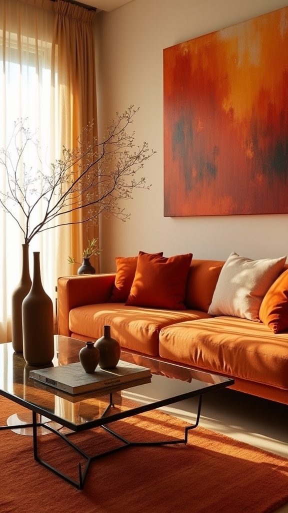
Beyond the interplay of metallic accents, the curation of art and decorative objects in orange offers a sophisticated approach to reinforcing the room’s chromatic identity.
Thoughtful spatial planning allows orange wall art and curated accessories to enhance both energy and cohesion within the living room. Experts recommend the following strategies for ideal impact:
Intentional spatial planning with orange art and accessories amplifies both vibrancy and unity, transforming the living room’s atmosphere.
- Burnt Orange Wall Art: Large-scale canvases or framed prints in burnt orange act as dynamic focal points, anchoring the room’s palette and expressing personal style.
- Sculptural Orange Decorative Objects: Ceramic vases or abstract sculptures introduce tactile interest and harmonize disparate design elements.
- Textile Layering: Orange throw pillows or rugs infuse warmth, grounding seating arrangements without visual saturation.
- Strategic Placement: Positioning orange accents near architectural features, such as fireplaces or exposed beams, enhances spatial harmony and highlights structural beauty.
Combining Orange and Teal for Dynamic Contrast
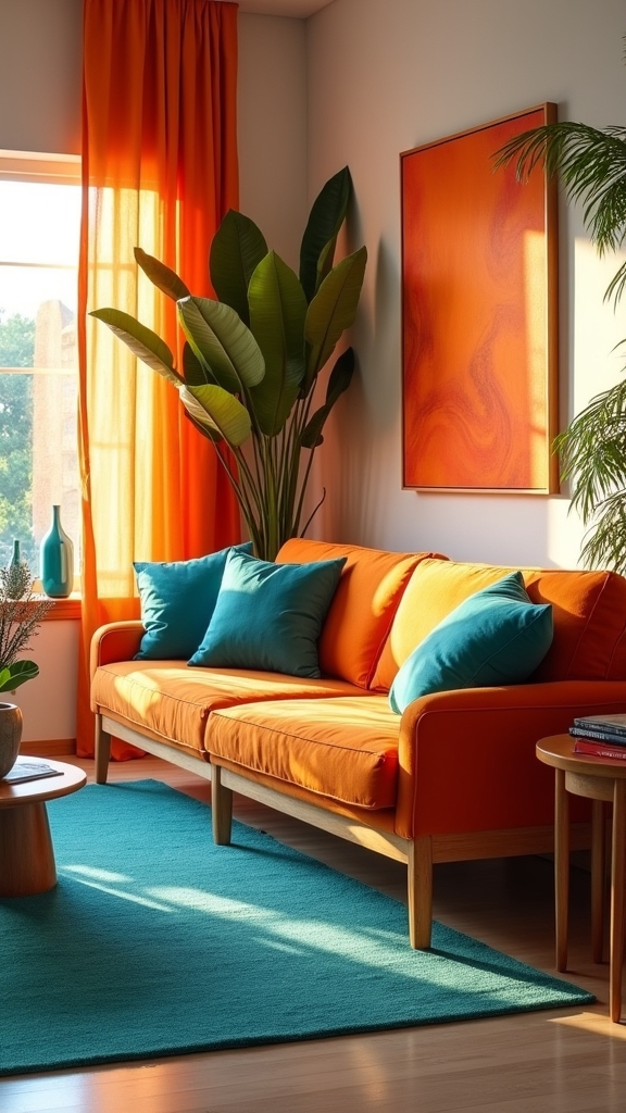
Pairing burnt orange with teal introduces a sophisticated interplay of warm and cool hues, a technique favored in contemporary spatial planning for its visual impact.
Feature walls in each color create immediate focal points, while curated teal accessories punctuate the palette and enhance zonal interest.
To maintain balance, experts recommend integrating crisp white trim and neutral furnishings, ensuring the space remains cohesive and inviting.
Balancing Warmth and Cool
When strategically combined, burnt orange and teal introduce a dynamic interplay of warm and cool tones that defines contemporary living room design.
This sophisticated pairing leverages color theory to create visual balance and heightened spatial interest. The warmth of burnt orange injects energy and intimacy, while the cool undertones of teal provide a rejuvenating counterpoint—ideal for trend-forward interiors.
Design professionals advocate the following spatial planning strategies:
- Zone Definition: Use burnt orange in larger areas and teal in smaller accents to delineate functional zones.
- Layered Textures: Incorporate knitted throws in burnt orange and plush cushions in teal to enhance tactile depth.
- Neutral Framing: Employ crisp white ceilings and trims to sharpen the interplay of these contrasting hues.
- Cohesive Integration: Maintain a consistent palette to unify diverse furnishings and decor.
Feature Walls That Pop
A well-executed feature wall in burnt orange, such as Toasted Clay, establishes an immediate focal point and anchors the living room’s visual narrative.
This dynamic hue, when paired with a complementary accent wall in teal like Teal Lux, leverages color theory to create compelling contrast and spatial depth.
The interplay between the warm, enveloping tones of burnt orange and the cool, invigorating presence of teal energizes the space, making it simultaneously inviting and visually stimulating.
For ideal spatial planning, crisp white ceilings and trim delineate the bold feature wall, amplifying light and providing a neutral framework.
In open-concept layouts, this strategic color juxtaposition subtly demarcates zones while maintaining cohesion, exemplifying a trend-forward approach to contemporary living room design.
Accentuating With Accessories
Strategic layering of accessories in teal and burnt orange introduces dynamic contrast, enhancing both visual rhythm and spatial balance within the living room.
This sophisticated interplay of warm and cool hues transforms orange living room accessories from simple décor elements into intentional design tools. The trend-forward approach leverages spatial planning to combine burnt orange’s warmth with teal’s invigorating undertones, grounded by neutral white trims and ceilings for ideal color clarity.
Metallic finishes, such as brass or copper, further amplify the palette, reinforcing a warm design while maintaining vibrancy.
- Teal cushions and throws: Anchor orange furniture with tactile contrast for a cohesive look.
- Artwork incorporating both tones: Integrate visual interest and unify the scheme.
- Metallic accent pieces: Enhance warmth and add contemporary sophistication.
- Feature wall in Toasted Clay: Establish a balanced, engaging focal point.
Creating Seasonal Interest With Autumnal Orange
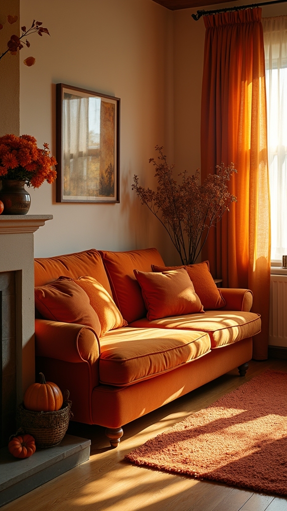
By integrating burnt orange accents and autumnal motifs, designers can infuse living spaces with a sense of seasonal warmth and visual depth. Burnt orange living room ideas, such as plush cushions and knitted throws, deliver both tactile richness and visual comfort, ideal for creating seasonal interest. Spatial planning benefits from pairing burnt orange walls with warm neutral furnishings, allowing the color to anchor the room without overwhelming it. Decorative elements—like dried leaves, pumpkins, or autumnal artwork—provide layers of seasonal narrative while maintaining a sophisticated palette. Candles in complementary hues further enhance ambiance, drawing on current trends that favor multi-sensory design. Incorporating warm scents like bergamot can also enhance the cozy atmosphere of the room, making it an inviting space for relaxation and gatherings.
| Element | Function | Seasonal Effect |
|---|---|---|
| Burnt Orange Cushions | Adds comfort | Evokes autumn warmth |
| Knitted Throws | Enhances texture | Invites relaxation |
| Seasonal Decor | Visual interest | Deepens coziness |
Utilizing Orange in Open-Plan Living Areas
How can the dynamic qualities of orange be harnessed to enhance open-plan living areas? Design experts recognize that burnt orange serves as an effective unifying accent, seamlessly linking distinct zones within expansive layouts. This approach leverages spatial planning to maintain cohesion without sacrificing individuality across multifunctional spaces.
Contemporary trends favor varied orange tones—ranging from muted Copper Blush to vibrant Toasted Clay—to delineate different areas while preserving visual harmony.
- Feature walls in rich burnt orange establish focal points, adding architectural depth and inviting energy.
- Burnt orange textiles—pillows and throws—integrate warmth and tactility, balancing minimal neutral furnishings.
- Layered hues of orange on adjoining walls define and distinguish open-plan segments, facilitating subtle shifts.
- Pairing burnt orange with teal or navy introduces sophisticated contrast without overwhelming expansive interiors.
Styling Orange Curtains and Window Treatments
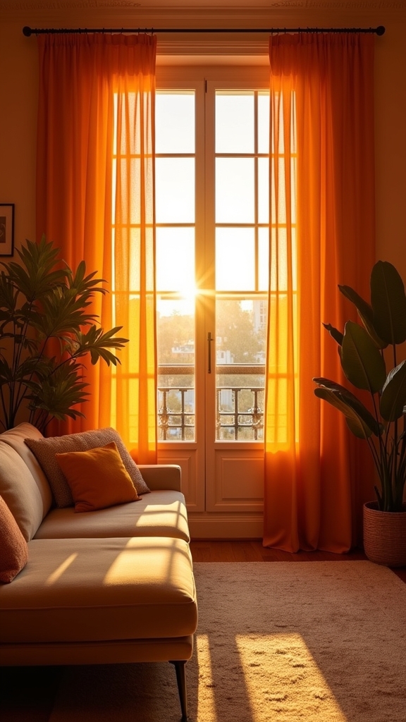
Selecting the ideal shade of orange for curtains, such as Copper Blush or Earths Core, supports both visual cohesion and current design trajectories in contemporary living rooms.
Strategic pairing with complementary hues like teal or navy blue introduces dynamic contrast, ensuring the window zone becomes a sophisticated focal point.
Expert spatial planning emphasizes the impact of color interaction to balance warmth, vibrancy, and harmony within the space.
Choosing the Perfect Shade
Curiously, the impact of orange curtains within a living room hinges on selecting a shade that harmonizes with both spatial dynamics and current design trends.
The nuanced undertones of burnt orange—such as Copper Blush or Earths Core—offer a sophisticated warmth, seamlessly integrating with neutral tones for a balanced visual narrative.
Expert spatial planning suggests that the right orange shade can enhance perceived room size, light quality, and ambiance.
Consider these guidelines:
- Assess undertones: Opt for muted, earthy burnt orange for a timeless effect, or vivid hues for bold statements.
- Material matters: Lightweight fabrics diffuse sunlight, amplifying brightness while maintaining color integrity.
- Layering impact: Combine orange curtains with sheers for dimensional interest and controlled warmth.
- Color scheme integration: Anchor the dramatic flair of orange with neutral tones to guarantee cohesion.
Pairing With Complementary Colors
When considering the interplay of color in a living room, expertly pairing orange curtains with complementary tones such as deep teal, navy, or subdued neutrals delivers a sophisticated chromatic balance that aligns with contemporary design trends. Utilizing deeper blue or green accents in window treatments tempers the intensity of orange curtains, creating a composed yet energetic environment. Layering with sheer white or cream drapes introduces light diffusion and depth, enhancing spatial perception. For a cohesive visual narrative, accessories in burnt orange and complementary colors unify the scheme. Patterned orange curtains featuring multiple hues can serve as an engaging focal point. Thoughtful spatial planning guarantees the warm vibrancy of orange is harmonized for inviting, modern living spaces.
| Curtain Color | Complementary Accent | Styling Suggestion |
|---|---|---|
| Burnt Orange | Deep Navy | Velvet pillows |
| Tangerine | Teal | Patterned area rug |
| Rust | Cream | Sheer drape layering |
| Orange Patterned | Sage Green | Botanical prints |
| Pumpkin | Charcoal Gray | Textured throws |
Mixing Vintage Finds With Modern Orange Elements
A thoughtful juxtaposition of vintage finds and modern orange elements infuses the living room with both warmth and visual intrigue. This design strategy leverages the nostalgic appeal of vintage while capitalizing on the vibrancy of modern orange accents, promoting a space that feels both curated and current. Employing expert spatial planning guarantees harmony between old and new, avoiding visual clutter while highlighting key features. When executed intentionally, this approach supports trend-forward interiors that remain timeless. Pair a vintage mid-century armchair with modern orange cushions to balance retro and contemporary aesthetics. Integrate vintage-patterned orange textiles, such as rugs, against modern burnt orange walls for layered warmth. Use a vintage pendant light as a statement focal point alongside sleek orange decor. Frame vintage art in modern styles to accentuate orange walls and unify eras. Additionally, incorporation of mirrors can enhance light and depth, strategically placed to highlight decorative items and enhance natural light.
Frequently Asked Questions
What Colours Go With Orange in a Living Room?
In living room design, experts suggest complementary colors such as deep blues, warm neutrals, and earthy tones to enhance orange accents. Incorporating metallics and soft pastels demonstrates trend awareness and optimizes spatial planning for balanced, inviting interiors.
How Do I Make My Room Warm and Inviting?
To create a warm and inviting room, one should prioritize cozy textiles and ambient lighting, employ strategic spatial planning, layer tactile materials, and integrate current design trends such as natural finishes and harmonious color palettes to optimize comfort and aesthetic appeal.
Is Orange Color Good for Living Room?
Current design trends highlight orange color psychology for its ability to foster warmth and sociability in living rooms. Spatial planning experts recommend integrating orange as accents or feature walls, utilizing its versatility to create contemporary, inviting environments.
What Color Goes Well With an Orange Sofa?
When selecting color combinations for an orange sofa, trend-aware designers recommend pairing with deep blues, earthy greens, or neutrals. Thoughtful spatial planning and curated sofa accessories such as metallic accents guarantee a balanced, sophisticated, and visually engaging living area.
Conclusion
Incorporating orange into living room design demonstrates a sophisticated grasp of color theory and spatial dynamics. By selecting nuanced shades, balancing with complementary hues, and strategically highlighting architectural details, designers can achieve both warmth and contemporary flair. Current trends favor earthy pairings and bold color blocking, while vintage-modern integrations maintain originality. Ultimately, an expertly curated orange living area maximizes visual impact, fosters inviting atmospheres, and enhances the overall spatial experience for both residents and guests.
5 Steps to Elegant Living Room Wall Decor Ideas
Navigate through 5 chic steps to transform your living room walls, and discover how to effortles
14 Living Room Grey Wall Ideas That Set a Calm Mood
Find out how grey walls can transform your living room into a serene retreat with these 14 calming i
Designing a Cozy Beige and Brown Living Room
Step into the world of sophisticated comfort with our guide on designing a cozy beige and brown livi
Leave a Reply