
Ten living room color combinations that work include fresh neutrals with natural wood, mushroom beige with black accents, and Scandi grey paired with mid-century blue. Navy with mustard introduces contemporary contrast, while earthy blue with curated decor adds soothing modernity. Pink and blue evoke Victorian charm, and layered greens foster tranquil harmony. Bold palettes like peacock teal with pink or vibrant orange with blue infuse drama and vibrancy. Each pairing offers unique inspiration and timeless appeal, with further suggestions ahead.
Key Takeaways
- Fresh neutrals paired with natural wood create a timeless, calming atmosphere adaptable to various living room styles.
- Scandi grey with mid-century blue accents delivers a modern, balanced look that feels both sophisticated and serene.
- Navy and mustard form a bold, dynamic pairing that adds contrast and energy for a contemporary living room.
- Layered greens with neutral tones promote tranquility and bring a nature-inspired, harmonious feel indoors.
- Pastel hues combined with vintage features evoke nostalgia and subtle vibrancy, perfect for a soft, inviting living space.
Fresh Neutrals With Natural Wood

Blending fresh neutrals with natural wood creates a living room aesthetic defined by tranquility and understated elegance. Soft creams and warm beiges, exemplified by tones like Eddy No.301 from Farrow & Ball, establish a calming atmosphere that feels both sophisticated and approachable. Natural wood elements—whether in coffee tables, exposed beams, or accent chairs—introduce visual warmth and tactile texture, grounding the space with an organic feel. The integration of potted plants further enhances this connection to nature, reinforcing serenity and inviting relaxation. Strategic placement of houseplants improve air quality, while adding interest and depth to the living room decor. This harmonious palette is trend-aware and versatile, seamlessly adapting to styles from modern minimalism to cozy rustic. By emphasizing fresh neutrals and natural wood, the living room achieves a timeless balance, ensuring comfort and effortless style for years to come.
Mushroom Beige and Black Accents

A canvas of Mushroom Beige offers a refined foundation for living rooms, channeling warmth and subtle sophistication inspired by natural hues. This trend-aware hue, especially with GoodHome Naturéa Mushroom Velvet matt, envelops the space in a calming atmosphere. Black accents—whether picture frames, lamps, or sleek furniture—introduce striking contrast while preserving an elegant, modern profile. The interplay between soft mushroom beige and bold black creates visual balance and depth, perfect for intimate gatherings. Incorporating natural elements like wooden furniture or woven rugs can further enhance the inviting character of a Mushroom Beige and Black accented room.
| Element | Mushroom Beige | Black Accents |
|---|---|---|
| Wall Color | Warm, enveloping, matte | N/A |
| Furniture | Soft upholstery, neutral | Statement pieces |
| Decor | Subtle, tonal accessories | Frames, lamps, vases |
| Atmosphere | Calming, inviting | Dramatic, sophisticated |
This pairing delivers a cohesive, trend-forward look that feels both understated and luxurious.
Scandi Grey Paired With Mid-Century Blue
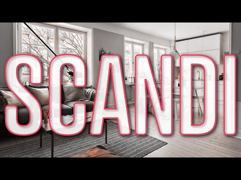
When Scandi Grey forms the backdrop of a living room, subtle undertones of blue and grey establish an atmosphere of tranquility and effortless harmony.
This versatile neutral color serves as a sophisticated canvas, allowing mid-century blue accents—such as Swedish Blue from Craig & Rose—to make a refined statement within the living space.
The interplay between scandi grey walls and mid-century blue furniture or accessories creates visual interest while maintaining a sense of cohesion and lightness.
Interior design trends favor this pairing for its ability to evoke calm and modernity, particularly when layered with natural elements like wooden furnishings and lush plants.
The result is a balanced, timeless look that seamlessly integrates comfort and style, perfect for contemporary homes seeking understated elegance with neutral colors.
Incorporating vibrant accent colors like yellow, green, or orange can further enhance the visual appeal and depth of the scandi grey and mid-century blue combination.
Navy and Mustard for Contemporary Contrast

Contrast defines the allure of navy and mustard in contemporary living rooms, producing a visually compelling interplay that feels both sophisticated and vibrant. This color scheme expertly balances the cool depth of navy—such as GoodHome Naturéa Siskin velvet matt—with the warm, energizing pop of mustard, exemplified by GoodHome Vence matt emulsion. In modern interiors, navy often anchors larger furniture pieces, like sofas, establishing a rich foundation, while mustard accents—cushions, throws, or art—inject brightness and movement without overwhelming the space. This calculated juxtaposition not only enhances the aesthetic of the living room but also fosters an inviting, dynamic ambiance. As a trending palette, navy and mustard offer a fresh and cohesive approach for those seeking to refresh their contemporary home design. For added sophistication, consider incorporating metallic accents like gold or brass to elevate the navy blue palette and enhance the visual interest of the space.
Earthy Blue With Curated Decor

Rooted in nature-inspired tranquility, earthy blue—such as Kittiwake No.307 from Farrow & Ball—sets a soothing tone for contemporary living rooms seeking a refined organic touch.
This calming palette enhances cozy living, inviting a serene atmosphere that feels both current and timeless. Thoughtful integration of natural wood elements, from coffee tables to shelving, complements earthy blue walls, grounding the space in warmth.
Curated decor—carefully selected artwork, ceramics, and accessories in harmonious hues—adds visual intrigue without disturbing the restful energy. Soft textures, introduced through plush cushions and tactile throws in earthy tones, enrich comfort while layering depth.
The result is a living room that feels intentionally composed and inviting, ideal for unwinding or appreciating art, embodying both aesthetic appeal and modern sensibility. Incorporating a green and wood paneling contrast can enhance architectural interest and visual harmony, adding depth and character to the room.
Deep Navy and Metallic Touches

While earthy blue palettes evoke organic calm, an entirely different statement emerges with deep navy paired alongside metallic accents. This colour scheme transforms living room design into a study of luxury and sophistication. Deep navy serves as a dramatic backdrop, while metallic accents—think gold or silver cushions, wall art, and light fixtures—add glamour and a striking contrast. A metallic feature wall or wallpaper becomes a luminous focal point, reflecting light and enhancing depth within the space. Carefully chosen accessories, such as metallic vases or sculptural decor, tie the scheme together for a unified look. Versatile and trend-forward, this pairing complements both modern and traditional interiors. Incorporating layered lighting techniques can further enhance the ambiance, adding warmth and depth to the living space.
Pink and Blue Victorian Charm

The Pink and Blue Victorian Charm palette showcases a sophisticated interplay of soft pastel walls, typically pairing blush pink above with serene blue below for a graceful, two-tone effect.
Vintage features, such as ornate coving and classic fireplaces, anchor the space with period authenticity.
Carefully chosen accents and rich textures complete the look, reflecting current trends in nostalgic yet invigorating living room design.
Soft Pastel Wall Pairing
A gentle interplay of light pink and cool blue infuses the living room with a subtle pastel palette reminiscent of Victorian elegance, fostering both warmth and tranquility.
The soft pastel palette, achieved with shades like Tailor Tack and Kittiwake from Farrow & Ball, layers light pink on upper walls and cool blue below, delivering visual depth and balanced sophistication.
This refined color combination highlights architectural elements such as ornate coving and vintage fireplaces, amplifying the room’s period charm while keeping the overall atmosphere serene.
To prevent the palette from appearing overly delicate, the inclusion of green accessories and subtle pops of orange or turquoise introduces fresh contrast, ensuring the space feels lively yet cohesive.
The result is a trend-aware setting suitable for diverse décor styles.
Vintage Features and Accents
Building on the delicate interplay of pastel hues, vintage features and accents enhance the pink and blue palette into a statement of Victorian charm.
Light pink graces the upper walls, while a cool blue anchors the lower half, creating a soft palette that feels both nostalgic and refined.
Ornate coving and vintage fireplaces serve as architectural focal points, infusing the space with elegance and historic character.
Plush sofas and intricately patterned armchairs further the period-inspired look, balancing comfort with sophistication.
Layered textures—such as velvet cushions and detailed rugs—add depth and guarantee a cozy atmosphere.
To prevent the scheme from feeling too muted, decorative accessories in green, orange, and turquoise introduce subtle vibrancy, making the living room feel fresh yet undeniably timeless.
Layered Greens for Tranquil Harmony

When layered thoughtfully, shades of green infuse a living room with serene harmony, echoing the calming presence of nature indoors. Layered greens—ranging from sage to olive—work together to foster a calming ambiance, especially when enhanced by abundant natural light. This approach not only expands the room visually but also creates a tranquil, peaceful environment perfect for unwinding. Pairing green paint options, such as Dulux’s Tranquil Dawn, with subtle neutral tones like cream or beige, balances vibrancy and softness. Incorporating textured fabrics like velvet and linen further enhances the sophistication and comfort, creating a tactile dialogue with the outdoors.
| Layered Greens | Neutral Tones |
|---|---|
| Sage, olive, emerald | Soft cream, warm beige |
| Velvet cushions | Woven baskets |
| Tranquil Dawn walls | Linen curtains |
Through this synergy, the living room becomes a sanctuary, reflecting a contemporary, nature-inspired sensibility.
Peacock Teal and Pink for Bold Drama

Peacock teal sets a daring stage in contemporary living rooms, its saturated depth offering a dramatic canvas for bold pink accents.
This striking pairing transforms spaces into vivid showcases of personality and style, appealing to those who crave vibrant colors in their living room design.
For a cohesive and visually compelling effect, consider these elements:
- Dramatic Backdrop: Paint walls in a rich peacock teal, such as Rust-Oleum’s Peacock Suit, to establish a sophisticated foundation.
- Bold Contrasts: Introduce pink velvet armchairs or cushions as statement pieces, elevating the aesthetic with playful energy.
- Botanical Accessories: Layer in green and white foliage to soften the palette and add organic balance, grounding the boldness.
Incorporating gold or brass accents not only adds warmth and vibrancy but also enhances the overall sophistication of the space, making it an inviting atmosphere ideal for entertaining and leaving a memorable impression.
Vibrant Orange and Blue Complementary Scheme

A vibrant orange and blue complementary scheme brings a carefully measured interplay of warmth and coolness to the modern living room. Statement furniture, such as a cobalt sofa or tangerine accent chair, anchors the palette, while accessories like cushions and artwork introduce bold contrast. This approach creates a visually engaging space where energetic color meets curated design. Incorporating metallic accents like gold can enhance sophistication by reflecting ambient light and adding brightness to the space.
Balancing Warmth and Coolness
Vibrant interplay defines the orange and blue complementary scheme, where warmth meets coolness in dynamic harmony. This living room colour scheme thrives on the energy of orange living room accents paired with the calming blue colour, offering both visual excitement and equilibrium.
The key lies in a thoughtful colour palette that layers burnt orange or tangerine with soft, cool blues to create a fresh, inviting atmosphere.
- Contrast with Cohesion: Pairing saturated orange tones with muted blues achieves a lively yet balanced look, keeping the space from feeling overwhelming.
- Depth through Variation: Mixing different shades—such as navy with tangerine—adds richness, ensuring the warmth and coolness coexist seamlessly.
- Flexible Accenting: Use accessories like pillows and throws to adjust intensity, allowing the scheme to evolve with trends or seasons.
Statement Furniture and Accents
Statement furniture anchors the orange and blue complementary scheme, transforming the living room into a striking showcase of contemporary style.
Vivid orange walls, such as those painted in GoodHome Naturéa Crocosmia Velvet matt, set a dynamic backdrop, immediately energizing the space. Against this canvas, blue accents—whether in the form of a plush sofa, velvet cushions, or a sleek blue coffee table—introduce a cool counterpoint, balancing the warmth and creating visual harmony.
Selecting statement furniture, like a sculptural orange armchair, not only enhances the room aesthetically but also serves as a bold focal point within the vibrant scheme.
To ground the palette and refine the look, accessories in contrasting colors such as grey or black provide a sophisticated, trend-aware finish to the overall composition.
Frequently Asked Questions
What Is the Best Color Combination for a Living Room?
The best color combination for a living room often features modern color palettes blending warm neutrals with pastel hues, complemented by bold accent walls or monochromatic schemes. Nature inspired tones further enhance aesthetic appeal, reflecting current trend-aware, detail-oriented design sensibilities.
What Dulux Colors Go Together for a Living Room?
Dulux color palettes pair beautifully for living room themes by blending warm neutral tones with cool color schemes. Accent wall ideas using textured finishes—like navy with grey or sage with cream—create inviting, trend-aware spaces with visual depth.
What Color Is on Trend for Living Rooms?
Trending hues for living room spaces emphasize warm neutrals, such as beige and soft taupe, reflecting calming color psychology. Bold accents—navy or jewel tones—add depth, while minimalist palettes with pastel pops create a sophisticated, contemporary aesthetic that’s highly sought-after.
How to Color Coordinate a Living Room?
To color coordinate a living room, one should consult color wheel basics to identify complementary colors, consider room size impact and lighting effects, incorporate texture variety, and reflect personal style, ensuring the palette is both visually balanced and trend-conscious.
Conclusion
From soothing neutrals to boldly layered hues, these living room color combinations showcase both timeless sophistication and modern flair. Thoughtful pairings—like navy with mustard or peacock teal with pink—invite personality, while earthy blues and layered greens cultivate calm. Each palette balances style and comfort, reflecting current design trends and classic appeal. By selecting hues with intention, anyone can transform their living room into a visually striking, harmonious retreat that feels as inviting as it looks.