
Orange and teal bedrooms blend visual vibrancy with sophisticated style. Strategic accent walls, bold textiles, and statement furniture create high-impact focal points, while expert layering of textures and patterns guarantees depth. Selecting the right teal undertones and pairing orange sparingly via accessories prevents visual overload. Organic materials and metallic accents enhance the palette, grounded by natural woods and balanced lighting. Neutrals and geometric rugs add clarity and cohesion. Discover how to adapt these expert concepts for any space or season.
Key Takeaways
- Pair bold orange and teal accent walls to create dynamic depth and high visual impact in the bedroom.
- Layer bedding, throw pillows, and textiles in both colors with varied textures for a rich, cohesive centerpiece.
- Incorporate statement furniture like teal dressers or orange headboards to anchor the room’s color scheme.
- Use geometric rugs and abstract art to unify the palette while adding pattern and visual interest.
- Balance vibrant accents with organic textiles and natural fiber rugs for comfort, grounding, and sustainability.
Orange and Teal Accent Walls: High-Impact Ideas
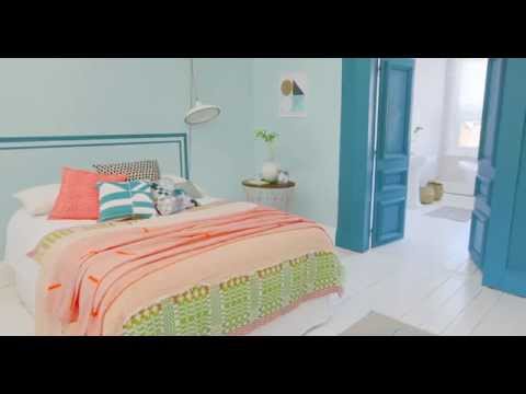
One impactful approach to bedroom design involves the strategic use of orange and teal accent walls, harnessing the vibrancy of orange against the calming undertones of teal to achieve a visually compelling focal point.
Utilizing color psychology, designers understand that orange energizes and stimulates, while teal promotes tranquility and balance. Effective accent wall techniques include painting a bold orange on one wall juxtaposed with a nuanced teal on an adjacent surface, creating dynamic depth and layered visual interest.
Lighting considerations are paramount, as both natural and artificial sources influence color perception and mood. To unify the scheme, complementary textiles and artwork that integrate both hues are recommended.
Balancing bold and muted tones guarantees the room remains inviting, while preserving the high-impact aesthetic that defines this color pairing.
Choosing the Right Shade of Teal for Your Room

Selecting an appropriate shade of teal is a nuanced process that profoundly shapes the mood and cohesion of an orange and teal bedroom.
Expert design guidance emphasizes the importance of teal undertones selection—ranging from blue-green vibrancy to muted, gray-infused variants. The natural lighting impact is paramount; rooms flooded with sunlight can accommodate saturated teals for a lively ambiance, whereas dim or artificially lit spaces benefit from softer, subdued hues.
Selecting the right teal undertone and considering your room’s lighting is key to achieving the perfect orange and teal balance.
Cohesion is achieved by aligning the teal's tonality with existing furnishings: lighter teals instill tranquility, while deeper shades impart sophistication and depth.
Designers recommend testing paint swatches in situ to observe how the hue interacts with bedding, artwork, and daylight variations. Pairing the chosen teal with burnt orange accents guarantees a visually compelling, balanced composition.
Making Orange Pop Without Overpowering the Space

A measured approach to incorporating orange guarantees visual interest without disrupting the room’s equilibrium. Utilizing orange as an accent color—seen in throw pillows, lamps, or a burnt orange headboard—capitalizes on color psychology by injecting energy and warmth while preventing sensory overload.
When juxtaposed against a dominant teal backdrop, orange becomes a deliberate focal point rather than a competing element. Introducing gradient shades, such as terracotta or coral, adds depth and sophistication, complementing teal’s tranquility.
Layering orange textiles with neutrals, like cream, visually grounds the palette and maintains harmony. Strategic placement of bold orange in artwork or select accessories guarantees cohesion, allowing teal to anchor the design.
This controlled methodology celebrates orange’s vibrancy while preserving a balanced, thoughtfully curated bedroom environment.
Balancing Bold Colors With Crisp White Highlights

Introducing crisp white highlights is essential for enhancing brightness in an orange and teal bedroom, ensuring the space remains airy and inviting.
Strategic placement of white elements creates visual breathing space, preventing color fatigue and allowing each hue to stand out distinctly. This approach accentuates color contrasts, bringing sophistication and balance to the overall design scheme.
Enhancing Brightness With White
When balanced with crisp white highlights, the bold pairing of orange and teal achieves greater luminosity and sophistication. White acts as a visual moderator, neutralizing the intense color temperature of orange and teal while amplifying natural light within the space.
Strategically placed white accents—such as bedding, curtains, or furniture—introduce texture contrast, ensuring the visual energy of the palette remains harmonious and not overpowering. A white backdrop on walls provides clarity, allowing orange and teal elements to stand out with precision and vibrancy.
Accessories like throw pillows or framed artwork featuring white details further refine the aesthetic, directing focus while maintaining a serene, cohesive atmosphere. This expert approach enhances the overall ambiance, ensuring the bedroom remains both bold and inviting without sacrificing comfort or style.
Creating Visual Breathing Space
Building on the luminosity achieved through white accents, the concept of visual breathing space becomes integral to balancing orange and teal’s boldness. In the context of color psychology, crisp white highlights act as neutral interludes, tempering the energetic interplay between vibrant hues.
Expert design guidance favors strategically placed white bedding, curtains, and accessories to create deliberate pauses within the color narrative, enhancing both airiness and spatial depth. Subtle elements such as white accent chairs, throw blankets, or lamp shades guide the eye and foster visual harmony, preventing overstimulation.
This careful modulation of white guarantees the room remains inviting and cohesive. By amplifying the vibrancy of orange and teal, white becomes an indispensable tool for achieving a well-balanced, visually dynamic bedroom environment.
Accentuating Color Contrasts
While orange and teal command attention with their saturated energy, the careful introduction of crisp white highlights is crucial for achieving compositional equilibrium.
White bedding, furniture accents, or trim serve not only as neutralizing elements but also as reflective surfaces, amplifying natural light and intensifying the vibrancy of both colors. This interplay leverages color psychology—white evokes clarity and calm, counterbalancing the stimulating properties of orange and the tranquil depth of teal.
Strategically positioned white accessories, such as lamps, frames, or pillows, create intentional visual pauses that prevent sensory overload and optimize spatial perception.
For cohesive style guidance, white wall art or decorative pieces can reference the room’s palette, unifying disparate bold elements. This approach guarantees a harmonious, visually dynamic space through expert space optimization.
Best Neutrals to Complement Orange and Teal

Although orange and teal inject vibrancy and energy into a bedroom, selecting the right neutrals is essential for achieving visual equilibrium.
Expertly curated neutral color combinations—such as cream, beige, and light gray—act as a balancing force, preventing the dominant hues from overpowering the space. Warm whites with subtle undertones enhance the inviting nature of orange while serving as a cohesive backdrop for teal accents, thereby enhancing color harmony.
For a more modern approach, cool taupes and greys introduce a calming counterpoint, allowing orange and teal to become striking focal points. Incorporating muted sandy browns or taupe grounds the palette, ensuring cohesion.
Light, airy accents in soft mint or pale peach add visual depth, supporting the bold color scheme without competing for attention.
Modern Geometric Rugs in Orange and Teal

A well-chosen modern geometric rug in orange and teal introduces dynamic visual interest, instantly anchoring the bedroom’s design scheme with bold pattern and saturated color.
Opting for abstract or structured motifs unifies disparate decor elements, especially when colors are echoed in bedding or curtains. Selecting the appropriate rug placement—such as partially under the bed or as a statement at the room’s center—maximizes the visual impact and spatial balance.
Material choice, whether wool for resilience or synthetic fibers for affordability, influences both comfort and rug maintenance requirements. Regular vacuuming and prompt spot cleaning preserve color vibrancy and pattern integrity.
With diverse sizes available and frequent sales offering significant discounts, integrating a geometric rug is an accessible strategy for reinforcing a cohesive and creative bedroom aesthetic.
Statement Furniture in Teal or Orange

Statement furniture in striking teal or vivid orange instantly defines the bedroom’s aesthetic, from sculptural dressers with lacquered finishes to bold accent chairs in plush upholstery.
Designers recommend selecting a bed frame in a saturated hue to anchor the space, ensuring it functions as both a visual and structural centerpiece. Each piece should balance form and function while reinforcing the chosen color palette for maximum impact.
For added dimension, consider pairing your statement furniture with complementary materials like natural wood or rattan, which provide textural variation and warmth while maintaining a cohesive and inviting atmosphere.
Eye-Catching Dresser Designs
When integrated thoughtfully into an orange and teal bedroom, a boldly colored dresser becomes a dynamic anchor that instantly commands attention. Teal dresser styles, especially those with vintage accent pieces, offer a striking focal point and inject visual depth into the space. Whether opting for a streamlined modern silhouette or a dresser with ornate hardware, the interplay of teal against orange enhances contrast and sophistication. Mixed materials, such as wood and metal, further boost the dresser’s presence, merging functionality with aesthetic appeal. To achieve cohesion, designers recommend pairing the dresser with orange lamps or curated decorative objects. This strategy unifies the color palette and transforms the dresser into an artistic centerpiece.
| Teal Dresser Style | Material | Design Focus |
|---|---|---|
| Vintage | Wood | Ornate Detailing |
| Modern | Metal | Sleek Lines |
| Adaptive | Mixed | Functional Storage |
| Art Deco | Lacquer | Geometric Hardware |
| Industrial | Metal/Wood | Minimalist Appeal |
Vibrant Accent Chairs
Beyond the dresser’s commanding presence, accent chairs in vibrant orange or teal introduce sculptural interest and fresh energy into the bedroom palette. Utilizing color psychology, orange evokes warmth and sociability, while teal brings tranquility and balance—making each chair an intentional mood-setter.
Select textured fabrics such as velvet or linen to add tactile richness and enhance the sense of luxury. Chair placement is critical: situate the chair where it invites interaction, such as a reading nook or by a window, without disrupting flow.
For visual harmony, coordinate an orange chair with teal throws or accent a teal chair with warm-toned pillows. Opt for silhouettes that echo the room’s prevailing design ethos, ensuring the accent chair feels curated, not arbitrary, within the composition.
Bold Bed Frame Choices
A bed frame in bold teal or orange instantly commands attention, anchoring the bedroom with both color and presence. Utilizing color psychology, teal evokes tranquility and creativity, while orange introduces warmth and energy.
Expertly chosen bed frame materials—such as velvet, linen, wood, or metal—directly influence the room’s tactile and visual impact. A statement bed frame not only sets the tone but also offers an opportunity to experiment with mixed materials and contrasting accents for enhanced style.
- Choose upholstered bed frames in burnt orange velvet or deep teal linen for added texture.
- Opt for metal frames in vibrant hues to achieve a modern industrial vibe.
- Mix teal wood with orange fabric accents for visual intrigue.
- Pair a bold platform bed with neutral bedding for striking contrast.
- Select materials that reinforce both comfort and color vibrancy.
Orange and Teal Bedding Ideas That Wow

Several impactful approaches can transform a bedroom through orange and teal bedding, establishing a striking visual centerpiece. Expertly curated bedding combinations—such as vibrant orange duvets paired with soft teal quilts—immediately capture attention while orchestrating a harmonious play of color brightness.
The interplay of rich and muted tones can be further enhanced by introducing throw pillows in multiple orange and teal shades, offering texture and reinforcing the palette. For year-round versatility, consider seasonally rotating duvet covers and quilts, maintaining the core color scheme for visual continuity.
Layering neutral or metallic-accented pillows introduces balance, toning down vivid hues for a refined atmosphere. Selecting bedding with bold graphic or floral motifs that unite both colors adds depth, ensuring the bed remains the focal design element.
Pattern and Solid Combinations for Orange and Teal Textiles

Strategic integration of patterned and solid textiles in orange and teal establishes both visual interest and compositional balance within the bedroom.
Expert designers recommend juxtaposing large-scale botanical motifs with crisp geometric prints, anchored by solid bedding to prevent overstimulation.
Layering diverse textures—such as velvet, cotton, and knit—further enriches the palette and enhances depth, ensuring the space remains inviting and cohesive.
Mixing Prints With Solids
While a carefully curated mix of prints and solids can enhance the sophistication of an orange and teal bedroom, the interplay between these elements demands thoughtful balance.
Expert designers emphasize the importance of pattern scale and texture variety in establishing visual interest without overwhelming the space. Large-scale florals or geometric bedding paired with solid orange or teal pillows achieves cohesion, while maintaining consistent color intensity across textiles guarantees a unified palette.
Accessories such as rugs or curtains can introduce subtle stripes or polka dots, echoing the primary hues for added intrigue. Strategic placement of solids among prints offers visual relief, letting individual patterns stand out.
- Opt for large-scale patterns for main textiles
- Use solids to balance and highlight prints
- Maintain consistent color intensity
- Introduce secondary patterns through accessories
- Leverage pattern scale for dynamic layering
Layering Textures For Depth
By thoughtfully layering a variety of textiles—such as cotton, velvet, and knit—in both orange and teal, designers achieve a harmonious interplay of warmth and depth within the bedroom. Expertly curated textile combinations, including patterned tribal or floral motifs paired with solid color accents, generate visual intrigue while creating contrast. Decorative pillows and throws, when selected in diverse textures, serve as tactile focal points, elevating the sensory richness of the space. Regularly rotating these elements—especially blankets and cushions—allows for seamless seasonal updates without compromising the integrity of the core palette. Balancing vibrant hues with muted shades guarantees the composition feels rich yet controlled. Below, a table illustrates effective ways to blend pattern and solid orange and teal textiles:
| Textile | Pattern Example | Solid Accent |
|---|---|---|
| Cotton | Tribal Print | Burnt Orange |
| Velvet | Floral Motif | Deep Teal |
| Knit | Chevron Pattern | Soft Aqua |
| Linen | Geometric Design | Rust Orange |
Layering Color and Texture With Throw Pillows

Although the bed often serves as the focal point in a bedroom, the thoughtful layering of throw pillows in orange and teal tones can enhance its visual impact.
Strategic pattern placement—mixing geometric, floral, and abstract designs—invites visual intrigue while maintaining cohesion within the chosen palette. Texture variety is essential; selecting fabrics such as linen, cotton, or faux fur not only introduces tactile depth but also amplifies comfort.
Mixing patterns and textures—think geometric prints and plush fabrics—creates visual interest and elevates both comfort and style on your bed.
A curated arrangement of different sizes and shapes, from lumbar to square pillows, achieves a sophisticated, multidimensional look. Regularly updating pillow selections according to seasonal trends enables effortless refreshment without straying from the core color scheme.
For expert results, consider the following:
- Incorporate diverse patterns
- Prioritize texture variety
- Use multiple pillow sizes and shapes
- Layer colors thoughtfully
- Rotate pillows seasonally
Drawing inspiration from Layering fabrics like velvet and linen, as seen in modern beige and black bedrooms, can help you achieve a similarly inviting and visually rich atmosphere in your orange and teal space.
Curtains and Window Treatments in Orange and Teal

After establishing depth and cohesion with layered throw pillows, attention naturally shifts to the impact of curtains and window treatments in an orange and teal bedroom.
Floor-length orange curtains dramatically frame windows against teal walls, intensifying the window color contrast while infusing warmth. Layering sheer white curtain fabrics beneath vibrant orange drapes offers both light control and multidimensional visual interest.
For a more dynamic aesthetic, patterned curtains featuring both orange and teal—such as geometric or floral motifs—provide seamless color integration and focal intrigue.
Sophisticated options include orange-trimmed teal curtains, which reinforce cohesion without overwhelming the palette. The interplay of fabric textures, from plush velvet to airy linen, modulates color perception and ambiance, subtly transforming the bedroom’s atmosphere as natural light shifts throughout the day.
Abstract Art That Unifies Your Color Palette

A well-chosen selection of abstract art serves as a sophisticated bridge between orange and teal elements, visually fusing disparate decor components into a unified palette.
Expertly curated abstract expressions enhance the bedroom’s aesthetic, allowing for seamless color interplay and cohesion. Large-scale canvases with bold shapes or textured surfaces in both hues assert themselves as commanding focal points, while smaller framed pieces echo the primary colors found in textiles and accessories.
Diverse styles—geometric or fluid—introduce visual dynamism and encourage personal interpretation within the thematic palette. Strategic placement above key furnishings further enhances spatial harmony.
- Opt for statement canvases featuring both orange and teal.
- Integrate smaller abstract art to reinforce palette unity.
- Mix geometric and fluid designs for visual intrigue.
- Reflect dominant room colors in art selections.
- Position artwork above beds or dressers for maximum impact.
Creating a Gallery Wall With Teal and Orange Prints

A curated gallery wall featuring teal and orange prints relies on thoughtful selection of coordinated art pieces that reinforce the room’s chromatic unity.
Strategic arrangement—anchoring the composition with larger works and layering smaller prints—maximizes visual impact and balance.
Creative frame choices, such as mixing sleek white with metallic gold finishes, further enhance cohesion while introducing subtle contrasts within the display.
Choosing Coordinated Art Pieces
When curating a gallery wall that features teal and orange prints, thoughtful selection of coordinated art pieces is essential to achieve visual harmony and depth.
Art piece selection should prioritize a balance of scale and diversity in artwork styles, ensuring the curation feels both cohesive and dynamic. Opting for a blend of large- and small-scale prints creates layered visual interest.
Combining abstract, botanical, and geometric artwork styles enhances the space’s eclecticism. Frames in white or metallic finishes deliver continuity and reinforce the chosen palette.
For added dimension, incorporate tactile elements alongside traditional prints. Consider the following expert strategies:
- Mix large- and small-scale art pieces
- Include abstract, botanical, and geometric designs
- Use complementary frames (white or metallic)
- Integrate textural or three-dimensional elements
- Maintain a unified color palette
Arranging Prints for Impact
Successfully arranging prints for impact relies on strategic composition and a keen understanding of visual balance. A curated gallery wall featuring both teal and orange tones benefits from a deliberate selection of print sizes, ensuring a dynamic interplay between large central artwork and smaller accent pieces. Mixing abstract, botanical, and geometric motifs introduces engaging variety, while varying the spacing between frames creates visual rhythm. Carefully chosen frame materials—such as white or wood tones—offer cohesion without overwhelming the vivid color palette. Adding three-dimensional elements, like floating shelves or sculptural decor, enhances depth and dimensionality. Consider the following expert tips:
| Print Sizes & Placement | Frame Materials & Accents |
|---|---|
| Large piece as focal point | White or wood frames unify look |
| Small prints for balance | Complementary colors highlight |
| Mixed orientations | Subtle texture adds interest |
| Layered with 3D decor | Neutral frames ground bold hues |
| Spaced dynamically | Avoid overly ornate details |
Mixing Frame Styles Creatively
Blending modern, vintage, and eclectic frame styles establishes visual complexity and depth within a gallery wall featuring teal and orange prints. Expertly curated frame combinations anchor the color palette, making each piece stand out while maintaining overall cohesion.
Utilizing a staggered arrangement encourages the eye to move fluidly across the display, optimizing both impact and balance. Differentiating frame sizes and orientations introduces a dynamic focal point, allowing the gallery wall to serve as an expressive statement in the bedroom.
Incorporating three-dimensional accents, such as shelves or planters, further enriches the visual narrative.
- Combine modern, vintage, and eclectic frames for layered visual interest.
- Maintain teal and orange in each print to unify diverse artwork.
- Arrange frames in a staggered layout for enhanced movement.
- Vary frame dimensions to create a bold focal point.
- Add shelves or planters for dimensional contrast.
Mixing Metallics With Orange and Teal Accents

Although orange and teal already offer a bold, energetic palette, the strategic introduction of metallics—such as gold, brass, or bronze—elevates the aesthetic by infusing sophistication and warmth.
Metallic accessories, including decorative pillows interwoven with gold threads and bronze picture frames, provide both contrast and cohesion, balancing the intense chromatic impact of the primary hues.
Expertly selected furniture finishes, like a teal dresser with gold hardware or a brass-accented nightstand, serve as luminous focal points, reflecting ambient light to enhance spatial dynamics.
This interplay of metallic elements with saturated color blocks introduces tactile and visual variety, preventing monotony while amplifying the room’s overall elegance.
The judicious use of metallics guarantees the scheme remains harmonious, inviting, and distinctly modern without overwhelming the senses.
Creative Lighting Fixtures in Orange or Teal

When integrated with intention, creative lighting fixtures in orange or teal function as both sculptural statements and strategic enhancements to a bedroom’s chromatic narrative.
Statement lighting in these hues injects energy and personality, all while reinforcing the modern fixtures trend. Designers recommend tailoring fixture selection to the room’s spatial dynamics and ambience needs.
Statement lighting in bold hues energizes your space and supports a modern look tailored to your bedroom’s unique ambiance and layout.
For visual impact and layered illumination, consider the following expert approaches:
- Opt for pendant lights in teal to highlight horizontal surfaces and introduce a contemporary edge.
- Select orange table lamps to achieve a cozy, intimate glow ideal for relaxation zones.
- Incorporate geometric statement lighting in orange or teal for a bold, modern aesthetic.
- Choose dimmable fixtures to control ambiance and accentuate color depth.
- Layer lighting sources to emphasize visual interest and dynamic color interplay.
Add Natural Touches to Soften the Palette

To temper the intensity of orange and teal, designers recommend integrating wooden accents, such as light oak or walnut furnishings, to introduce warmth and visual grounding.
Organic textiles—like linen and cotton for bedding and drapery—create tactile softness and a soothing counterpoint to saturated hues.
Strategic placement of greenery in color-coordinated planters further enhances the palette, infusing the space with a sense of calm and liveliness.
Incorporating reflective mirrors and art can amplify natural light and add a sophisticated touch, balancing the bold palette with subtle elegance.
Incorporate Wooden Accents
Several well-chosen wooden accents introduce a natural element that grounds the vibrancy of an orange and teal bedroom.
Expertly curated wood finish selections offer tactile richness, softening the bold chromatic interplay. Lighter woods like birch or maple maintain an airy atmosphere, while deeper tones such as walnut provide striking contrast and visual depth.
Accent wood accessories—ranging from sleek picture frames to sculptural lamps—enhance the palette without overpowering it. Selecting wood finishes that harmonize with both orange and teal guarantees a cohesive, sophisticated look.
- Opt for a teak bedside table for organic warmth.
- Choose floating maple shelves to display curated decor.
- Integrate walnut-framed artwork for dramatic contrast.
- Add birch lamps with textural grain for subtle interest.
- Select warm-toned wood finishes to unify the scheme.
Use Organic Textiles
A thoughtfully curated selection of organic textiles introduces tactile softness and visual harmony to an orange and teal bedroom, tempering the intensity of the palette. Eco friendly bedding crafted from organic cotton, linen, or hemp provides breathable comfort while reflecting a commitment to sustainability. For visual balance, organic fabric options in subtle neutrals—such as cream or beige—should be prioritized for curtains, grounding the vibrant color pairing with understated elegance. Natural fiber rugs, like jute or wool, add an earthy foundation while decorative pillows in linen blends with natural dyes contribute warmth and coziness.
| Texture | Emotional Impact | Example Use |
|---|---|---|
| Soft linen | Calm & Inviting | Bedding, Throws |
| Woven jute | Earthy & Grounded | Area Rug |
| Organic cotton | Fresh & Soothing | Curtains, Pillowcases |
Add Greenery Elements
Although orange and teal create a striking visual statement, integrating greenery elements introduces organic softness that tempers the palette’s vibrancy.
Strategic indoor plant selection—ranging from sculptural snake plants to feathery ferns—provides a natural counterbalance to bold hues, infusing the bedroom with balance and tranquility.
Cascading planters and tall plant stands accentuate verticality, drawing the eye upward and reinforcing architectural interest.
By incorporating varied leaf shapes and lush textures, the space gains dynamic visual depth without detracting from the central color scheme.
To merge functionality with design, small herb gardens or groups of succulents can be placed on bedside surfaces.
- Select indoor plants with diverse leaf shapes
- Use vibrant pots to echo room colors
- Employ cascading planters for vertical emphasis
- Position herbs or succulents on dressers
- Layer plant heights for visual depth
Decoupage Projects for Orange and Teal Decor

Transforming bedroom decor with decoupage enables the strategic introduction of orange and teal palettes through expertly curated paper cutouts. This technique provides both visual vibrancy and refined compositional control, ideal for accentuating surfaces such as drawer fronts or furniture tops.
Utilizing advanced deco techniques, designers can apply lighter feather motifs to soften bold hues, ensuring the orange and teal tones achieve balanced prominence. Color layering is essential: blending blue seamlessly into orange via overlapping paper forms creates a dynamic gradient, establishing cohesion across the decor scheme.
Experimentation with mixed media and intentional contrasts adds dimensionality, making each decoupage element a focal point within the space. The result is a visually compelling, custom look that enhances the bedroom’s overall design narrative. Adding metallic accents can further elevate the space, as subtle touches of shimmer introduce depth and sophistication when paired with bold color palettes.
Cozy Reading Nooks With Bold Color Pops

With decoupage techniques establishing a foundation of color cohesion, attention naturally shifts to the reading nook—an intimate zone where orange and teal interplay through tactile elements and curated furnishings.
Here, color psychology is paramount: teal evokes tranquility, while orange injects energy, creating a balanced environment ideal for immersion in literature.
Teal’s tranquility and orange’s vibrancy harmonize, crafting a reading nook where calm focus meets invigorating energy—perfect for getting lost in a book.
Expert styling recommends layering textures and shapes to enhance both function and aesthetics in this personalized retreat. Visual unity is accomplished by repeating key hues and integrating statement art for creative flair.
To maximize comfort and style, consider these features:
- Plush teal armchair paired with a vibrant orange throw blanket
- Teal bookshelf displaying colorful books and orange accents
- Patterned cushions uniting both hues for added comfort
- Small round orange side table for utility and contrast
- Bold wall art blending teal and orange above the nook
How to Update Orange and Teal Accessories Seasonally

Seasonal updates to orange and teal accessories rely on strategic textile swaps, from plush knits in winter to breathable cottons in summer, maintaining visual interest and comfort.
Layering diverse patterns and textures—such as geometric prints with tactile throws—adds depth while anchoring the color palette.
Rotating accent decor and floral arrangements in seasonally inspired hues guarantees a cohesive yet refreshed aesthetic throughout the year.
Swapping Textiles for Seasons
A thoughtful approach to updating orange and teal textiles throughout the year guarantees the bedroom remains visually engaging and seasonally appropriate.
Strategic textile swaps and seasonal shifts allow for ongoing revitalization of color and comfort. Experts recommend choosing materials and hues that mirror the mood and climate of each season, ensuring the space feels both curated and inviting.
Consider these guidance points:
- Rotate bedding: Use light, floral quilts in spring; opt for textured burnt orange duvets in winter.
- Select throw pillows: Integrate pastels for spring, deeper shades for autumnal richness.
- Update curtains: Sheer orange in summer for luminosity; heavy teal velvet in winter for warmth.
- Refresh accessories: Display seasonal vases and frames reflecting current motifs.
- Swap blankets: Lightweight cotton for summer, plush fleece or knits in colder months.
Layering Patterns and Textures
By thoughtfully layering patterns and textures, a bedroom infused with orange and teal achieves both dynamic visual interest and tactile richness.
Expert application of texture mixing—pairing smooth cotton with plush velvet or woven knits—elevates comfort while maintaining a unified palette.
Achieve pattern balance by introducing throw pillows in complementary motifs, such as geometric or abstract designs, ensuring both colors are equally represented.
Seasonal rotation of accessories like blankets and area rugs enables refreshment without disrupting the core aesthetic.
Integrate patterned curtains or duvet covers that blend orange and teal at similar color intensities for cohesion.
Discreet accent pieces—vases or artwork—featuring both hues add another layer, allowing updates that respect the underlying design language and seasonal variations without visual clutter or imbalance.
Refreshing Accent Decor
Thoughtful rotation of accent decor enables a seamless changeover of orange and teal bedroom accessories throughout the year, guaranteeing the space remains visually invigorating and seasonally attuned.
By introducing textured throws and carefully selected seasonal accents, the bedroom’s aesthetic evolves without the need for major renovations. Curated updates to soft furnishings and decor objects not only refresh the palette but also add tactile and visual layers integral to a sophisticated interior.
Employing a restrained yet strategic approach to accent decor guarantees harmony within the bold color scheme while fostering a sense of renewal.
- Rotate throw pillows in varying orange and teal shades for seasonal impact.
- Swap bedding to lighter pastels or deeper hues based on the time of year.
- Update decorative accents like vases and prints to reflect seasonal motifs.
- Add lightweight, patterned textured throws or curtains for dynamic interest.
- Incorporate small decor items with seasonal shades or patterns for cohesion.
Kid-Friendly Orange and Teal Bedroom Ideas

Many vibrant design possibilities emerge when orange and teal are combined in a child’s bedroom, balancing playful energy with functional practicality. Designers recommend durable, easy-care fabrics for cozy bedding and curtains, ensuring longevity while maintaining visual impact. Playful decals featuring whimsical motifs or geometric shapes can be applied to walls, allowing the space to evolve with changing tastes. Rounded-edge furniture in bright orange or cool teal not only injects color but also prioritizes safety in this dynamic palette. Storage solutions in coordinating hues—such as bins and shelving—encourage organization without disrupting the room’s energetic cohesion.
| Element | Design Guidance | Kid-Friendly Benefit |
|---|---|---|
| Cozy Bedding | Durable, vibrant fabric | Comfort and longevity |
| Playful Decals | Removable wall art | Customization, flexibility |
| Rounded Furniture | Teal/orange finishes | Safety, visual interest |
Small Bedroom Design Using Orange and Teal

One effective approach to maximizing space in a small bedroom is to anchor the palette with a teal accent wall, which visually expands the area while establishing a calming foundation.
A teal accent wall can visually enlarge a small bedroom while providing a soothing and stylish backdrop for the entire space.
Integrating light orange bedding utilizes color psychology to energize the room without overpowering it. Multi-functional furniture, such as a teal bed frame with built-in storage solutions, enables clutter-free organization and reinforces the primary color scheme.
Mirrored surfaces, especially those with teal frames, serve as space tricks by reflecting light and visually amplifying both teal and orange accent features. Pairing patterned textiles—geometric or floral—in both hues offers dynamic decor balance and depth.
For optimized small space design, experts recommend:
- Teal accent wall for spatial enhancement
- Multi-use furniture with storage solutions
- Teal-framed mirrors for light reflection
- Patterned textile options for depth
- Strategic orange accent features for visual interest
Color Harmony Tips for Orange and Teal Bedrooms

Achieving color harmony in an orange and teal bedroom requires deliberate balance between vibrancy and subtlety. Expert guidance recommends utilizing color psychology by combining bold orange accent pieces with soft teal backgrounds, ensuring complementary hues maintain visual equilibrium. Integrating varying shades through bedding, artwork, and curated accessories enriches the palette while sustaining cohesion. Neutrals—such as white or cream—act as visual breathers, preventing sensory overload and allowing orange and teal elements to command attention. Pattern selection in textiles, favoring designs that merge both hues, unifies the theme and enhances spatial flow. Strategic lighting choices further accentuate the interplay, with fixture color temperature modulating ambiance.
| Element | Design Guidance | Visual Impact |
|---|---|---|
| Accent Pieces | Bold Orange, Soft Teal | Energizes, Soothes |
| Neutral Base | White/Cream Balancing | Opens, Clarifies |
| Pattern & Lighting | Integrated Hues, Warmth-Adjustable Fixtures | Cohesion, Adaptability |
Frequently Asked Questions
Do Orange and Teal Look Good Together?
Orange and teal create a visually compelling palette, as orange psychology suggests warmth and enthusiasm, while teal energy introduces tranquility. Strategic use of varying intensities and neutral accents guarantees a harmonious aesthetic, recommended for dynamic, style-forward interior compositions.
What Colors Make Teal Pop?
Teal color combinations that enhance teal accents include warm hues like burnt orange or mustard, soft pastels such as peach, crisp neutrals, and dramatic darks. Metallic gold or brass elements further intensify teal’s visual depth and sophistication in interiors.
What Colors Go With Orange in a Bedroom?
In a bedroom, an orange accent pairs effectively with warm neutrals for subtle harmony, while calming blues introduce balance. Incorporating vibrant contrasts—such as navy or rich teal—elevates visual interest, ensuring a sophisticated yet inviting aesthetic.
What Colors Go With Teal in a Bedroom?
Teal in a bedroom pairs well with coral, peach, warm cream, or deep navy for contrast. Expertly layered teal accent elements and textured teal fabrics combine beautifully with soft pastels, neutrals, or metallic finishes for enhanced visual harmony.
Conclusion
A well-designed orange and teal bedroom balances color intensity with strategic accents, nuanced shades, and thoughtful placement. Layered textures, crisp white borders, and grounding neutrals prevent visual overload, while curated accessories offer seasonal versatility. Whether working with a compact space or a child’s room, attention to proportion and intentional contrast guarantees a sophisticated, cohesive look. Embracing these expert principles, designers can achieve a bedroom that feels both vibrant and harmonious—a true reflection of creative color mastery.